HOME | DD
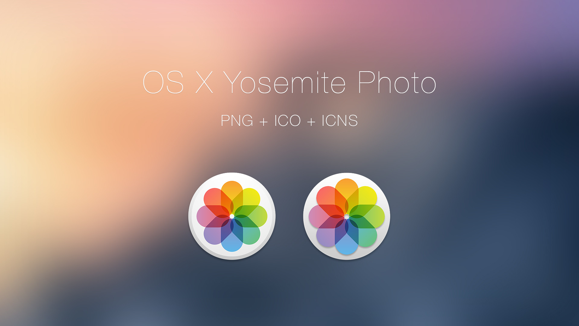
 simalary44 — OS X Yosemite Icons - iWork Applications DOWNLOAD
Published: 2014-08-15 16:33:39 +0000 UTC; Views: 4893; Favourites: 23; Downloads: 1231
Redirect to original
Description
What you've all wanted, download them now! [UPDATED: FIXED COLOR ISSUE]Update 1: 10/10
- Fixed/Changed Colors to correct icon
Related content


Comments: 11

What about Notes, the Outlook equivalents (Mail, Contacts, Calendar, Reminders), and Skype's equivalents (FaceTime and Messages?
👍: 0 ⏩: 0

The recoloring looks great! Is it just me or are the numerals on the 'y-axis' of the numbers teal or blue? The icons appear much more vibrant btw, so thank you for making my desktop pop even more!
👍: 0 ⏩: 0

Could you design an icon for remote desktop in Yosemite style?
Thank you!
👍: 0 ⏩: 0

Would consider redesigning the number and Keynote logos to match the colors to the stock logo colors. It is the only reason I am not using them. They are gorgeous otherwise.
👍: 0 ⏩: 0
I would also appreciate a parallels desktop yosemite icon.
And please a PSD format for the iWork icons.
Thank you.
👍: 0 ⏩: 0

Nice and clean!
Worth pointing out, I think, is that in the latest iteration of iWork, Apple decidedly designated each app its own color. You can see this in both the Mac OS X icons as well as the iOS icons. Your Pages color is correct, but the colors Numbers and Keynote would be switched.
👍: 0 ⏩: 1
Yeah, I neither noticed or minded before but you are right about Keynote being blue and Numbers being green. I'm not sure if that would look as nice though in the UI with the different gradients and such, but I cannot be sure...
👍: 0 ⏩: 0
The gradient on the left of Numbers (the paper in the background) has a gradient light at the top to dark on the bottom as opposed to the way that Pages and Keynote have drak at the top and light at the bottom
👍: 0 ⏩: 1

I know, i did it on purpose because if it is switched, it doesnt look good. Sorry if you dont like it
👍: 0 ⏩: 1
It looks great and I do like it, I just wanted to make sure that you were aware of it bc you asked on the preview if everything looked alright. I only noticed it bc I am studying graphic design and art, otherwise I would have never noticed...
👍: 0 ⏩: 0