HOME | DD
 simone4390 — Lissa

Published: 2010-10-04 20:23:18 +0000 UTC; Views: 2145; Favourites: 45; Downloads: 9
Redirect to original
Description
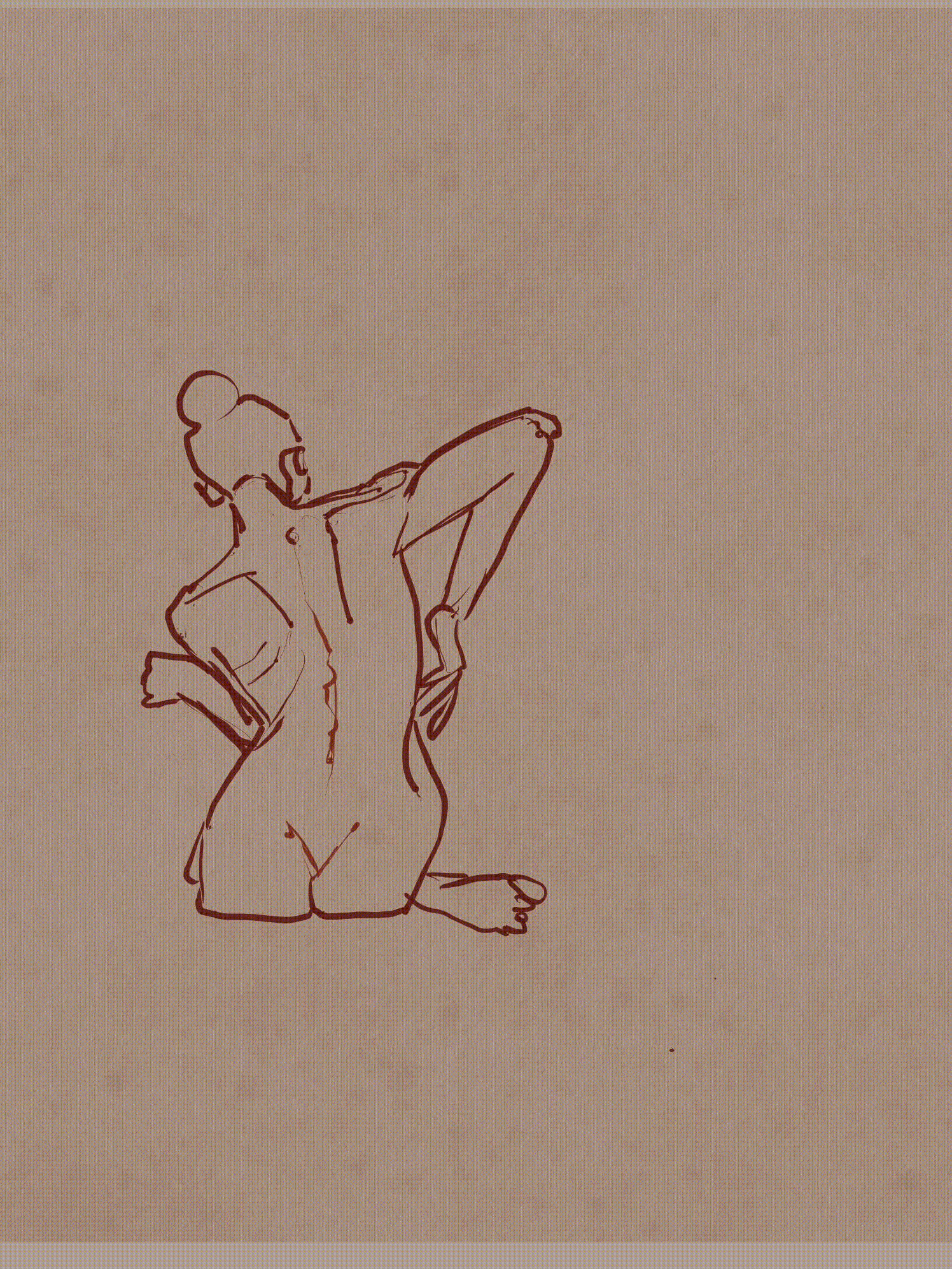
From life in charcoal, pastel and conteRelated content


Comments: 57


 (Smile)")


Very nice. Again a great use of color and texture. I like the roughness of it too. Normally, shading with colors like pinks, yellows, blues would look very strange on a person's face but you've pulled it off perfectly!
👍: 0 ⏩: 1

I love the colors and the crosshatch-y pattern on the face.
")
👍: 0 ⏩: 0


i love the texture. great touch with the stroke of colors on her face
👍: 0 ⏩: 0


faved and loved... i loved this study of yours.... the texture shifts the mood of the picture up... keep it up.
👍: 0 ⏩: 1

nice rough style! gives it an expressionistic touch!
👍: 0 ⏩: 1


really expressive and accurate. Brilliant drawing.
👍: 0 ⏩: 1


This is nice... real nice! Keep up the good work
👍: 0 ⏩: 1

Thank you. I do my best
👍: 0 ⏩: 1


Please support me by faving the article!

👍: 0 ⏩: 1


Beautiful work yet again ! I find I quite like your loose style and your bold use of color. I like the 'sketchy' nature of this quite a bit - in other words, the rough lines and visible brushstrokes. They work wonderfully. My only real issue with this piece is that it is a bit dull, and I wish the darks stood out a bit more. When I photograph or scan my work, sometimes I find that the vibrance of certain colors gets lost and doesn't quite look the way it does in real life. That may be the problem here, and any digital imaging program you may have - be it Photoshop or GIMP - will have some way of adjusting color levels to really get the shadows and highlights to stand out. I think this piece would really benefit from that.
Otherwise, though, this is well drawn, proportionate, and really a nice piece of artwork.
👍: 0 ⏩: 1
Yes perhaps I should retouch the scan of the natural drawing. It is a good hint. Thank you.
👍: 0 ⏩: 1
I hope it proves to be helpful, as you really do great work !
👍: 0 ⏩: 0


Is Conte easy to use? It's a great piece, charcoal is very hard for me to use.
👍: 0 ⏩: 1
Conte is hard chalk. I like to use it for refining sketches in colour, when the basic forms are on the paper already. Most of the time I do that with charcoal. Charcoal is good for sketching roughly and correcting over and over.
👍: 0 ⏩: 1
Ah, thank you! Good to know!
👍: 0 ⏩: 0

Wow I love the rough look of this and all the colors involved. (pinks yellows blues)
👍: 0 ⏩: 0


This is great! I need to try drawing someone live...But this is lovely. The colors you chose and the texture really caught my eye.
👍: 0 ⏩: 1

| Next =>