HOME | DD
 simonmichel00 — superman Vs Train
Published: 2011-06-12 11:52:00 +0000 UTC; Views: 2495; Favourites: 22; Downloads: 0
Redirect to original
Description
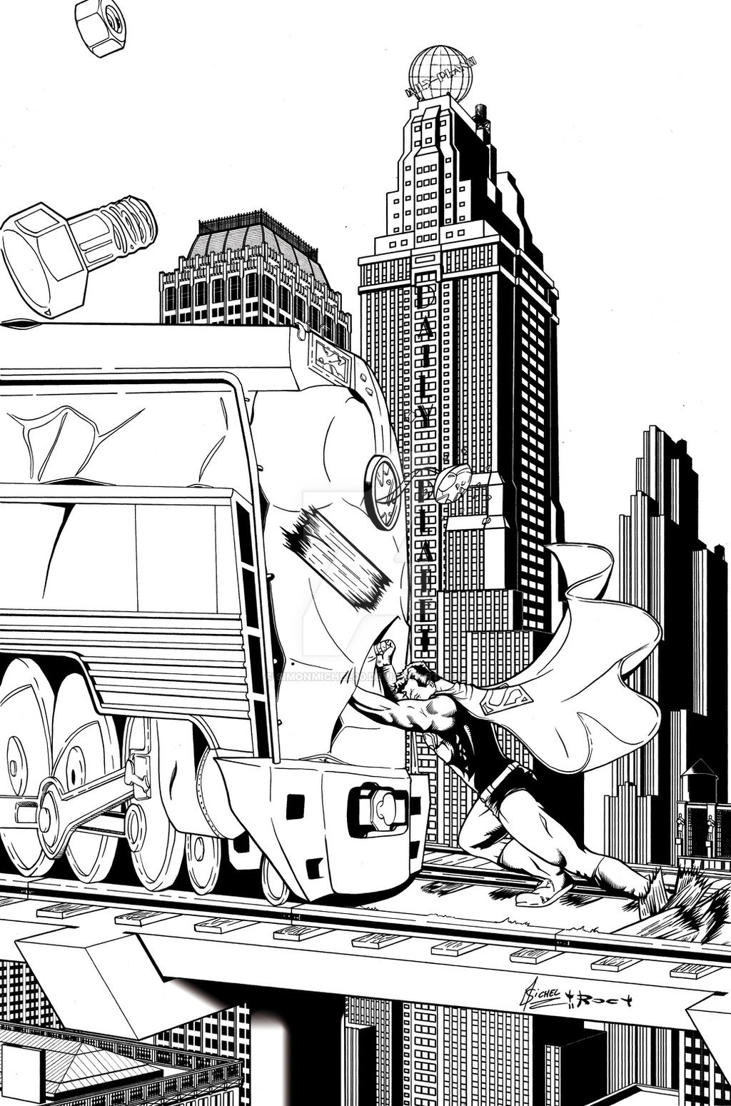
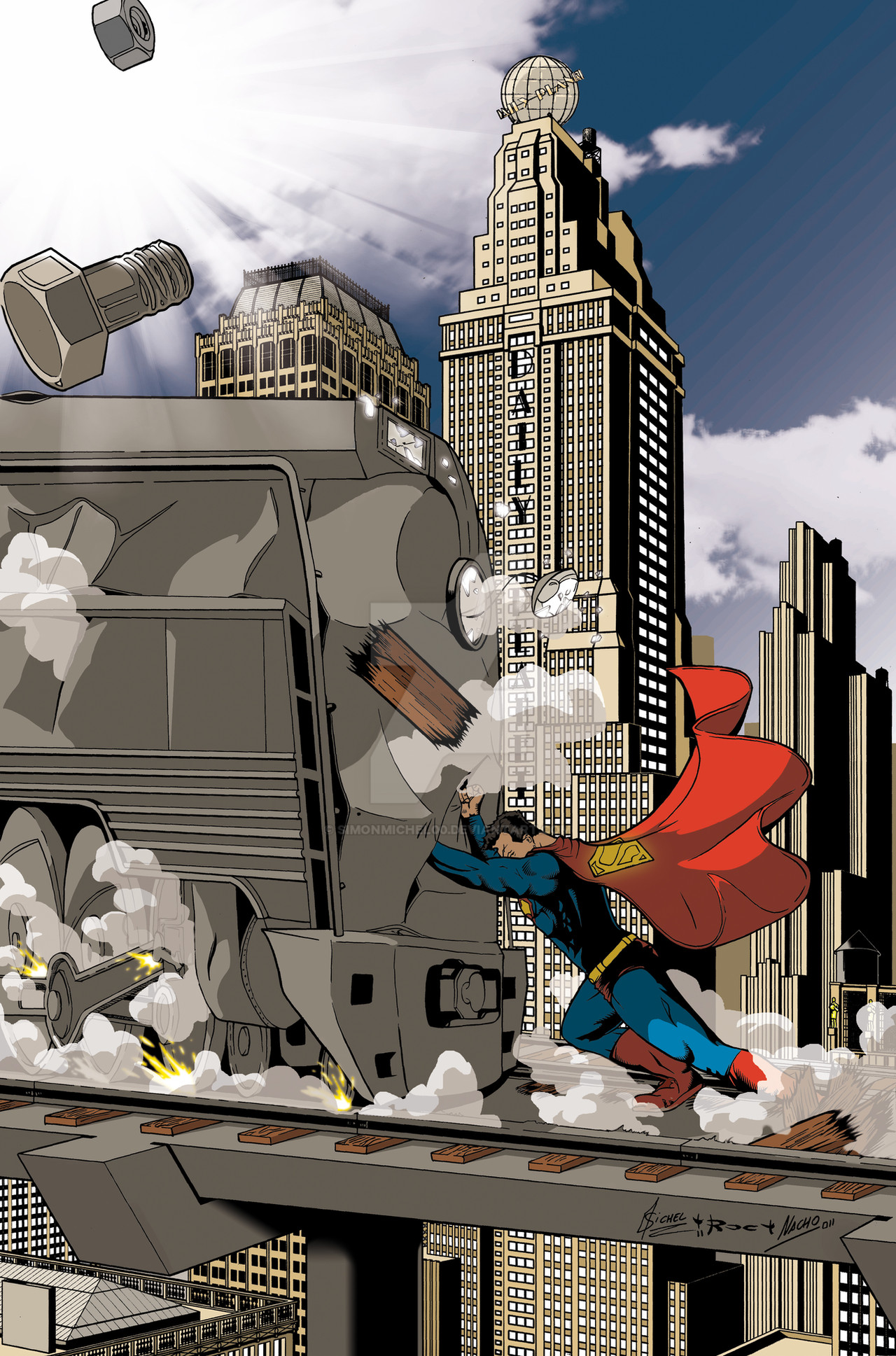
I love superman! he's such a awesome character to play with...anyway, this is a very classical image of superman, him stopping a train, done by a lot of artist, thought I think the first was Joe Shuster, on Action comics #13 cover, [link]
then I know Terry Dodson, Tim Sale and a few other did it too, so, it's kind of a after after all these wonderful picture of men in blue tight with "art-déco" train!
I hope you like it,
pencil by (me),
INK by
thanks to for the background composition ideas! I own you one man!!
 (Smile)")
Related content


Comments: 31

i like it enough that you should consider the following changes: lessen the contrast on the buildings, shade the sky a little, with a light blend at the bottom, to a little darker up top, and put some more dark areas on the train, with the rest of it gray metal. it would focus the piece a bit.
👍: 0 ⏩: 1

hi,
thanks!
however this is traditional art, and I don't own the original anymore
did you check the color version?
 (Wink)")
👍: 0 ⏩: 0

It's a nice piece, but there's one thing buggin' the ever-livin' crap outta me - the train wheels. I don't understand them at all. The perspective and ratio is all wrong. (on a side note - as an editor I would recommend getting rid of the bolt that's flying toward "camera")
👍: 0 ⏩: 1
hey!
yes I understand, truth is, the wheels were going to disappear at the color version that you can see here [link] so I decided to don't waste my time doing them (as an editor I'm sure you can understand that.) so my inker improvised.
👍: 0 ⏩: 0

je viens de voir que je n'avais pas répondu a ton message, merci Laurent!
👍: 0 ⏩: 1

arrggg y haz puesto el otro ugly superman.... mouahahahaha! gracias!
👍: 0 ⏩: 2

Vale, lo he cambiado por la portada calendario a colorXD
👍: 0 ⏩: 1
perdona me avia ido de DA por poco tiempo, demasiado trabajo!! bueno gracias por cambiar los, mi mensaje era media una broma porque ya sabes que no me gusta este otro superman
")
👍: 0 ⏩: 1
por eso te lo cambieXD, aunque a mi me gusta bastante la verdad^^
👍: 0 ⏩: 1
ayy yo no lo veo ugly XDD si prefieres que ponga otro dime cual, pero queria poner o los dos en color o los dos en blanco y negro, te gustaria más que ponga los de la portada y contraportada del calendario?^^
👍: 0 ⏩: 0
Merci merci, j'ai longement hésité a ajouté des bois de renne mais finamement je me suis dit que ce serai mieux sans.
👍: 0 ⏩: 1

Et je dirai que bordel de merde tu as bien fait!
👍: 0 ⏩: 0

Très chouette ! question : le décor d'arrière-plan, c'est du fait main ou... du Sketch up ou un truc comme ça ?
👍: 0 ⏩: 1
fait main
👍: 0 ⏩: 1
Eh bien bravo, total respect !
Oui, la règle pas assez longue, j'ai le même problème actuellement sur un truc 
Fais une grille la prochaine fois, c'est ce que je ferai pour ma part ! : P
Félicitations pour ce très beau boulot personnel et collectif !

👍: 0 ⏩: 1
c'est pas la règle qui est trop petite, c'est la table HAHAHA! j'ai une règle de la taille suffisante.
👍: 0 ⏩: 1

gracias hombre! ")
👍: 0 ⏩: 1

Joli boulot collectif même si je pense que la cape aurait du aller dans l'autre sens et envelopper Supes pendant l'effort qu'il fait. La perspective des roues du train ne me parait pas correspondre à la perspective générale. Le différentiel de lumière entre le 1er plan et l'es buildings est cool.
👍: 0 ⏩: 1
dans mon sketch de base elle aller dans l'autre sens, et la vérité, c'est que c'était la solution de facilité, ça caché le corps de sup, la mettre comme ça me permet une sorte de compo pyramidale inversé, de plus, elle montre toujours le corps et la puissance de sup, de plus elle est correct si comprise comme le vent qui s’engouffre sous la cape et la soulève, avant de la plaqué sur sa tête.
pour les roues, en effet, elles ne sont pas vraiment cool mais j'ai dit a roc a l'encrage de ne pas y passer 20 ans que de toutes façon elle serais cacher par de la fumée et des étincelles, cela dit pour ce qui est de la pers, le train le superman et les rails sont dans une pers différente que le décors puisque a la base pensé pour autre chose (autre compo totalement) et j'ai eu la flemme de retapé le train le superman et les rails pour la pièce final j'ai donc juste coller celui que j'avais déjà fait sur ce décors vue de la différence était assez petite.
en effet je suis assez content du décors.
👍: 0 ⏩: 1
Bon, si tu es content ... c'est l'essentiel !
👍: 0 ⏩: 1