HOME | DD
 skandalouzgfx — CS Orange Darkness template

Published: 2005-07-18 11:57:37 +0000 UTC; Views: 10830; Favourites: 25; Downloads: 5716
Redirect to original
Description
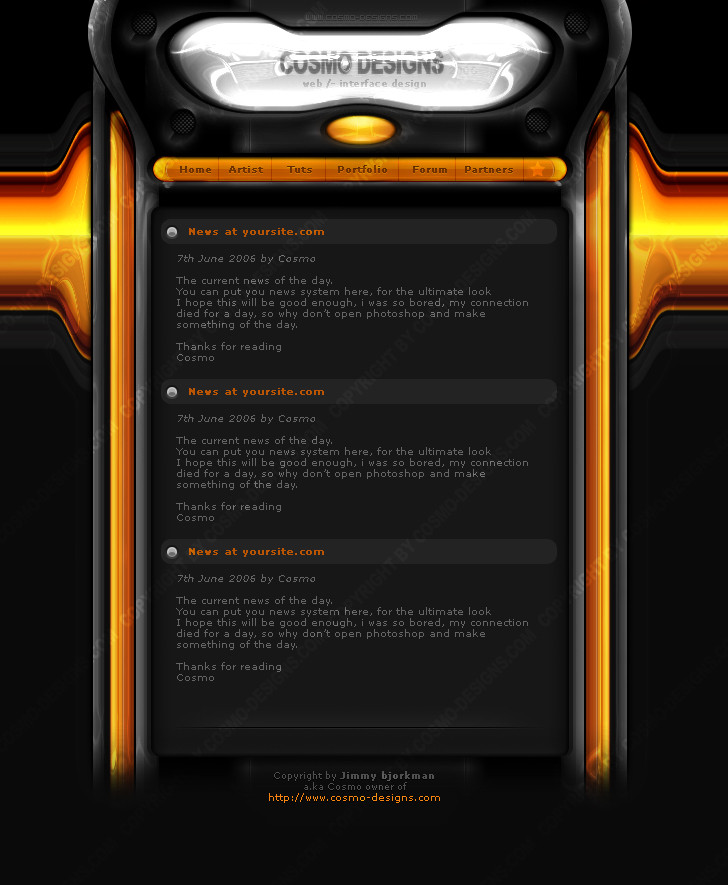
made this when i was bored, the header kinda looks like crap but im gonna change that later on. I'm thinking of selling it as well. its like 90% done now, comments appreciated as i need help to spice things up. what do ya think?(oh it took me like 15 hours or so btw)
Related content


Comments: 41

")

ik spreek ook nederlands :d awesome templates ")
👍: 0 ⏩: 0

Hot damn, make some more tutorials.
D:
sooo awsome...
👍: 0 ⏩: 0

lol grabs knive rofl! oh shit i better run! - also why did u get banned from CodedFX?
👍: 0 ⏩: 1

haha dont you dare
i got banned because Gareth is a render ripping faggot, as well as a template ripping fag, and me and some others proved it. he wished to ban me and some others instead of admitting it, thinking 'it was the best solution to keep the peace'. many members flamed me and the other guys that were proving it, but after a day or 3 they noticed how right we were and gareth got scared. soooo he removed all the evidence and banned me and some others :] oh god i enjoyed saying I TOLD YOU SO to all those members XD
👍: 0 ⏩: 0

a good work, if you want make a visit on my gallery, i've maked 2 template but i don't receive comments
👍: 0 ⏩: 0

I like it very much. The only think that i dont like is in the header the " shapes " you know... looks a little unglossed. Great work, keep it up!
👍: 0 ⏩: 1
uhh i dont really kno what you mean by shapes, but thanks for your comment

👍: 0 ⏩: 0
I like it very much. The only think that i dont like, is in the header the " shapes " they look unglossed. Great work, keep it up!
👍: 0 ⏩: 0

man that is awesome stuff i think you ned to write a tut on it lol.
👍: 0 ⏩: 1
i think you need to hide *grabs knive*
lol
👍: 0 ⏩: 0

WTFOMGLOL!
Great work! My only suggestion is make the borders more blended with the rest of the template, the lines a little less harsh and whatnot (lower opacity).
And the cs dude could use some soft blending (select, feather, delete)
also, 


👍: 0 ⏩: 0

im one of the main designers on hostedfx  (Wink)")
👍: 0 ⏩: 0

")
tanx joo! still gotta sell it tho ")
👍: 0 ⏩: 0


Thats a very nice layout, only thing... from the screen shot the orange squared distract from the rest of the page. They jump out at you when you need other things to do that. They look good in the top nav menu, but the rest of the page doesnt need the orange bloks... other than that its awesome!
👍: 0 ⏩: 0

looks awesome man +fav.......... btw whats you msn?
👍: 0 ⏩: 0

wow love the temp
only thing i dont like is the "glass" effect on the banner....if you got rid of that i think it would look much better
awesome job
+fav
-aved
👍: 0 ⏩: 0

very nice template man
it could be worked out a little bit more on some places which would make it even better
btw:
👍: 0 ⏩: 0

holy... looks so hot man, very impressive work. 5/5 scores  (Smile)")
👍: 0 ⏩: 0

15 hours, while you were bored? You seem to have a lot of spare time...
btw, great work
👍: 0 ⏩: 0

Great Template, Easy to Code, Don't do anything at the header.. looks pro to me
👍: 0 ⏩: 0


some edges look a little to jagged, too dark for my taste- nice idea though.
👍: 0 ⏩: 1
i prefer dark colors as they are easier to work with IMO. thanks for your opinion!
👍: 0 ⏩: 0
thanks man
👍: 0 ⏩: 1

[link] .. Niet dat daar zo bijster veel verkocht wordt maar er mag wel eens een klasse lay-out komen in plaats van die baggerdingen wat ze daar meestal verkopen.
👍: 0 ⏩: 0

wow this is a very nice template i like this template a lot gj on it
👍: 0 ⏩: 0


Did you do all the other pages? Like Download and Matches? Cause now.. its like.............. Fucking AWSOME!!!!!!!!!!!!!!!!!!!!!!!!!!!!!!!!!!!!!!!!!
Very very nice interface! Good Job!
👍: 0 ⏩: 0
how did you know i was dutch lol.
thanks for the comments, keep em coming!
👍: 0 ⏩: 1

ik ben ook nederlands
Wat voor opleiding/school of werk doe je?
Ik ga in iedergeval naar de zomervakantie naar het Grafisch Lyceum Rotterdam
👍: 0 ⏩: 0
in dutch:
Ziet er goed uit ")
in English:
It's looking very good
👍: 0 ⏩: 0

Like I said, ITS REALLY GOOD!! The colours, the font, the content is awesome. And the banner is perfectly fine man!!
👍: 0 ⏩: 0

don't beat yourself up over the header, it looks might professional if you ask me. dope work my friend.
👍: 0 ⏩: 0