HOME | DD
 SketchMonster1 — DBZ Colored, -unfinished-

Published: 2009-10-19 08:26:16 +0000 UTC; Views: 1542; Favourites: 35; Downloads: 42
Redirect to original
Description
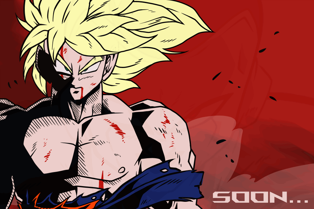
I need help finishing this. If anyone has any help as to value of things, and vertain colors. etc. Anything will help.Related content


Comments: 13


So, color theory is not my strong point, but you have blue dominating the picture. There is a volume of purple with piccolo's pants and hat...
Purple and green are contrasting colors, so piccolo stands out right away (he kinda pops into view).
Vegeta kinda fades into the planet/star thing behind him, because his outfit is blue and the grey/blue shading flattens himout a bit.
Whitening his boots and gloves in the highlights would work to give moore depth.
Yellows and oranges contrasts blues and violets, and i think it might help if the planet below had a orangeish hue (maybe the smokey texture).
possibly a planet in the background could be yellowish and a more neon blue for another. Lastly you coud let certain stars be a little brighter and bigger (if using the brush tool, soften the edges. And last but not least, of course to seperate Vegeta from th planet and the background more, there could be a fine feathered or bold outline (these are authourized in the world of DBZ).
Overall, a very strong anatomical based version of one of the most popular shows and instantly recognizable characters! I love the reflected light on (our) right side of the characters, and definately think it should stay. Definately works with the direct light and ambient light from other sources.
👍: 0 ⏩: 0

Glad I stopped by--this is pretty awesome. Two of my fav DBZ characters by far.
I can't see much you should do to it...but maybe if you want to punch up the values you could add more dramatic lighting. Maybe have some gold coming off of Vegeta, or light from a star or something behind them.
👍: 0 ⏩: 0

Wow that angle is wickedly awesome!
Lighting is superb!
👍: 0 ⏩: 0


Well you could define the figues more and ...thats a planet right? maybe you could add more detail to that too. Its very nice tho.
👍: 0 ⏩: 1
Cool! I used to love that show. I like the detail!
👍: 0 ⏩: 0


I recommend lookin' at a space scene from DBZ, see if that hits you with any inspirations for colors n' whatnot.
Love how it looks so far, though!
👍: 0 ⏩: 0


Turn the image upside down and don't look at it for a couple of days. The next time you look at it, you won't be seduced by subject matter or drama. Being upside down, your eye will instinctively be drawn to shapes and forms. Wherever your attention is drawn by this instinct will be a good thing or a distraction. If it's a good thing, make the rest of the piece rise to that level. If it's a distraction, fix it.
Separate forms with color as well as shape. Isolate with focus or blur. Looking at it upside down with a fresh perspective will open your eyes to a new approach.
Works for me, anyway.
👍: 0 ⏩: 0