HOME | DD
 SketchyOne — LIghtSkin+Highlights Practice
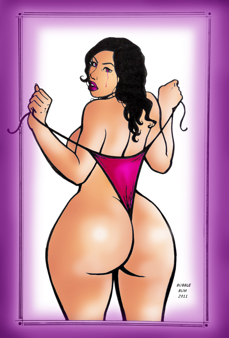
Published: 2011-08-01 11:45:36 +0000 UTC; Views: 1402; Favourites: 51; Downloads: 61
Redirect to original
Description
All Credit to the lineart goes toThis Is The Original Line Art [link]
This is the version without any highlighting [link]
This is the Version with Highlights [link]
so I wanted to set highlights and while that i also did changed her skin tone in this piece quite alot to this very much lighter skin right here
 (Smile)") hope u still like her skin tone and would want to know how u liek my highlighting? if it is set right :S
hope u still like her skin tone and would want to know how u liek my highlighting? if it is set right :S
Related content


Comments: 19

I'd love to see this in the Paradise gallery, SketchyOne! ")
👍: 0 ⏩: 0


 (Wink)")
👍: 0 ⏩: 1

The shading on her backside & legs looks a little off, I think this is because of the technique you used rather than bad highlighting. I think in places they are a little too bright and you can see the brush strokes too much. Have you ever heard of blending? I would strongly recommend it :3
👍: 0 ⏩: 1
not heard of blending P: you should tell me about it !
well i think on her legs i dont really know if its that off but somethigns odd about her back kinda i thought too ^^' i will trymore practice and try to improve that
👍: 0 ⏩: 1
Blending is when you have a shade or a highlight, apply it with a soft brush to where it goes, in small amount, then take the eye dropping tool, pick a colour in-between the shade/highlight and the base, then start going over it. Rinse and repeat as needed. It helps to create a more natural, smooth feel to the shading or highlighting (:
👍: 0 ⏩: 1
well thank you for explaining
👍: 0 ⏩: 0

That remains the best of the 3 , in term of lights and skin tones. (you forgot some lights, like on the main border of her nose however ! )
But since your light is fixed you need to show the shads !
Light works better if you got the shads in the right place.
Reflected light might be a plus too, especially to give depth to your colors.
Last but not least, you need to isolate the basic lineart, or if you did, you need to clean it, because lots of white pixel appears, and that kill a bit the whole stuff !
👍: 0 ⏩: 1
WOW THANK YOU SO MUCH FOR YOUR TIME
👍: 0 ⏩: 1
well ACTUALLY there is NO shades on you pic
watch the shades, see the light and then make conclusion of where you need to put those damn shads XD
👍: 0 ⏩: 1
yeh.. kinda not really any shading but i will work it over again ^^' haha thanks once again xD...
👍: 0 ⏩: 0