HOME | DD
 Skia — Pain and Hate

Published: 2012-10-29 19:54:24 +0000 UTC; Views: 52306; Favourites: 7314; Downloads: 1236
Redirect to original
Description
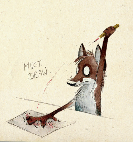
Brothers in Crime.Related content


Comments: 242


It would be perfect as a nightmarish theme^^ Very good!
👍: 0 ⏩: 0


What true feelings...
this is just genius.
Awesome!!
<3 your work
 (Smile)")
👍: 0 ⏩: 0


There is so much being communicated in this image. Such chaos and insanity being portrayed with a sense of simplicity. Really good work!
👍: 0 ⏩: 0

This drawing is so full with expression. I can feel the hate and especially the pain coming from it. Your artwork is amazing. You've got so much talent.
👍: 0 ⏩: 0


Looks awesome!
But is it supposed to look like the number 2?
")
👍: 0 ⏩: 0


You just gave me a great idea...(Dun worry, its way different than this, just something to do with the personification of Pain and Hate)
👍: 0 ⏩: 0


this is so weird! I love weird things.
Looks like a face...
👍: 0 ⏩: 0


first I thought that was the dragon logo fron guild wars 2
👍: 0 ⏩: 0


")

It's rather interesting that the two negative emotions are portrayed as sinister, hound-like forces. I suppose it would explain the side-effects of the two emotions.
👍: 0 ⏩: 0

I feel bad for saying that at a first glance, I thought it was the Guild Wars 2 symbol. But really, this looks quite nice. Good work.
👍: 0 ⏩: 0

I like it how the first one seems to be tearing away from the second one. It looks painful. And the expression on the second one's face looks full of loathing.
Very nice.
👍: 0 ⏩: 0


Saw this on the front page and really like the style. It makes these thin, inky lines into living things. Awesome work!
👍: 0 ⏩: 0

I like this kind of style... Dark and gritty/grungy, swirls and strings and stuff... Neat
👍: 0 ⏩: 0


Ooh, very nice. I love the two expressions together.
👍: 0 ⏩: 0


| Next =>