HOME | DD
 SkipDesign — Social Networks
Published: 2011-01-19 02:31:56 +0000 UTC; Views: 7062; Favourites: 150; Downloads: 211
Redirect to original
Description
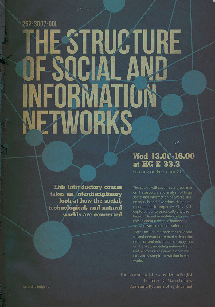
A poster for the lectures in ETH university, Zurich, Switzerland dedicated to social networks analysis.Related content


Comments: 23

Highly Targeted Audience On Facebook Without Wasting Your Time 100% FREE An Meet Social Media’s New Unfair Advantage.. get Money-Back Guarantee businesscashtricks.blogspot.co…
👍: 0 ⏩: 0


Great typeface selection (Bebas ftw!). Really like the retro colours and texture too.
👍: 0 ⏩: 0

you got the taste
nice choice of font set & also the color!

👍: 0 ⏩: 0

Really good dude! The type is nicely layed out, nice muted colours and good use of texture and shape. Great job!
👍: 0 ⏩: 0

 (Smile)")


It's amazing. I love how you represent the social and internet network with this connected circles.
Great. Keep it up!
👍: 0 ⏩: 0

really nice job, i liked the colors, good use of textures and nice typo too (:
👍: 0 ⏩: 0


Amazing piece of design ! Is it possible to get any infos about the typefaces used in this poster ? These are great !
👍: 0 ⏩: 1

Thank you. I've used Bebas Neue, Shakula and Aller in order of main focuses.
👍: 0 ⏩: 1
Nice set ! Bebas is awesome and free (which is rare), Aller is far better than Myriad pro in my opinion, and shakula seems like ChunkFive. Great layout anyway !
👍: 0 ⏩: 0

Good typography.
Helvetica condensed bold, chunk five (not sure) , and the body text on the right seems an Helv. but it's not.
Good colours and texture as well.
Nice poster, well done mate!
👍: 0 ⏩: 2
Thanks.
You're wrong about typefaces. These are Bebas Neue, Shakula and Aller in order of main focuses.
👍: 0 ⏩: 1
Bebas!!!
It's one of my favourite fonts but I haven't recognized it!
Shakula I don't know it, Aller I got it.
Good selection, next time I will be focused to recognize better them.
Well done!
👍: 0 ⏩: 0
Yeah it seems like chunk five but it's not (look at the "y"). Types used are so fitting together !
👍: 0 ⏩: 1
Yeah right! It's really similar to the C-5.
Thanks 4 info.
👍: 0 ⏩: 0

