HOME | DD
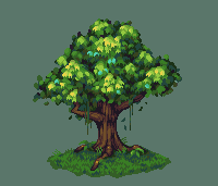
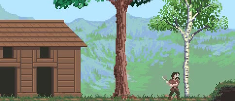
 skittlefuck — Tree Study - 1
Published: 2014-08-11 12:31:34 +0000 UTC; Views: 8514; Favourites: 366; Downloads: 129
Redirect to original
Description
Not going to lie, I tried to mimic this palette as much as I could by eye retinaleclipse.com/treepalettes3.png I didn't really accomplish what I set out to do in the beginning, but I'm happy with the result. Will definitely be doing more trees later on.
Here's a palette comparison if anyone is interested (the 15 colour palette being the one I made) i.imgur.com/TR1Avw0.png
I think my palette is more stiff, in the sense that I used more of a flat ramp whereas the other one was much more flexible with it's saturation and hue, it also shifts a lot more towards blue.
Back to doing side-view art now x_x
enjoy!
(sorry for the rather bland title ")
Related content


Comments: 71

Ack, thank you so much, that means an awful lot!
👍: 0 ⏩: 1

Woooow! That looks amazing! * U *
👍: 0 ⏩: 1
Ahh thanks so much, you're too kind ^^
👍: 0 ⏩: 0

Looks good. Detailed but not too busy, I can approve of this. Still need to practise backgrounds myself.
👍: 0 ⏩: 1
Yeah, backgrounds are really difficult, imo they seem to be much easier when working with smaller palettes.
👍: 0 ⏩: 0

Haha, yupyup
Thanks a lot mon!
👍: 0 ⏩: 0

... Well.
This gives me a good reason to give them another try, huh.
👍: 0 ⏩: 1
Yeah, go for it! Tree's are really annoying to do, but every try will be better than the last : )
👍: 0 ⏩: 0

I think it looks good! Possibly could of retained more form of the branches in the upper half of the tree by letting em be a little visible between the clumps of leaves, but that's just me nitpicking a little. I like the way you've represented the light bouncing off the leaves. Even if you did use a reference for your colour, this still looks much like your own work to me. I like the texture you used for the grass, and honestly prefer your work on the trunk to the reference's.
Your "other art" suggestions came up with another tree attempt from March, and between that and this, this really shows an impressive leap forward in skill! I know that deviation states it was already a little old, But you should be proud of this work as it really shows you've made a lot of progress regardless.
👍: 0 ⏩: 2
I see what you mean, the other trees in the description did that, I should've noticed that from the beginning when I was pixelling the leaves (and that's not a nitpick at all!), I'll edit it up a tad and post again in a few minutes!
And yeah, I also think it's a big improvement, but there's still so much more to learn :S
EDIT: fixed it a tad, not sure if this is how you meant it but I did a sort of silhouette of the branches in the leaves i.imgur.com/CvYoQNO.png
👍: 0 ⏩: 0

I agree with Jenny here actually. Color conservative is good for management and consistency, but don't obsess over it XD I think yours looks pretty good on its own. Although for some reason I kinda feel like the texture of the foliage is kinda out of place, since the leaves don't have distinguishing outlines compared to the trunk.
👍: 0 ⏩: 1
Hmmm, you may be right, but I didn't mean for it to be an outline but moreso just the darkest shade on the tree (which is why it doesn't full encompass the tree). Maybe if I just lower the value on it it will blend better into the tree and not look like an outline, I'll test a bunch of stuff out and see what I come up with. Thanks man!
👍: 0 ⏩: 1
Yeah perhaps less contrast for that shade. If you're familiar with unseven or Glauber Kotaki, you should reference his palette for this style. He never uses any colors that dark at all.
👍: 0 ⏩: 1
Ah yes, he's a good artist to look at for reference. It's a shame he doesn't have any pieces of trees
👍: 0 ⏩: 0

Oh thanks so much : )
👍: 0 ⏩: 0

the pj heart emoticon fits here.
also, side note, the perspective on the branch (closer to us) that's sticking out seems to be weird. Hard to tell which direction it's facing.
👍: 0 ⏩: 1
Oh, good call, I meant it to look like it sticking out of the front/side, but then curving towards the back a bit but I see what you mean. Definitely the way I shaded it :L Thanks for the crits man, it's always appreciated.
👍: 0 ⏩: 0
<= Prev |