HOME | DD
 skryingbreath — Circul
Published: 2008-08-16 01:54:44 +0000 UTC; Views: 15767; Favourites: 386; Downloads: 0
Redirect to original
Description
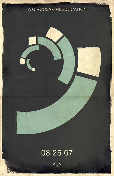
Nah nah (nahnahnahnahnah)Oh god I love posters.
Related content


Comments: 54


This immediately made me think of the golden ratio.
👍: 0 ⏩: 0


do you have the source for this one, sexy? i wanna make it a wall for my pc/phone.
also lmfao@comments directly above don't remember that at all
👍: 0 ⏩: 2

Good old fashioned tit licking, what's your email. Note me
👍: 0 ⏩: 0
so it appears my previous comment is not directly above. well then.
👍: 0 ⏩: 0


man, that is stunning work, i missed this somehow
👍: 0 ⏩: 0


 (Wink)")


")

I love everything about this poster. The spiral made up of curved blocks, the colors scheme, the slick lines with wear on the edges. Simply lovely.
Tell me, does that spiral make use of the "Golden Section?"
👍: 0 ⏩: 1
You know I'm not totally sure. I did use it in a golden section based piece though [link]
👍: 0 ⏩: 1
Well that cinches it then. This is definitely using the Golden Section if that one is. Looks like you have an eye for perfect ratios without even realizing it!
👍: 0 ⏩: 0


Reminds me a lot of 08 - Tuggummi - Flash Design (dedicated to skupers).avs
Im not an art person so i'll just give you a 
")
👍: 0 ⏩: 1
")


Oh you bastard.
Looks awesome man, dig the edge effects, relly sets it off.
 (Smile)")
👍: 0 ⏩: 0


reminds me of the Muller Brockmans beethoven, good work
👍: 0 ⏩: 1


If you stare at this for too long you get dizzy.
👍: 0 ⏩: 0

I like this a lot. The distressed look and dark colors are really appealing. Plus it just stands out with simplicity and style.
👍: 0 ⏩: 0

A Ha a.. i did something simmular for a graphics project at college
funny how you notice things like this in other peoples work
👍: 0 ⏩: 1
Have you a link to yours? I'd like to see!
👍: 0 ⏩: 0

I likes the simplicity
good job, the cool-toned colors add a nice effect to it too

👍: 0 ⏩: 0


Geh, it's too good not to fav...
Here's my poster attempt: [link]
👍: 0 ⏩: 0

that's a pretty good design! the golden section I assume?
👍: 0 ⏩: 1


| Next =>