HOME | DD
 Skyder117 — Art Class prac
Published: 2012-08-10 01:46:32 +0000 UTC; Views: 788; Favourites: 18; Downloads: 8
Redirect to original
Description
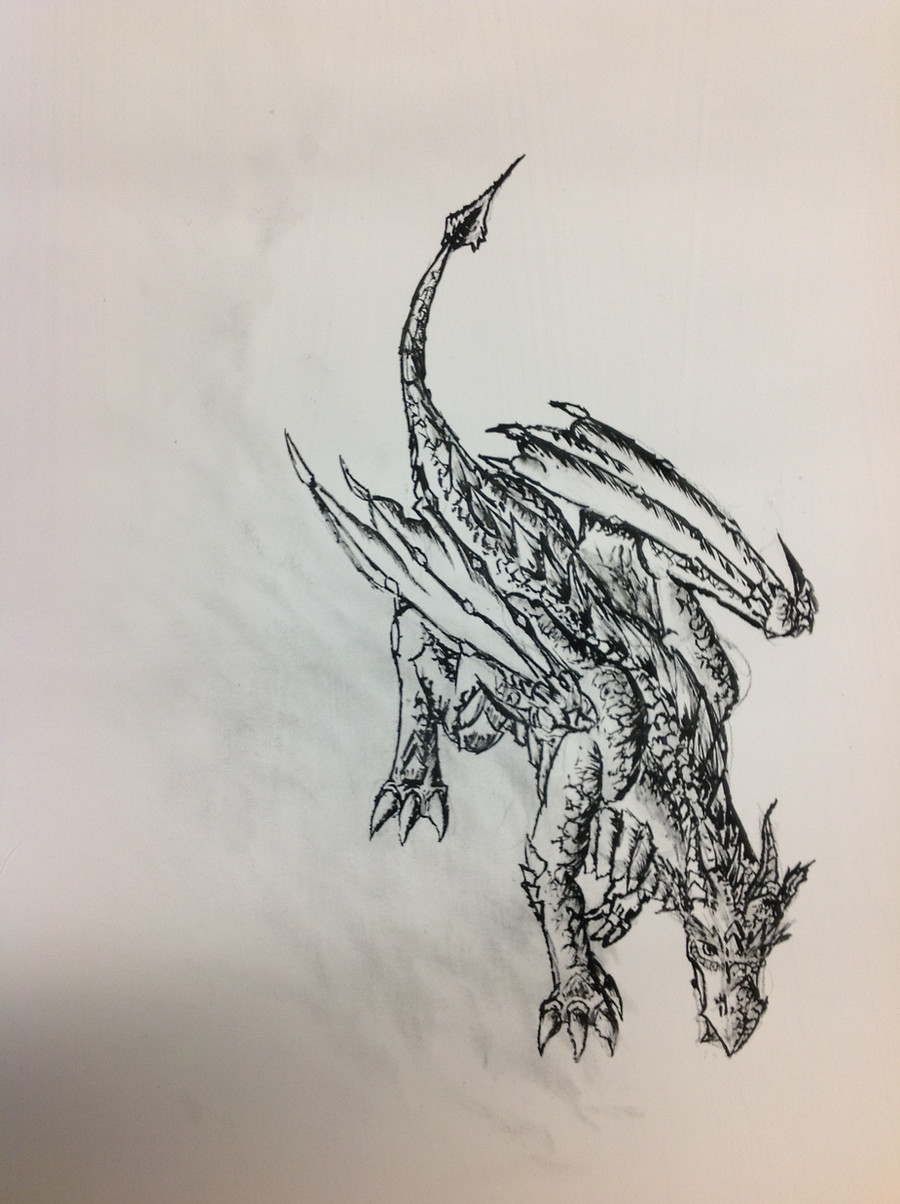
I had my art lecture on the principles of transition between light and dark. Afterwards we were given brushes, ink, stanley knives and paper, before being told to do some art. This was what I turned out with.The lecturer did note I need to work more on depth, that in order to give it a more 3 dimensional feel my shading requires more detail. Seems a fair analysis to me
Related content


Comments: 42


I love these kind of detailed drawings and the dragon as a whole is perfect 
")
👍: 0 ⏩: 1

level of artness? dude this is dA, level of artness goes right out the window, with my Acer and paintbrush!
👍: 0 ⏩: 1

....ot quite sure what yo mean by that but, Your a great artist!
👍: 0 ⏩: 0

sort of, i had a base sketch with the basic shapes put down in pencil. The idea was that I would always have a clear indicator of what I was drawing while I was drawing it.
Didnt work of course. Stupid guidelines got rubbed out as I drew!

👍: 0 ⏩: 1

Heh. You must draw lightly with pencils. At least they erase themselves.
👍: 0 ⏩: 0


I can kind of see their point on that. The drawing looks like there is illumination from left hand side of the page. The subject itself is very well drawn (of course).
👍: 0 ⏩: 1
Hehe. A friend and I were discussing art at one point, and we had this theory that things on the art change depending on what hand the artist was using. You can tell I'm left handed for example. because in a lot of my pic (not all), the head faces the right of the page. Maybe it affects how the artist does light in the picture too! xD
👍: 0 ⏩: 1
I never thought of that one. When drawing, posture can often have some influence. One thing that I noticed in your example was the look-down angle, which is more rare. I go back through my favorites and find that this angle composition drew my attention very easily, as well as look-up angle.
👍: 0 ⏩: 0

I want to study art NOW!! Will have to wait till october.
Nice job, looks so great!
👍: 0 ⏩: 1
Well you might not have to wait that long. [link] <-- these guys do videos on the techniques they use. Would definitely help out in making your art look epic!
👍: 0 ⏩: 1
owieeeeeeeee, thank you skyder ^.=.^
👍: 0 ⏩: 1

Nice work and yes your lecturer has a point.
May i suggest trying multiple shades for the shadow?
👍: 0 ⏩: 1
I was gonna try doing crossthatching, where you use crossed lines to indicate a change in the shadow. couldnt get around to it though, because the drawing was too small. Note to self: draw bigger!
👍: 0 ⏩: 1


compared with the rest of the work the class did... average!
👍: 0 ⏩: 0

It's definitely a good piece, obviously a good choice of subject matter (Smile)")
At least that's what I think, but you don't have to take my word for it, I'm not an art major, just an enthusiast...
👍: 0 ⏩: 1
thats actually very helpful advice coming from an enthusiast! xD
The lecturer i mentioned before also talked about Sebatier borderlines, a solarisation effect used for light behind objects and to also provide more depth to shading. i dunno how I was supposed to do it with ink, but he spent a good 5 minutes explaining the technicalities.
👍: 0 ⏩: 1
You got a point there... Ink is a pain, when it comes to shading. I think there are two ways to attack the problem. One is when you shade, shade in a diagonal fashion. And alternate between diagonal lines going from bottom right, up left; and lines that go bottom left, up right. that gives you two distinctive shades. They are the same strength, but, they look different. The way I recommend is using pen in tandem with pencil. I love pencil, in that you have a wide variety of grays to chose from, (it's a shader's best friend
Hope my rambling advice helps...[link]
👍: 0 ⏩: 1
cross thatching, its a complicated concept, and i was gonna try it here, but well... only one hour.
pencil though, thats a good idea! think ill use that next time, instead of what lecturer was suggesting... using a brush with methylated spirits to wash the ink to a blur- which wouldve worked, if picture wasnt only 6 inches tall and more likely to get blurred away!
👍: 0 ⏩: 1
Ah fancy names... See I just experiment, I don't actually know what they're called but if they help, good on you
👍: 0 ⏩: 1
Ok, I'll talk to the lecturer about this, he's done plenty of work with graphite painting (literally painting with pencil lead), if he's done this technique with pencil and ink, he might know how to use this one effectively... well at least waaay better than i could by just tying it meself (not gonna stop me trying though xD) By the way, I did start in pencil, with a base sketch of the shapes, but it rubbed out as I was putting on the ink!
As for knowing the names, I know exactly what you mean. This art class is the first formal art training I've undertaken in 7 years (high school art clashed on my timetable so after a semester I wasnt able to continue). Half the time I dont have a clue what the lecturer is talking about, so I end up having to research in my own time.
👍: 0 ⏩: 1
If you want to try something really interesting, try charcoal etching. It's messy work, but it's like having a giant rough pencil in your hand. Charcoal and pencil 'lead' are just different states of carbon; one more refined than the other. You can get some really dark shades with charcoal, but like I said it's messy and is closest thing to dry painting in my book (besides oil pastels, those pigments can run or smudge too...) -sigh-
Have fun with your artwork
👍: 0 ⏩: 1
thanks for the advice, dude. heres hoping i will have fun ^.=.^
👍: 0 ⏩: 0

