HOME | DD
 Skyder117 — End of Days
Published: 2014-08-16 16:02:29 +0000 UTC; Views: 1872; Favourites: 42; Downloads: 4
Redirect to original
Description
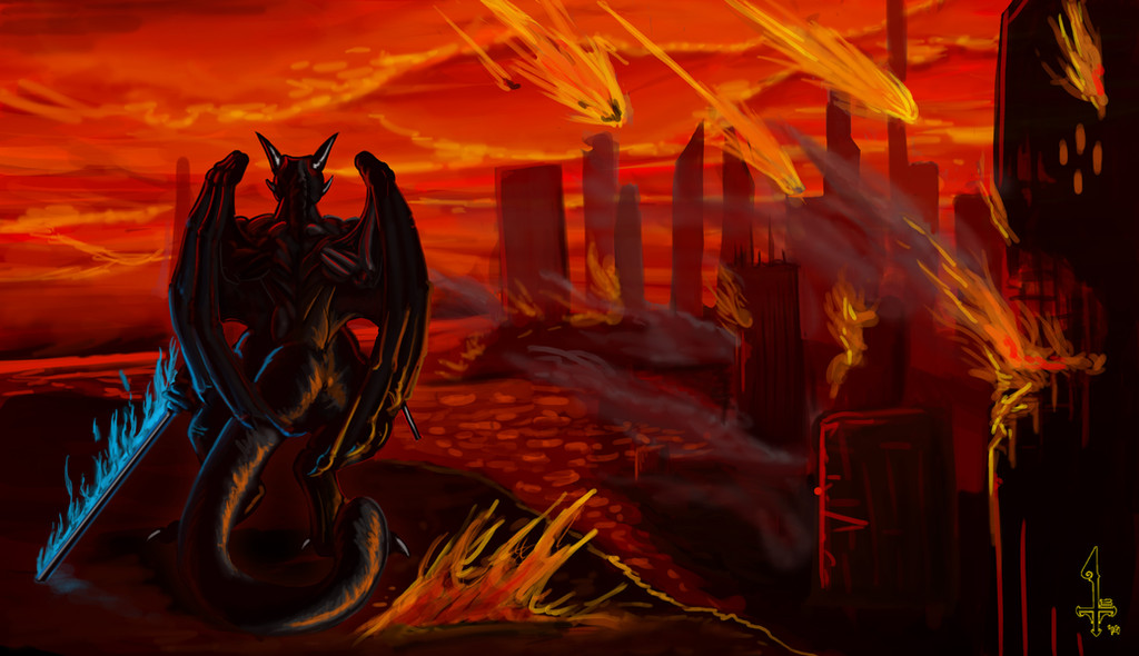
When it happened, nobody was ready. Our governments, our defensive forces, our emergency services, no-one could have forseen their arrival, or the death they would leave in their wake. Humanity, once numbering in the billions, was whittled down to a few thousand in the space of 3 days.
When it happened, we all paid the ultimate price, our blood ran through the streets in rivers, our bodies burned in the fire. There was destruction, anarchy, despair, grief, and annihilation. All that we left were our ashes, blowing in the breeze of our destroyed world, vapors of what we once were.
When it happened... he arrived to save those who had survived. That was his charge. Time would tell if he would succeed. Indeed, time would tell if he ever could.
A commission for
Time taken: too long
Related content


Comments: 29

See what happens when you give beans to my anthro dragón Edward? A fire dragón with gas issues may cause this
👍: 0 ⏩: 0

This looks amazing, the detail and the flow is great
👍: 0 ⏩: 1

the flow? I mean, I get you like the detail, but this is just standard rule of threes composition, iunno if there be any flow.. feel free to lemme know where you see it, of course
👍: 0 ⏩: 1
Probably a bit more common in the talk with my art classes, but flow tends to refer in the art classes the direction the eye travels in the piece. This has a nice path for the eye to follow without getting stuck or interrupted by one single part, everything working together
👍: 0 ⏩: 1

I really do like your art. Especially the composition went well in this piece. Though, we are all learning and I would just reveal a secret that would improve this already well-done painting. It's about the flames-they look much more realistic and, well, hot, if you draw the middle very bright (value 95 ca), and gradually tend towards yellow, then orange, and then a darker red the farther you go to the edge. Experiment! Be free. Trial and sometimes error brings you forward and feels great. Just found that, for example, the comets would look more incandescent and powerful that way.
👍: 0 ⏩: 1
Ya know, looking back at the pic, thats shoulda been something I really ought to have done. Thanks for the tip dude, much obliged
👍: 0 ⏩: 1
Anytime. As for values in general: Try playing with the value distribution, concentrating on one area of the scale too much never works out. And starting in greyscale makes it much easier to work with values. PS, you know. Oh, and do you know Daarken? He's got a NICE set of custom brushes on Enliighten, his page. Those help a lot. PS, you know.
...I guess shouldn't be bothering you so much... I just know too many theory things... u__u
👍: 0 ⏩: 1
Dude are you kidding? Im sitting here taking notes! This is the kind of critique I've been craving for aaages!
Okay, grayscale, was something I used to do, but leaned away from it when it took too much time. However when I look back at my gallery, I see a lot of my images are too heavily saturated. Now I've tried to fix that, but it never works, so if you reckon I should work on values before I add color, then I dont mind trying grayscale again.
As for Daarken, that is a familiar name. My local bookshop has a copy of one of his books, which I've seen, but never looked into. Now I'm actually seeing his art, I might go and buy it. Reason I havent already is cus it looked like a WoW art book... which I got plenty of as it is ^.^; Have gotten those brushes though, installing em as we speak.
Dude, thanks for the help, please feel free to put in your two cents whenever you wish, and dont worry about gettin me pissed off or anything. Comments be about feedback, I'd take one "Wait that shouldnt be there... ó.0" over 20 "WOW ZOMG 10/10 BEST PIC EVA! 

.... or about 200 "nice :I "
👍: 0 ⏩: 1
You have no idea of how much I can't express my thankfulness. It's tough when in real life, everybody keeps whining on about how they suck at drawing, and when I even just start about that it's not that difficult or how to improve, they just refuse. They want to keep crying! They're probably afraid, but man! They should stop.
So, well, over the last year or so, I gathered technical knowledge, and it hardly helps me, just makes my self-esteem go down like an old antivirus. It seems like everybody's better than me... I can't say if it's true, I just don't see things turning out the way I want them to, so I didn't upload anything since I started.
But if I can help, I shall be there. SOOO. *cracks knuckles* I would start with saying that art collection books are nice, but that there are books that, in my opinion, everybody who wants to paint digitally needs ASAP. The list includes:
-any good human anatomy book (my choice: "Atlas of Human Anatomy for the Artist" by Stephen Rogers Peck. It didn't take 10 years to write for nothing. Genius.)
-"Drawing on the Right Side of the Brain" by Dr. Betty Edwards, who was so nice to find out how to draw well even though you used to suck
-"Color and Light" by James Gurney (irreplaceable.)
-"Framed Ink" by Marcos Mateu-Mestre, the ONE book about composition.
-the list goes on. For example, and it might be expensive, but oh, damn: "Alla Prima - Everything I know about Painting" by Richard Schmid. Also, traditional color theory WILL help to improve anyone's digital drawings, as color isn't just part of oil or acrylic and canvas! Also, copying other's works helps, if you don't get it right, try upside down. Betty Edwards knows why. My following points are mostly free, especially my first recommendation.
My three favorite artists who regularly upload tutorials, instructional vids and more are: Sycra Yasin (beautiful passion for teaching + tells his own story), Matthew Archambault (teaches at the School of Visual Arts in Manhattan and is there by his students seen as the very best) aand Stan Prokopenko (youtube: Proko), whose vids are amazingly well edited. He might only use charcoal pencils, but hell! Is he good! I'll definitely switch from graphite to charcoal, he convinced me. Graphite sucks xD
👍: 0 ⏩: 1
*cracks neckbones*
in order you submitted:
-got (digital copy)
-got(physical copy)
-got(digital copy, also have a physical copy of Imaginative Realism)
-got (digital copy, recently attained)
-got(digital copy, recently attained)
-Traditional Painting - I got student acrylics, might invest in oils but havent really had a drive to. Have dont traditional colour theory though
-Copying others works - I traced a lump of ginger the other day if that counts
-Sycra - Subscribed
-Proko - Subscribed
M Archambault - Will subscribe to, after the assessments quiet down a tad
And now, my turn:
Brune Hogarth - Name gets thrown around everywhere for anatomy, good reason too.
George Bridgman - Hard to follow, but if you can get his books, theyre worth reading
Anything by ImagineFX - I keep a collection of their magazines, as well as several of their specialist books
Christina Yen ( ) released two books, one of which entails her method of drawing reflective scales.
As for youtube, Peter Draws, Scott Robertson, Level Up, aaand 's channels make for good viewing.
👍: 0 ⏩: 1
*cracks entire spine by holding on to a desk and turning on a wheelchair (yes I can!) so that everybody looks over disgustedly and groans* BTW, there's a huge critique of your painting in here, so it's got loooong. Looking back, I might add: LOOOOOOOOOOOOOOOONG. But it's worth it.
First of all: answers to recommendations.
-will buy the Hogarth "Dynamic Anatomy" sooner or later. I'm saving for a better computer right now.
-don't entirely understand the concept of the Bridgman books though... AHH there are 2 George Bridgmans! *Inception noise*... they describe his "Complete Guide to Drawing from Life" as "not for beginners" - sounds excellent. Will have a serious look.
-I used to avoid ImagineFX videos, just didn't sound like a professional tutorial, more like... ughh, I dunno. I'll watch their stuff on YT and have a look for their most recommended printed media. If it does what I want I will have a closer look.
-The-SixthLeafClover. To express myself in VERY short, I will just say that I think she's awesome, but her chroma is too timid, her value contrasts are too poor, and her luma is too high. (I just deleted six lines or so because I was going into more detail - could write an essay about this woman.)
-I already knew Peter draws and SRD but they were too specific for my taste - good artists though, have had a look at their general videos already.
-Level Up I didn't know about yet. Vids are LOOONG though, so I need time. And one thing about Nebezial: I do like his werewolfs.
Secondly: the rest. at the end I'll add a bit to my "critique" of your pic.
-I never seriously worked with paint. In school of course, but it is all so superficial you might just as well let the children spit on the canvas/cheap A4 copy paper and call it "modern art". A little dream of mine although is that I start with oil on canvas in a few years. Costs quite a bit, but hell! I love me some old masters.
-Mr. Archambault, as you should know, doesn't have a lot of free stuff, which is not entirely on YT. He is a bit exclusive, but that's what makes his students so happy. Also: there used to be a service done by Sycra - he would critique your paintings, for free. Proko does that with his permanent subscribers too, but M.A. does it twice a week for every of his students if they want! Awesome. And yeah, Daarken has got a thing for fantasy/video game concept art. I got to know him by playing MTG, especially the HD version of "Bloodghast" ensnared me-such proficiency. The value contrast, the perfect amount of glow, the filter-look, the abstract background, the experienced, explicit use of anatomy...
-Sooo, coming back to your painting, I still have one or two more or less general opinions to voice. First, color theory. I see you used the almost complementary colors blue and red and, consciously or not, achieved a slight balance. The reason for which I think the painting is not balanced however is in part because of the concentration. Your chroma is too intense (I'd describe you as eager) and except for a few focal points of drama, I would keep them under control more. Ex: clouds: they should become pale in the distance, and get darker/have more contrast at the top of the picture. I see you tried to work with rim lights, but those ain't gonna happen much if the sun or fire is causing them. Rim lights are born when the light source is slightly behind the object, but as I see it, the light source should logically be way under the clouds, so they might still get a bit more light in the distance and get really dark and threatening in front. (With an existent, but much smaller rim light) The same rule applies to the sword and the dragon. I can't see it shining just calmly away, it burns in blue, bright fire, and therefore should produce a more consistent lighting over the dragon's body, especially the back. (bounce light! we aren't out in space, so the blue light is gonna bounce everywhere and eventually reach even behind the wing.) Also, notice how the blue isn't very visible on the floor around it. As I see it, if it does burn with such flames, the sword's metal should glow. Do that by painting the sword in a dark, saturated blue and go over it with the overlay/hard light effect. For fire or suns, color dodge is a bit more recommendable, because it works towards white. I strongly recommend another youtuber here, cubebrush (formerly MBworkshops), who is a professional PS sci-fi artist
and has got a detailed video on the multiple ways of glow. He's also got one hell of a playlist about chara design.
I also don't know what the ground in front of the city is made of. If it is water, then the glistening will be brighter and more sparse. Also, the buildings should show dark distorted reflections, as their shadows would really be darker. I see you went lighter towards the horizon there, but the city seems small to me - composition thing there. So instead, I would have less distance between the shadow values of the city and just go for a deathly silhouette, try to be detailed and take skyscrapers in the process of construction as a reference. Next, the smoke would probably be thicker, and darker, and I would work with it as part of the darker mass of buildings, and let it catch some of the red lights. Also, as I now see, the light source itself is at the horizon, but the direction is unclear to me. (Go lighter in value and more generous with brightness towards a side, imagine a huge light coming from way behind (ex.) the buidings, and really show the long shadows the city casts. (Also,water is darker in general. My favorite example is "Fishermen at Sea" by Turner.)
General color composition: There is a rule that says: warm light, cool shadow, cool light, warm shadow. Your clouds have very warm, bright shadow areas. Why do I mention this here? Because it is a chance to use more (slight) blueish, greenish greys in the cloud shadows to balance between cool and warm, for you have too much warm. (It would also help the warmth to "pop".)
Also, I talked about concentration and chroma errors. I think the sword's blue should be less bright and in front of a dark negative space, the flames should be smaller or more irregular, for it looks a bit artificial...I'd just go for a glowing sword in front of black, and the blue tone that kinda contrasts and fights the more distant and foreboding reds should bounce off more. So yeah, you mainly lack a really dark area here.
COMPOSITION:
I thought about the composition and what I said is true, the composition is not bad. However, I think it doesn't fit. The city is much smaller than it probably is supposed to look like. I'd fix that by placing the scene bravely more in front or within the city and show a three point-perspective, with the buildings going fairly high, and the character more in the distance ("down the street", smaller!) and play with the glow and reflection of the blue in the glass windows (or shards or whatever) and/or show the main character in a low angle-shot. The distance makes him seem mysterious and works well with the "Rückenfigur" (just search what I mean xD no translations.), the worm's eye-perspective makes everything seem mightier and imposing (works well with dark areas). A HUGE tip for fixing composition issues is not to start off with what you come up with, but to make around 10 thumbnails first that are focused on positive/negative space, composition and movement.
Some tips at the end: I would paint the builings themselves with a rough chalky custom brush and use very straight upward lines. In this composition, you could use the shift key to make perfectly horizontal or vertical straight lines. (not much in 3PP though...) I saw you already did that, but then you slipped not so straight lines over it, that made the buildings soft and wobbly. I'd also use a perspective grid to get 3d into the buildings which currently look like rectangles. So yeah, lightsource behind the city, less light, more color balance, more bounce light, but also more cast shadows. Thanks for staying with me. In the future, I might do something like that for another one of your pictures. Or more. It helps also me get over the anxiety I have with digital - I have this problem that I try and work much too fast, and figures used to be stiff, and all that. Oh, and take more photo references! Draw and study from life. All the time. How is an artist supposed to work from imagination if the memory he's got from life isn't as clear as a friggin' 4k screen? Betty Edwards helps a lot here. Copying other's works is a bit like drawing from life, just that you reflect the other's artwork and "get" ideas, gather inspiration. And no, your painting isn't bad. This is just a way of improvement. All I can say is: draw from life and photos more. That will give your imagination more ways to express itself, and a better library - having photos open while painting is ok, but you shouldn't draw from them, just use some textures and compositions as inspiration, or you'll end up like me, stuck in a picassoesque limbo. Good night.
LONGEST REPLY EVER.
PS: it will also improve you line quality. Always try working with your shoulder. G'day xD
👍: 0 ⏩: 1
...Wow, shit I cant beat that.
Only got one point however, your comment on complementary colors. Now if I were keeping to the polar opposites, the polar opposite of red would be green. However Sam, he has a blue sword, cant change that to green without him smacking me upside the head for getting it wrong. Sooooo my way of compensating was to make the background/scene a dark reddish orange, and to make the sword a light cyan teal-ey blue. They're not completely complementary, but they are close.
As for the your long... long.... looooong critique, after I segregated it into sections to mentally digest (My brain cant do text walls), I was able to figure out that it was actually the most helpful thing I've gotten from this site. Incredibly constructive and well thought out. So you get to have that trophy.
This part though: "Betty Edwards helps a lot here. Copying other's works is a bit like drawing from life, just that you reflect the other's artwork and "get" ideas, gather inspiration".
You know waaay back, there was an artist who's famous quote was "Good artists copy, but great artists steal", refers to how an artist can copy an art piece in a way where they explore the concept and idea behind the original, and learn enough from it to turn it into something new. I know there's power in that sort of training... just havent decided on the one pic I want to explore. Maaaybe an Albert Bierstadt.
👍: 0 ⏩: 1
Retrospectively, it's easy to apologize for a rushed writing style. My comma- and grammar mistakes are unforgivable and add to the ghastly smelly pile of words I shoved into your face. I'd stick with a billion "sorries". I always used to write and read nearly continuous text or at the least consume books with hellishly small letters, and when I write digitally my mind doesn't wrap around the concept of "why what you write doesn't have to be intently read despite simple content". Sorry.
In response to your first answer, I'll just say that I can point out ONE word in my "novel" in "defense". I wrote "almost complementary" in the beginning. It indirectly said that I understand the colors HAD to be this way (Am a sort of an onlooker of the furry community myself, and I know that if your OC has a blue sword, he's got a blue sword.) and therefore intended to kinda present a way to work around this problem, by dimming the light around the sword to make the blue clear to the commisioner, but also to work with greenish and purplish and blueish elements (wound up a bit) like the cold shadows from the warm light to add atmosphere and artistic aspiration.
The dimming of the sword in itself brings balance. As Dr.Edwards writes: "[The human brain longs for unity.[..etc..]]" = Search for the feeling of unity, once you know the color wheel and how to use it as unconsciously as your own name in response to somebody asking. The same goes with proportion and perspective, or the correct use of edges. But that takes much longer. Also, conceptual work on the colors, knowing your palette before you start thumbnailing (with an idea of the atmosphere in mind) could help you with ideas and trains you to think about what you're doing while you're painting / drawing. You also wouldn't feel a bit lost when it came to the application of the first color to the greyscale picture. Cubebrush's got a good video on how to create good color palettes.
I know lots and appreciate all of your attention. It does happen that I reconsider my own choice of words. By now that I am further in art than when I wrote this, I must add that your second suggestion is truly right and much preferrable over my own gooey and hopelessly spongy advice. I'll let much more lifeblood flow into my messages and be hard-edged and mist-free in the future. Bierstadt is a good choice. Remember that it needs to be as close as possible to the original (maybe just take a cutout first?) and have fun. Seriously, fun is what one should always have. Oh, and, before the end: A big tip: "Digital Painting Techniques", Vol.1-6. It's full of PS-specific tutorials, free online content (ex. cloud brush),
and is beautifully printed. It contains advice from Daarken, Marc Brunet (Cubebrush) and Dr. Chee Ming Wong (sick!) only on Vol.1! Cover of Vol. 1 is by Daarken by the way.
I am much obliged. I have to learn self-restraint better and organize the ideas I have. The problem is that whenever I may get an idea, I'll take two and lose myself, just naming what comes to mind. After I was finished (took me 3+h) I couldn't go on and tediously edit the entire critique. I believe I could have made it more understandable and shorter.
So ehh...yeah, thanks. It's not an effort for me merely writing a thought process down, and I love to help you. It's just that I believe I'm not very resistant towards criticism and, projecting, choose to not bother people with what is my opinion. By just painting, you are far ahead of me, and I must yield.
👍: 0 ⏩: 0

This looks so epiiic~ c':
And a neat story to it, as well *.=.*
Nice work, Sky!
👍: 0 ⏩: 1
Well its Sam. When hasnt he looked epic?
As for the story, five minute brain fart to go with the pic. Tha's about it to be honest. If you want a better one, I suggest fav.me/d78usm8 , since there's actually plot.
Thanks dude
")
👍: 0 ⏩: 1
True, true~
Alright though *.=.*
You're welcome!

👍: 0 ⏩: 0


Great! I like the flame on the sword and the meteorites.
👍: 0 ⏩: 1
Heh, they took a lotta time to perfect, glad to know I got em looking good. Thanks very much
👍: 0 ⏩: 0

