HOME | DD
 skyknightnd — StormHawks poster concepts
Published: 2007-09-11 06:46:47 +0000 UTC; Views: 15272; Favourites: 198; Downloads: 2516
Redirect to original
Description
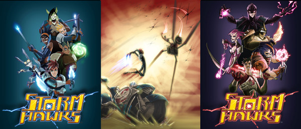
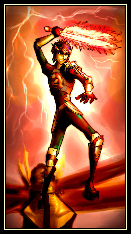
This is a ROUGH CONCEPT. This one was done before the high res poster i've posted previously, I jsut though it would be cool to post the old sketched version and concept for the other 2 posters. the expression on stork is old thats why it doesn't look as good as the big one. Lots of people have been complaining about the expressions and not high res enough on these roughs.Related content


Comments: 77


What are the chances that the Cyclonis poster is done up like the Stormhawks one somewhere?
👍: 0 ⏩: 1

Ahh no ")
👍: 0 ⏩: 1
I'd definitely appreciate a copy from a ComicCon. I enjoyed the art book and comic I got from Calgary this year!
👍: 0 ⏩: 0


I would so buy these. When I take over the world, I assure you, there will be a Storm Hawks poster in every room.
")
👍: 0 ⏩: 0

wooooow nice coloring in the middle one <3
master cyclonian is the best 2D evil person I have EVER seen she gives me so much insperation the howle serie actually does x3
I can't wait do try some fan art of this serie
👍: 0 ⏩: 0

That one is really cool. Would be nice to see it bigger
 (Wink)")
👍: 0 ⏩: 0

I really like the rough/sketchy style taken to the third one though; just something about it suits the Cyclonians =3 I guess it's the abstractism in their and its' characterisations; or it just adds a basic level of mystique to them 
👍: 0 ⏩: 0

awesum! when there r matchups against single opponents,
stork - repton
finn - ravess
piper - cyclonis
junko - snipe
aerrow - dark ace
well u can see why they match up.
👍: 0 ⏩: 0


Ooohhh, the villain poster and the middle poster look so cool! Repton FTW
👍: 0 ⏩: 0

i love this so much
and what is this other poster im hearing about
👍: 0 ⏩: 0

ok..id pay a kajillion cubed for any of these on a shirt....
👍: 0 ⏩: 0


I really like the middle one. The one on the right it really neat too. I love Stork's expression on the one on the right.
👍: 0 ⏩: 0

I prefer the final version but it's nice to see this one, the expressions and composition have differences and I think those small changes make all the differences.
The middle one looks quite epic, they're all very well done.
👍: 0 ⏩: 0


OMG! J'aime trop! est-ce que tu travailles chez Nerd Corp.?
OMG!I love your Storm Hawks art!Do you work at Nerd Corp?
👍: 0 ⏩: 0

OMG
MASTER CYCLONIS!!!!!!!
sooooooooooo uber sexxy!
👍: 0 ⏩: 0

 (Devil)")

Haha, I love how Stork is freaking out in the first one :]
👍: 0 ⏩: 0

awsome posters, love Stork's "home alone" face at the top LOL

👍: 0 ⏩: 0

my fav there is the middle one the forms are good would like to see that in high res
👍: 0 ⏩: 0

All of these looks so cool!!!!^^
I like the third one the most, though!!^^ 

👍: 0 ⏩: 1
ehhe thanks, everybody like that one the most, unfortunately I haven't really have the time or need to finish that one yet, but slowly people( work related) been asking more and more so i might have to finish it sooner or later.
👍: 0 ⏩: 1
Cool!^^
I can't wait to see the finished product!^^ 

👍: 0 ⏩: 0

DUDE!!I LOVE Storks face!!And Aerrow is HOT!
👍: 0 ⏩: 0

That's really cool looking. I love the Cyclonian Poster.
👍: 0 ⏩: 0

its so cool that you are showing the concept drawings. They are awsome!
👍: 0 ⏩: 1
Well hopefully when i have some spare time I can finish off the villian poster. I have too many little projects i want to do for myself right now.
👍: 0 ⏩: 1
thats cool. little projects are fun.
 (Smile)")
👍: 0 ⏩: 0
ahhhhhhh ahha did no body read my new descriptions??? hehe these are the ORIGINAL CONCEPTS. That means they were done before the High res StormHawks poster i poster long time ago. The middle and the Cyclonian poster are ROUGH SKETCHS, therefore they are not fully DETAILED.
👍: 0 ⏩: 0

ahh yes it's the Cyclonians. Hm..I see you took off DA's headgear. Or maybe it was just designed later. And I can't really see that hydraulic pump thing on his arm, but it might just be the low resolution. To an outsider's pov, it would be difficult to see if Cyclonis is male or female, otherwise, she looks amazing. Middle image would be a sick poster, I can just see it on my wall. And the changes for the Storm Hawks poster are well done. Stork has more of a controlled insanity in the second version.
👍: 0 ⏩: 1
ahhhhhhh ahha did no body read my new descriptions??? hehe these are the ORIGINAL CONCEPTS. That means they were done before the High res StormHawks poster i poster long time ago. The middle and the Cyclonian poster are ROUGH SKETCHS, therefore they are not fully DETAILED.
👍: 0 ⏩: 0

They're a bit too small to make a good analysis. I do like the one in the middle alot. Aerow's limbs look a bit noodle-ish though. I don't like Stork's expression in the first one either. You should have stuck with the previous expression where he's being a devious little skeemer. Anyway, where can I buy these?
👍: 0 ⏩: 1
haha these are old. that is the OLD expression on stork. these are concepts , roughsketch.
👍: 0 ⏩: 0

Nice!
My only complaint would be the size. Can barely see the details on each character.
👍: 0 ⏩: 1
Ya sorry about that, it is because its not really been release so i can't really post high rez, also it is only a rough concept
👍: 0 ⏩: 1
Ah, I understand. That's ok.
Still great stuff! 89
👍: 0 ⏩: 0


Wow, that's cool! =3
Heh, took me awhile to notice Stork's new, uh, expression... XD
Very nice on the villians---as always your art's awesome!
")
👍: 0 ⏩: 1
actually its an old expression, this is old , before i painted the final poster
👍: 0 ⏩: 0

awesome. maybe some background on the outer posters though? like....clouds and lightning...I dunno, you're the artist, but the blankness to me almost seems distracting. I love it otherwise though! Also...I miss new episodes every week. Oh where has my happiness gone? ...Tivo...Thats where.
👍: 0 ⏩: 1
And yes I understand these are only "concepts" as the title declares, but i wanted to say more than "OMG LUVS"...
👍: 0 ⏩: 0
| Next =>