HOME | DD
 skyknightnd — StormHawks poster concepts
Published: 2007-09-11 06:46:47 +0000 UTC; Views: 15280; Favourites: 198; Downloads: 2516
Redirect to original
Description
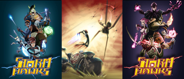
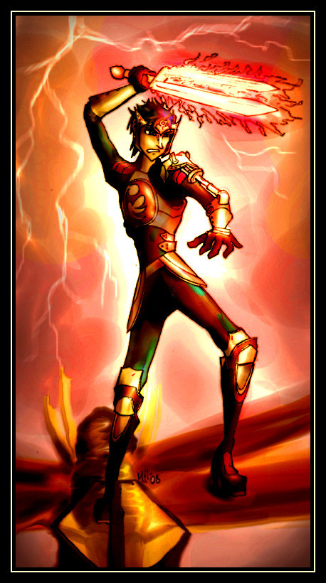
This is a ROUGH CONCEPT. This one was done before the high res poster i've posted previously, I jsut though it would be cool to post the old sketched version and concept for the other 2 posters. the expression on stork is old thats why it doesn't look as good as the big one. Lots of people have been complaining about the expressions and not high res enough on these roughs.Related content


Comments: 77


LOL, Stork looks like he could be a fitting cantidate for "The Scream".
Seriously, though, that is pure awesome right there. The Bad Guy version of the poster is simply amazing and goes well with the Good Guy version, and the epic painting-type image of Aerrow locked in a duel in the center just adds to the coolness.
 (Smile)")
👍: 0 ⏩: 0

Great work!
I really like how the layout of the villains match
the poses of the good guys so closely


👍: 0 ⏩: 0

Absolutely wonderful! X3 Can't wait to see more. Must 
👍: 0 ⏩: 0


cool poser :3 looks great, nice work ^^ first part of the poster, love storks expressions makes me laugh and very well done with all of the characters ^_^. the middle picture of the poster is very well done as well great use of color and effects~ and the last part of the poster is very sinister and awesome :3 excellent work there.
👍: 0 ⏩: 0


I literally laughed out loud when I saw Stork and Radarr's expressions. XD
👍: 0 ⏩: 0


Wow! I love the way the villians poster came out. Very cool. and the middle poster is a very awesome action scene.
👍: 0 ⏩: 0


hehe its small cause its just a rough concept, its not even nicely drawn out.
👍: 0 ⏩: 0

 (Wink)")

whoa cool! I wish we could see them closer :/ I sorta like the first version of the good guy one, even though stork is more in character in this one XD Awesome work, i love it! post more when you can PLEASE!
👍: 0 ⏩: 0

These are amazing! I love the epic poses of the middle poster the coloring is also beautiful. The villian poster is also and awesome concept, I love how the dark ace looks.
👍: 0 ⏩: 0

Man, loving it. Stork's original expression is v. funny, but I can understand why you went with the other. And the middle poster is so dynamic, wowee *_*
👍: 0 ⏩: 0


Wow, these are so cool. I really like the dynamic positions of the skimmers in the middle one. I'd love to have something that cool on my wall. The compositions of the other poster designs are amazing as well! I really like how you position the characters. And you made Junko look so adorable, and still strong-looking at the same time. Awesome designs!
👍: 0 ⏩: 0

Sweet! I'd love to hang those on my wall!
Baddies rock!
👍: 0 ⏩: 0


That's awesome in a can there. ")
👍: 0 ⏩: 0

Scream! The Dark Ace looks awesome in that third one! : D I'd totally buy them, hah. I love the "bad guy" one. Actually, all of them are fabulous. especially the colors in the second. ♥
👍: 0 ⏩: 0
