HOME | DD
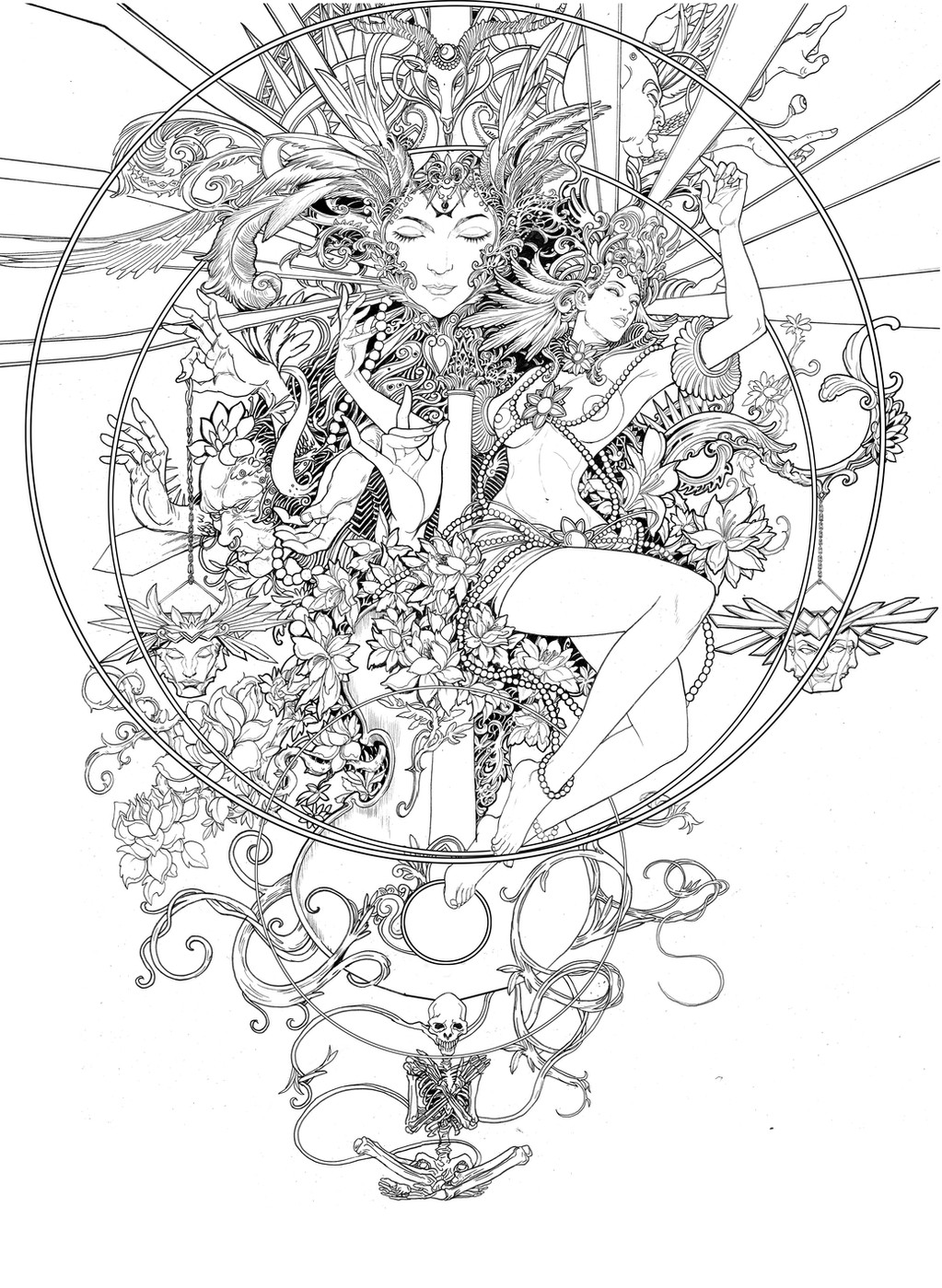
 Skylow — DM's Screen Cover

Published: 2005-06-04 20:51:23 +0000 UTC; Views: 2966; Favourites: 49; Downloads: 388
Redirect to original
Description
For a hungarian RPG game - M.A.G.U.S. d20 editionDungeon Master's Screen
unfortunately the publisher cancell this project
maybe i will make a color version just for myself
Related content


Comments: 18

Hát ez mekkora jó lett volna belső borítónak!!! Kár, hogy kimaradt....
👍: 0 ⏩: 0

man ,,, your stile is soo cool,,,very good work ...bless
👍: 0 ⏩: 0


Very cool. Reminds me of Mucha a little too. A little bolder though.
👍: 0 ⏩: 0


Nem látod a képen a logót...??  (Smile)")
👍: 0 ⏩: 1

Nemcsak, hogy látom, de néztem is nagyon sokáig
👍: 0 ⏩: 0

Gregory,
I spent a while going through your gallery, and I find your work refreshing and original! This image in particular really highlights your unique approach to illustration and design.
I love your linework! From your conceptual pieces to your characters, there is an intricate combination of graphic and shading elements.
The way you render hair is most excellent. Too bad the publisher cancelled this project. It is their loss...
I hereby dub "DM's Screen Cover" a favorite! Keep up the great work, and thanks for sharing your talent!
")
👍: 0 ⏩: 0

wow, shitty. youve been working on those for a long time too. What a waste; my sympathies go out to you. At least they are good portfolio peices. Personally, i think that your linear ink style would lose its charm if you added colour, but i might be wrong
👍: 0 ⏩: 0


You could do a very intricate stained glass peice with that as the template. TI's owuld be aweomes.
The lineart itself is still excellent on it's own though.
👍: 0 ⏩: 0

This is so beautiful.
If you do a colored version that would be lovely, though the simplicity of lineart is so magical on its own.
👍: 0 ⏩: 0

A color version ? Maybe. This BW version is already excellent (contrast, composition, style), anyway.
👍: 0 ⏩: 0