HOME | DD
 SkysTheLimitStudio — Don't Think They Understand
Published: 2007-12-16 00:35:49 +0000 UTC; Views: 1053; Favourites: 15; Downloads: 0
Redirect to original
Description
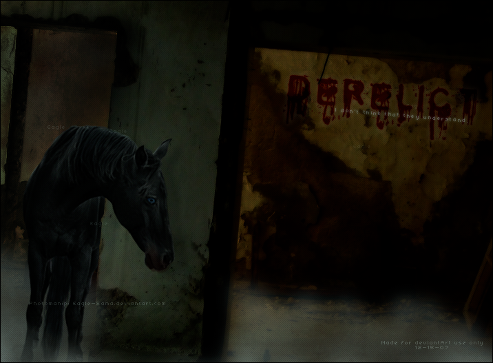
If you favorite, please comment!Click the picture or a demonic rabbit will hunt you down and eat your innards.
Quick request at Beyond Escape. I used 's wonderful tutorial on turning bays to blacks, and then I also removed a blaze, stockings, and of course drew in the eye. I thought the skewed perspective was kinda neat, and cropping the hooves out were on purpose. When it looks crappy, just delete! That's my motto! Buahaha.
I hope the text isn't too horribly hard to read. Sawwy if it is. Lighting is kinda screwy, but this /was/ made at 3AM with tired eyes and a swollen foot. I know, excuses excuses. -grins-
Ohoh, and I pulled an idiot move. Only after I was done I realized the background is for dA use only. Luckily the person was nice enough to be ok with using a clickable to lead back rather then make me pay for my retardedness and make her a new one.
Edit: Tweaked the angles a bit.
Credits:
Horse: (Check her out! She has incredible horse stock)
Background:
Texture: Unknown
This is for Snowfire of Run Like The Wind ONLY. And not for use off dA.
Related content


Comments: 21

I Favorited, I do love the text; asw well as the back ground but the stance of the horse is flawless
👍: 0 ⏩: 1

Thanks for the comment and favorite!
👍: 0 ⏩: 1
Yeah!
Thank you for sharing you art
👍: 0 ⏩: 0

I think I would have liked to see the horse's hooves. The image looks fine cropped as it is, but I think it would have more depth if you had included the hooves.
Ok, now that I have that out of the way, on to the parts of the image that I absolutely love.
I adore the bloody text! Is that a font or did you draw in the blood by hand? Fantastic job either way, the placement is just perfect!
I also really like the various angles in the background image. I'm a fan of weird angles and strange perspectives.
The eye looks extremely realistic. Blue eyes can sometimes be hard to pull off, but you did an excellent job here.
👍: 0 ⏩: 1
Aww, thanks Snowy! I would have liked to have left the hooves too, but I was at a lost to make them look grounded. Instead we had a magical floating horsey on our hands. x^D I suppose I should made my lazy butt get into gear and spent more time on it.
Thank you, thank you! Its a font that can be found on daFont called Cold Night For Alligators, but drawing it myself would have been a cool idea. In fact, I think I might try that in my next image. I'm so glad the placement worked out, I was worried it'd be to dark.
Thanks a ton for the compliments, it means a lot to me. I love drawing eyes, so happy I'm starting to get them down.
👍: 0 ⏩: 0


and the fog is a nice touch
thanks for using my stock
 (Smile)")
👍: 0 ⏩: 1
Thanks for the compliments!
Thank /you/ for providing it!
👍: 0 ⏩: 0

stunning. yet the horse's body looks a bit weird, like its butt got cut off :/
👍: 0 ⏩: 1
-giggles- She's standing kinda behind the wall. But I can see how it'd look odd. Thanks for the comment!
👍: 0 ⏩: 0

Wow... this is so awesome... I love the horse and the bloody? name on the wall.
👍: 0 ⏩: 1
Thank you very much! I'm glad you like the bloody name. I though it was a nice touch.
👍: 0 ⏩: 1

Wow! ")
👍: 0 ⏩: 1
Aw, thanks! I enjoyed working with your stock. You're welcome! And thank you so much for providing it!
👍: 0 ⏩: 1

ok so at first, before i clicked and made the image all pretty, i didn't think i'd like it... good thing i clicked! this is beautiful, once again his eyes just pop out! i love that about your graphics, a horses eye is window to their sould.. or something like that so i enjoy seeing their eyes so noticable! The only thing that looks funny is the wall is at an angle while the horse looks to be a little more straight? Anyways everything else is perfect, you have a talent with text!
👍: 0 ⏩: 1
I'm glad to hear the eyes make a difference! And thank you for taking a moment to click it. -grins-
Mm, I see what you're talking about. The funny thing is that the hooves matched up with the ground. But when I lean back it does looked off. Dayum it. x^D Actually, I think I can fix it with ease. I'll do that tonight.
👍: 0 ⏩: 1
yeah... gosh angling is a pain.. that's why i avoid it

👍: 0 ⏩: 1
Hehe, why yes, yes it is. I figured it was time to face the music.
So I tweaked it a bit. Does it look better? Too much? Not enough?
👍: 0 ⏩: 1
yep, much better, or i think so
👍: 0 ⏩: 0