HOME | DD
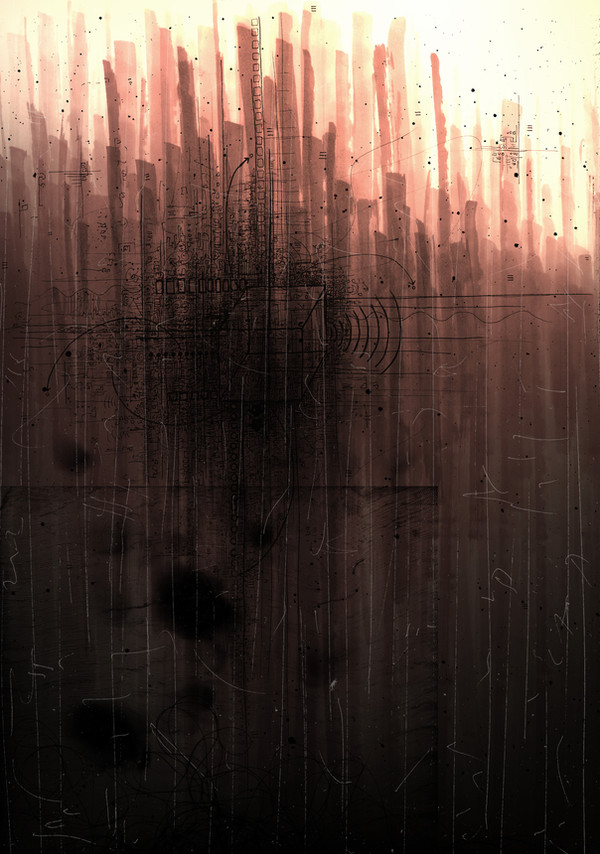
 sl33pyincognita — Depth Perception
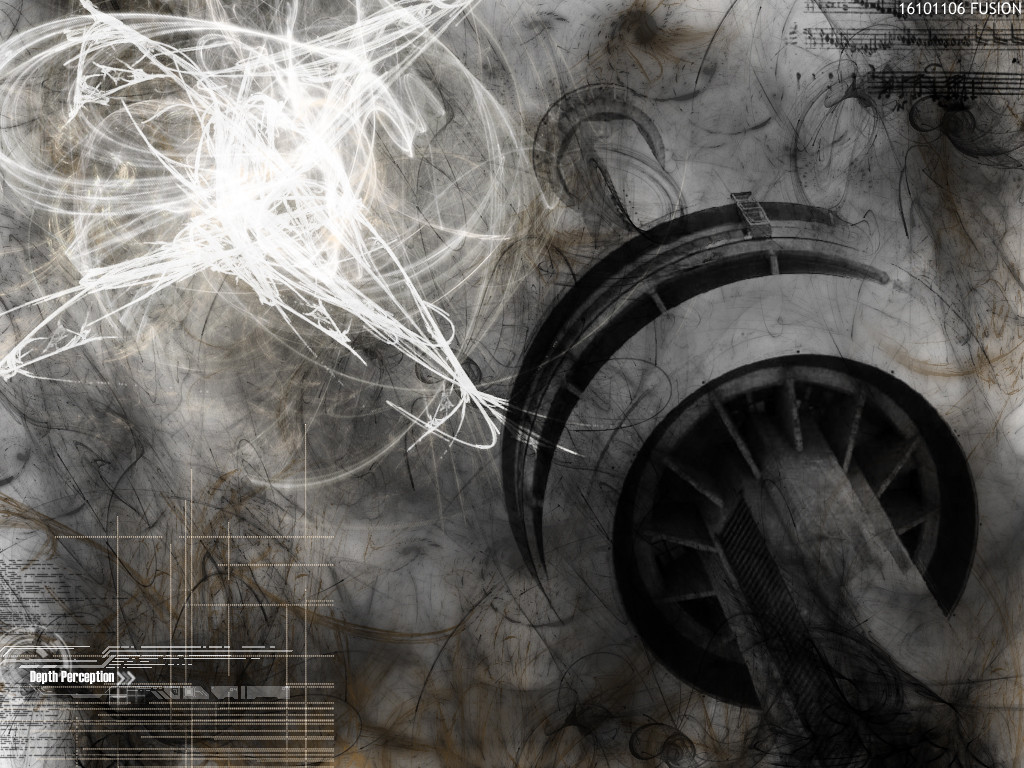
Published: 2006-11-07 08:13:44 +0000 UTC; Views: 2562; Favourites: 26; Downloads: 17
Redirect to original
Description
A depth perceptionLanguished in the night
All my life,I’ve been
Sewing the wounds
FULL VIEW PLEASE!
comments welcomed...
 (Smile)")
Related content


Comments: 79


Composition looks good. And there is definilly depth in the pic. Like the usage of grey tones and the brown is a nice touch.
👍: 0 ⏩: 0


")


Of the two pics you showed me I like this one the most, the neutral and earthy tones really make this abstract shine - if you know what I mean

👍: 0 ⏩: 1


looks quite sci-fi... or maybe im thinking too much about sci-fi hehe.
👍: 0 ⏩: 1

lol haha... i actually also thought it was kindof sci fi... although i tried to move away from sci fi ><
👍: 0 ⏩: 0

I enjoyed the textures-- are those musical notes in the upper right corner? If so, they add to the piece. So do the whips of lightning.
👍: 0 ⏩: 1


thankyou for the fav !
👍: 0 ⏩: 1

i like it, but the bright spot...it's kinda too bright and too big...at least for my tastes
👍: 0 ⏩: 1
ahah np ill keep an eye on those kinds of things in the future
thx for ya comment
👍: 0 ⏩: 0


I like this chaos too, yeah, but what the hell are these notes doing there?! ")

👍: 0 ⏩: 1
i thought it gave it an interesting perspective... but meh thx for comment
👍: 0 ⏩: 0


im sry but i just dont understand abstract pictures, i try to but i dont , i dont sea beauty like you do i see choas , and i cant help but feel coundfused as to what people see in them , and even though this isnt my expertize i would advice that next time you use a rely eye catching couler like blood red or someother coulor to catch the viewers eye
👍: 0 ⏩: 1
yea! thats wat i was thinking after looking at it... thankyou for confirming my thoughts!
👍: 0 ⏩: 0

i really like how the white and black kinda contradict themselves? all in all, very good picture <3
👍: 0 ⏩: 1

Sweeeeet abstraction. It makes me think of a tower... a lonely tower... *gets slapped* I need to stop analyzing things.
👍: 0 ⏩: 1
bahahaha... dont slap yourself embrace the abstraction and analyze as much as u like!
👍: 0 ⏩: 0


Very nice work. As i had mentioned to someone else earlier I'm not a big fan of abstract art but you do it rather well. Plus the conception behind it is really neat. Sending ideas off through art is always a good time.
👍: 0 ⏩: 1
thank you for your kind words
👍: 0 ⏩: 0


oooo this peice had me at the music staff.. i love how detailed the whole peice is over all, im gonna fave this
👍: 0 ⏩: 1
thank you... your far too kind!
👍: 0 ⏩: 0

Wow I really like this peice
Everything is nicely balanced with dark and light; I love the abstract qualities along with the photo.
As far as constructive critique; Its hard to critique something thats abstract. The best I can do is that text at the bottom. while I like the thin line designs around it, the bold font itself (impact) seems to clash with the pic a little bit. Also, its so bolded and yet small that its hard to read (at least for me.. but my vision sucks lol). I would make it more subtle and with thinner lines, but thats just me.
👍: 0 ⏩: 1
oo yes... i will definitely look out for the text in the future... however in this piece,, because the text was small the thinner text was less visible than impact,... i did originally have a much thinner text in mind
thx for the comment glad u liked it!
👍: 0 ⏩: 0

hm..u know what the pic reminded me of? this would make a perfect cover for one of Diorama's albums (in case u know this band u'll get the message, if not- well, anyway it's like this), it just hits the mood 200%!
I personally like it very much
👍: 0 ⏩: 1
haha Diorama is that german goth band right?
cool!
👍: 0 ⏩: 1
yep. rather darkwave)
👍: 0 ⏩: 0

I like all the little things in here for instance the music notes. It makes you have to look further into the picture. Great job and I hope you don't mind me asking but what did you do this on?
👍: 0 ⏩: 1
| Next =>