HOME | DD
 slayerD1 — Mega Flat UI Kit
by-nd
slayerD1 — Mega Flat UI Kit
by-nd
Published: 2013-07-17 23:52:02 +0000 UTC; Views: 20943; Favourites: 86; Downloads: 1459
Redirect to original
Description
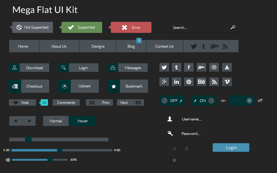
Same Mega UI Kit as before just this is a flat version. The flat version has a few small changes with the font, icons used as well as long shadows introduced in the social media icons and buttons.Any feedback would be highly appreciated concerning the look and feel and of the cause FREE PSD download over here
 (Smile)") enjoy.
enjoy.All
 's are highly appreciated
Related content


Comments: 9


Could anybody tell me, WHY flat interface is cool???!!! My brain studied 20+ years to recognize bulgy objects not to stare at flat rectangles and spending time to recognize active elements and their functions! So, may be professionals can give an answer?
👍: 0 ⏩: 2

Pretty much what endeppa said. Simplicity. It's more pleasing to look at as you will be more focused on the actual content instead of "how many effects can you possibly add to a button". Flat UI is more clean, some say it's boring to look at but I'd say that all the shiny 3D buttons are the one getting boring to look at after 10 years.
👍: 0 ⏩: 0

I'm no professional, but I think you can view the matter a little poetically. It's a reduction of complexity to its simplest and most meaningful/interactive forms. Much like in physics and art, seeings things through their context and meaning and seeing the most principle tools of the trade (subatomic particles; basic shapes, gradients, and colours).
Moreover, it's just very pleasing to the eyes.
👍: 0 ⏩: 0


the file is in PSD format , wich means that u can use any part of this file in its layered format in one of your other works , like IOS app design , or website template design , hope that i helped you ^^
👍: 0 ⏩: 0

Extremely nice, I don't get why this doesn't have more views - the only thing that could maybe be improved is the dark green of the hover-buttons and the slider, because you can almost not see it on the dark background - normally I'd suggest an outer glow around it, but that would probably not look good with this flat look.
👍: 0 ⏩: 0


Wow, you know how to spam. I'm so impressed. Of course I'm not being sarcastic.
👍: 0 ⏩: 0