HOME | DD
 slippyninja — Cobra Commander: Colors
by-nc-nd
slippyninja — Cobra Commander: Colors
by-nc-nd

Published: 2011-03-25 02:50:30 +0000 UTC; Views: 5757; Favourites: 84; Downloads: 205
Redirect to original
Description
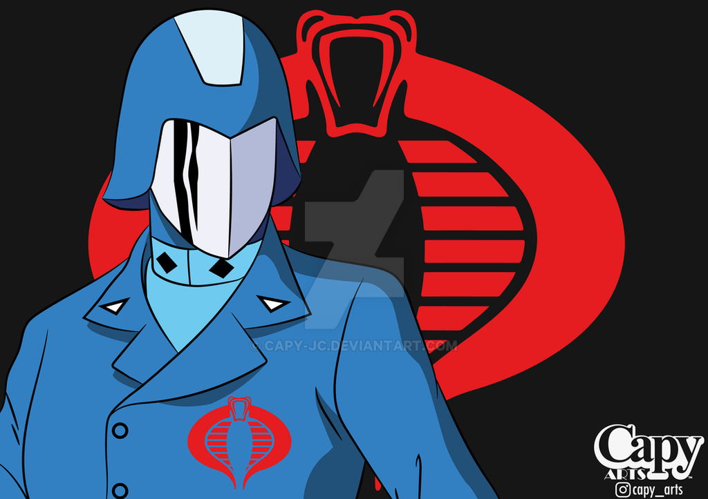
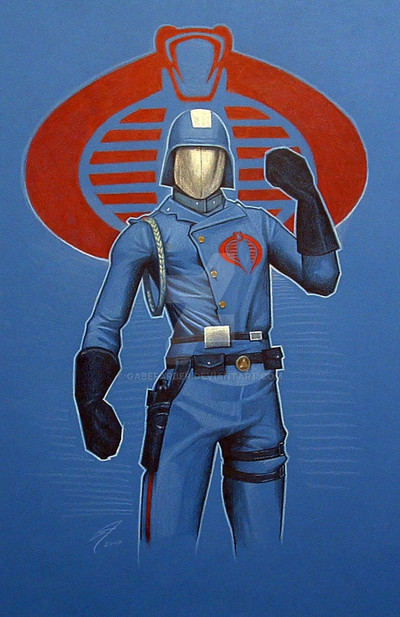
My submission for the weekly challenge over atCobra Commander recruiting.
Im sold.
peaces
EDIT: per critique from changed the font a little...still not happy with it but eh.
Related content


Comments: 31

I always sided with COBRA as they had better tech and cooler headquarters. They also wanted to remake the world. Why work 9 to 5 when you could sign up to conquer the world?!
👍: 2 ⏩: 0


Nice. I am ready to join Cobra. Gotta be better then Obama land.
👍: 0 ⏩: 1

i hear that...thanks for stopping by!
👍: 0 ⏩: 0

Good type, Good Pose, Good Colors....Flawless Victory on this illustration....
👍: 0 ⏩: 1


This is surely one of the most impressive depictions of me I have ever seen! Excellent work!
👍: 0 ⏩: 0

bro this is the bomb
I vote this for best piece of the bunch
perfectly done my friend
 (Wink)")
👍: 0 ⏩: 0
 (Smile)")

thanks man that means a lot.
👍: 0 ⏩: 0

Fantastic - the colors, shading, clothing, finger pointing pose - altogether an exceptional entry. Just beautifully crafted. This would have been killer even without the fonts/slogan - but think you did a cool job coming up with a great phrase on it.
Kinda has the hubris I'd expect from the character. Really gonna be a tough piece to beat out this week.
total pleasure to see this.
👍: 0 ⏩: 1

Awesome piece! Love the angle and lighting on the figure....the lettering seems type set to the left, which throws the composition off a bit....good luck to your opponent...he/she will need it!
👍: 0 ⏩: 1
thanks...and yeah i want the typography in there but i dont know how to make it fit.
👍: 0 ⏩: 1
Try center with the point size unified per line. It will round the composition to the figure....which is the height of awesomeness...hope that helps.
👍: 0 ⏩: 0

this one i vote for first place! nice angle, great colors and it's even a fun demotivational! A+!
👍: 0 ⏩: 1
thanks a ton for your support...and yeah i was looking for demotivational...i was orignially gonna put him in the aisle of a plane...really bad reference. but i like the demotivational better.
👍: 0 ⏩: 1
yeah, worked out great.
👍: 0 ⏩: 0
Good god! cobra commander is bringing out the best in people! This shit is mad cakes!
👍: 0 ⏩: 1

nice one, typography seems a little loose compared to the really solid drawing though.
👍: 0 ⏩: 1
i cant agree with you more...it was nearing the end and i am exhausted...maybe after another cup of coffee ill hit the letters again. Thanks for the feedback though.
👍: 0 ⏩: 0