HOME | DD
 Slushy-man — Demons and Wizards
Published: 2010-02-17 10:42:45 +0000 UTC; Views: 1019; Favourites: 12; Downloads: 13
Redirect to original
Description
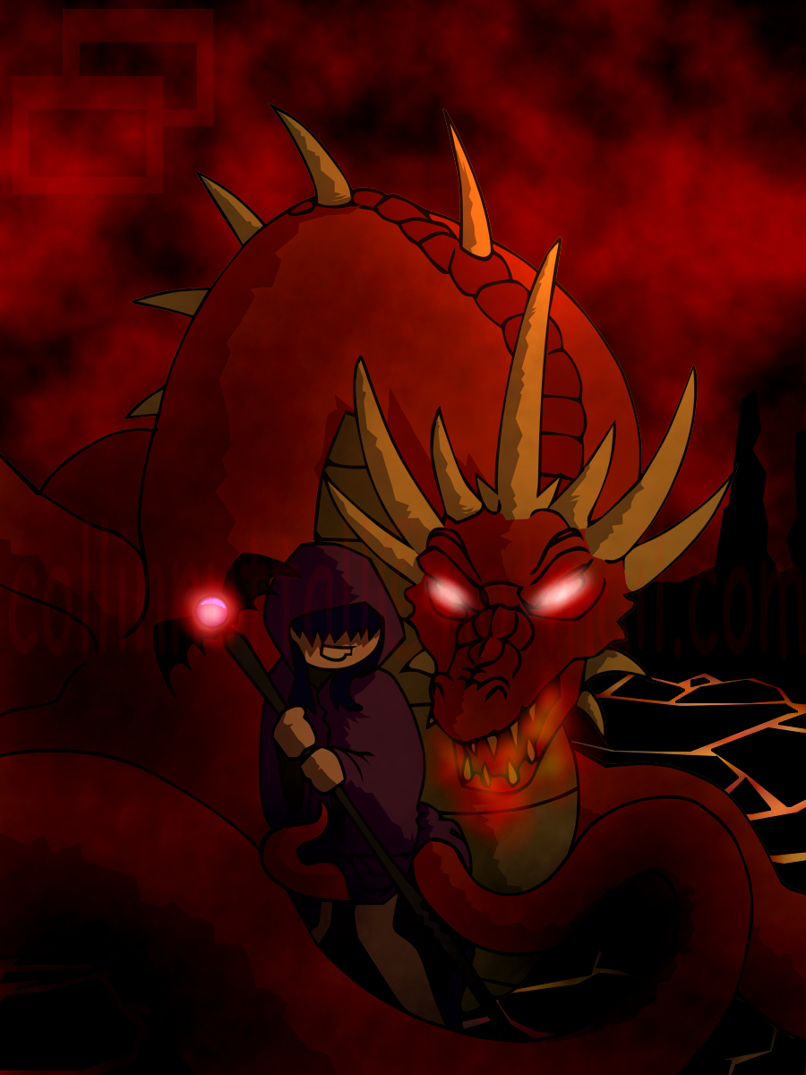
Bin listening to alot of Demons & Wizards recently.Fucking Kick ass band!
After listening to a few songs, I got a sudden urge to draw a Big, Bad ass, Red Dragon, getting a little frisky with Powerful lil Warlock! >3
I was a lil angry with the line art for this one, But vary pleased with the final colored product! <333
Dragon and Warlock © Mine
Related content


Comments: 17

That dragon is looking for some action^^
👍: 0 ⏩: 1

DA's telling me I need a premium membership to crit you. Well screw that says I! Overall we're looking at a fairly decent composition. Tehre are a few issues I'd like to point out though and one of them has already been adressed by you. Angry line-art is an issue. The dragon's neck is rather lumpy and ill-shaped. Also, the neck is far too wide at the base of the head. It makes poor Mr.Dragon look like he's choking on a pig or something.
The mage is pretty good, but the left (my right) arm is not very well defined. This makes the form from the shoulder down look sort've muddled. This can be fixed by adding some definition with shadows or adjusting the line-art. The lava cracks also bother me. Other then colour, they show no real sense of warmth. This wouldn't be an issue, but you spent some time to make the dragon's eyes and such glow. Darker colours have a tendancy to look farther away, and this creates an odd effect in the background since it appears that magma SHOULD be seeping through cracks in the rock, not flowing willy-nilly over the landscape.
Swivel has touched on my final points. Their is a lack of contrast in the composition so that the background clouds and the dragon do not stand apart from each other. I would like to add that the dragon also has a thin white line around him that sticks out rather noticibly. (ack, I think that's mispelt.)
That's my two cents. Nice work, and I hope to see some more.
👍: 0 ⏩: 1

Thank you for your Critique! ^w^
👍: 0 ⏩: 1

The only problem I have witht his picture is the lack of contrast; it's too dark. Perhaps it's just my monitor, but I had to strain my eyes a little to see some of the details. Okay, looking at it (now that my eyes adjusted) something about the lower jaw looks wrong, and the width of its neck uneven. There should be a curved line along its neck behind one of those horns on the left. I'm sorry if that doesn't make sense. However, the composition and shading is refreshingly simple, and the dragon is absolutely gorgeous (in context of your style).
👍: 0 ⏩: 1
Thank you for the Critique! ^w^
I don't get them often enough soz its refreshing! ^^
There is a curved line along its neck, its just behind the horn. I think I may have lost part of it when I was inking, thank you for pointing it out! x3;;
Bweeeh, I'm glad you like teh Dragon! ^w^
👍: 0 ⏩: 0


Thank youz Vary Muchy! ^.^

👍: 0 ⏩: 1
^.^
Hey look Mangos! 8D [link]
👍: 0 ⏩: 1

