HOME | DD
 SmarTramS — Guifx Website

Published: 2008-04-11 05:03:14 +0000 UTC; Views: 34556; Favourites: 246; Downloads: 1646
Redirect to original
Description
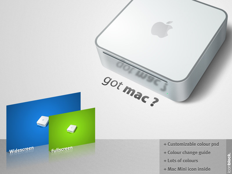
Website for a company I used to work for.Related content


Comments: 116

beautiful website i like it........... What software have made it..
👍: 0 ⏩: 0


Man you make a sick layout... i LOVE IT you should try and sell themes on theme-stock.net
👍: 0 ⏩: 0


So basely this company makes a Touchscreen design thing a prototype?
👍: 0 ⏩: 0

I wonder to what extent i can use files found on deviant art. Can someone educate me? Can i use this file in my designs?
The design is really wow.
👍: 0 ⏩: 0


")

 (Smile)")


W00T - awesome design! I absolutely LOVE the cleanness (word? ")
👍: 0 ⏩: 1


Looking at this image, I think, in my opinion, to preserve the sleek look, that you should add more room between the gradient-filled box and the ad-type boxes below. The two "rows" of them sort of glue together. The extra space at the bottom, above the darker box, is too wide, in comparison to the one below the gradient-filled box.
Also, you could resize the gradient-filled box so it's a little bit larger, and the touch screen doesn't bleed out as much, because its shadow is kind of colliding with the "Store" text, on the far-right ad-type box.
Next, viewing the actual site, I would also suggest that you try to hide the dark links-type box beneath "the fold", so it's not dominating the page. I'm viewing this site on a HUGE monitor, because I really appreciate large pictures of art as they appear in online galleries. Or, if this practice would seem a little hard to do, you can always make the links-type box to a fixed size, fitted at the bottom of the page. That way, you'll leave more room for content, instead of blank space.
Just a few ideas...
👍: 0 ⏩: 0


B-E-A-UTIFUL!!! Nice use of colour, contrast and lighting effects. And I loooove the simplicity. Awesome job.
👍: 0 ⏩: 1


I thank you for the nice comment
👍: 0 ⏩: 0

Jaw dropping. This is skills on toast.
Well Done!
👍: 0 ⏩: 1
Hey man thanks so much, means a lot
👍: 0 ⏩: 0

| Next =>