HOME | DD
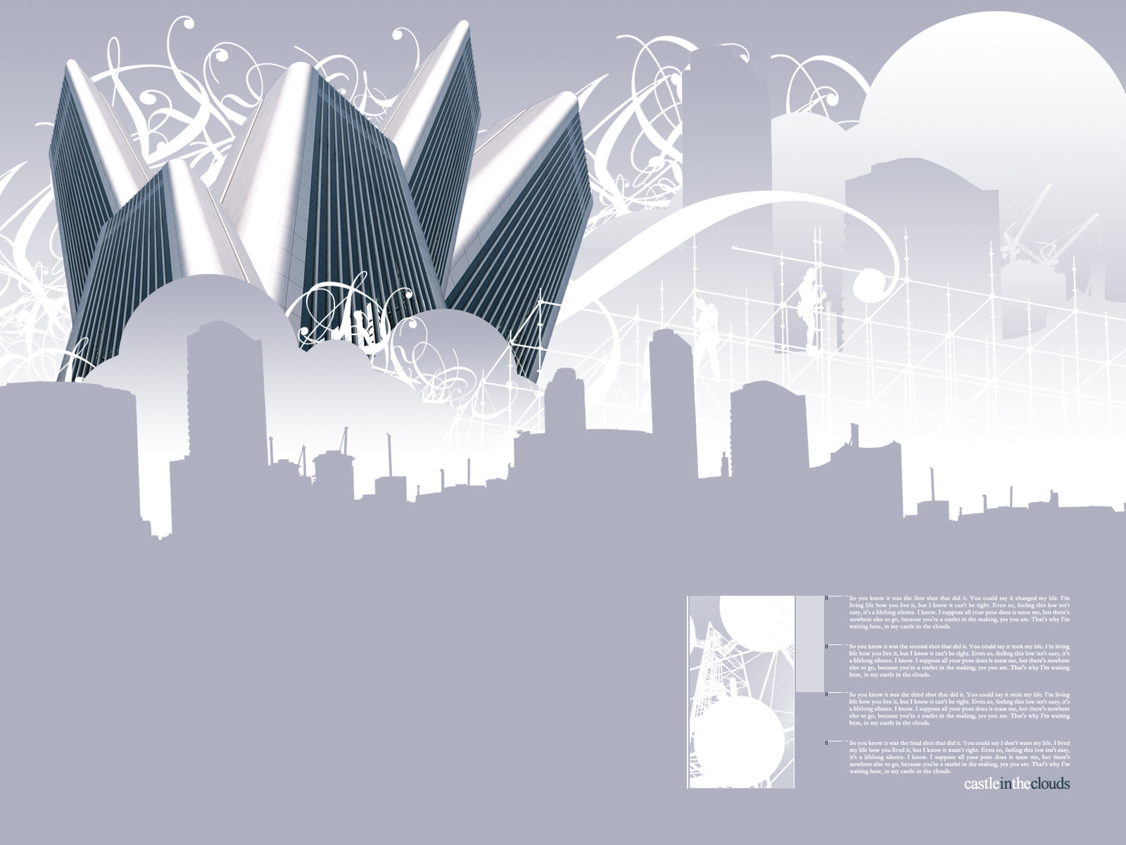
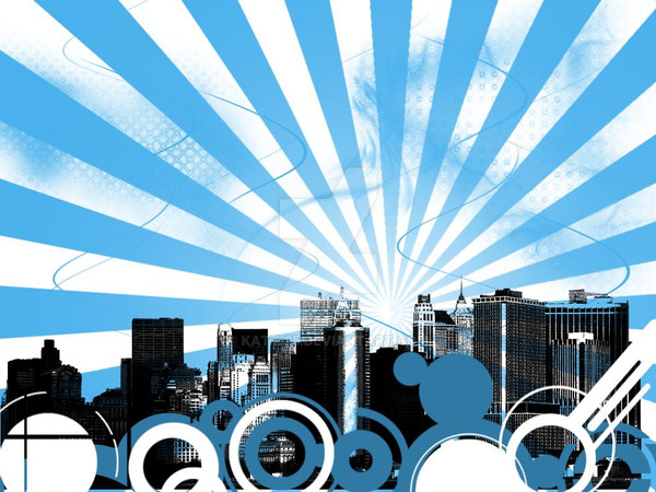
 smashmethod — Castle In The Clouds
Published: 2004-07-10 05:07:16 +0000 UTC; Views: 11472; Favourites: 84; Downloads: 6840
Redirect to original
Description
For tips and techniques on how to make digital art like this, check out my YouTube channel.YouTube: www.youtube.com/user/fictional…
Facebook: www.facebook.com/fictionalhead
Twitter: www.twitter.com/fictionalhead
Google+: plus.google.com/+fictionalhead
Portfolio: www.fictionalhead.com
Related content


Comments: 67


Well, good graphics in there, very good work... and fits perfect with XP Silver theme.
👍: 0 ⏩: 0

I love a lot of your work, it looks hot. Thanks 4 being my friend to. May I ask what are some of the differnt programs you use with some of your work?
👍: 0 ⏩: 0
I live a lot of your work, it looks cool. Thanks 4 being my friend to. May I ask what are some of the differnt programs you use with some of your work?
👍: 0 ⏩: 0

LMAO. I love how you note "color variation isn't this ones strong point". Nice. I like it a lot, its very...partyish I think is the word. I love the renderings they are sweet, and the 2d/3d is sweet, and nice cityscape. Really well done
Def a 

 (Smile)")
👍: 0 ⏩: 0

Well done !!! It's one of the the few finest wallpapers on this site. I like your work !
👍: 0 ⏩: 0

Very nice composition.
I really like the 'calm' silhouettes of the buildings against the 'busy' sky.
In 'real life™' it's usually the other way around.
👍: 0 ⏩: 0

Wow, this is an amazing design, I love the lack of colors, makes it very modern and stylish! I can't help but wonder how you find time to create so many designs in such a short period of time! Wow!
👍: 0 ⏩: 0

lol.... looks like sanyo air condition on first impressions. but then again.... cheerios.
👍: 0 ⏩: 0


Damn, this is awesome! Great work! what have you used to make it?
👍: 0 ⏩: 0


I wonder how you can continuously produce awesome stuff like this... great work!

👍: 0 ⏩: 0

I love the designs simplicity, I mean, the majority is vector, then the rest is mind blowing effects. Very creative, the vector(foreground, background) is quite detailed and the skyscrapers are quite impressive.
👍: 0 ⏩: 0

creative but the lower part could add in a little something ?
👍: 0 ⏩: 0

")

This is a really cool wallpaper and I plan to use it on my computer. Thanks for submitting.
👍: 0 ⏩: 0

Nifty. When I first saw it, I thought the city might have been good ole Grand Rapids. But then I looked harder. Cool stuff as always though.
I also like the paragraph in the lower left, did you write that?
👍: 0 ⏩: 0

Very wonderfully done. I like how you merge 3d with 2d. Everything appears graceful. This is now my wallpaper.
👍: 0 ⏩: 0


nice idea but as you said it could need some more colourvariations. Furthermore the lower part is too empty for my taste
 (Wink)")
👍: 0 ⏩: 0

i LOVE this but is it really abstract? i think this is a wonderul collage with a silver cool theme... a very graphic design/arts feel to it. I'm curious.... what says "abstract"?
👍: 0 ⏩: 0


Almost looks like the 3D structures are going to take over the humble 2D...Run!! Run quickly little Vector RUN!!!

👍: 0 ⏩: 0


In my opinion, this is your first great piece in a while.
Lately, you've been putting out 2 or 3 pieces a day and each just resembles the one before it. To me, your work lost all meaning, because you were just churning it out.
This is different from what you've been doing recently, so I felt I should comment, and also
Just don't rush to put out more deviations.
👍: 0 ⏩: 1

Like everything that came before it, and everything that will come after it, this piece has no meaning to begin with. Different from what I've been doing? Yes. The same as all the other pointless-crap everyone else is doing? Yes.
Not to mention this took less time to do than anythig else too... maybe I should "churn out" more of these stupid things.
👍: 0 ⏩: 1
I hope you didn't take my comment as an insult.
I'm just saying that I've been seeing so much of your work that it's lost its "special edge", I guess. I would space out my deviations more, that's all.
👍: 0 ⏩: 1
I didn't, I don't get insulted. I just find it humorous that thought it had a "special-edge" to begin with. It's all just products of boredom dinking around on the computer, 99% of it isn't even art, it's just digital fodder.
They're getting submitted because they're getting made, not the other way around.
👍: 0 ⏩: 2

this is some nice digital fodder regardless of how or why you came to it. Nice work on the blue tones too.
👍: 0 ⏩: 0
I see...
You have a lot of free time, don't you, mate?
👍: 0 ⏩: 0

i really like the color variations
its gives a smooth ambient feel onto it...the stocks are looking great too
weird yet effective
nice one
👍: 0 ⏩: 0

Great work! Simple yet clean, good work! I love these pictures, simple, clean and fun.
👍: 0 ⏩: 0

I enjoy this style very much. Those rendered buildings combined with the "vector" work makes it look sexy. Really nice!
👍: 0 ⏩: 1
I'm not sure what you meant by "rendered," but the buildings are from a stock photo off of sxc somewhere.
👍: 0 ⏩: 1
Really? I thought you had rendered them!
👍: 0 ⏩: 0

I'll say "yes, they can," even though there isn't a single one in this image.
👍: 0 ⏩: 3

Except for those that came with the typographic elements, I take.
👍: 0 ⏩: 2
If you're trying to push the whole "text is actually vector" in photoshop, before you finalize the piece, that actually wouldn't be the case in this piece either, as the text was rasterised at a massive size, and scaled down to get smoother anti-aliasing.
👍: 0 ⏩: 0
| Next =>