HOME | DD
 smellkid — Sabon Spring
Published: 2006-03-08 01:18:07 +0000 UTC; Views: 3872; Favourites: 20; Downloads: 422
Redirect to original
Description
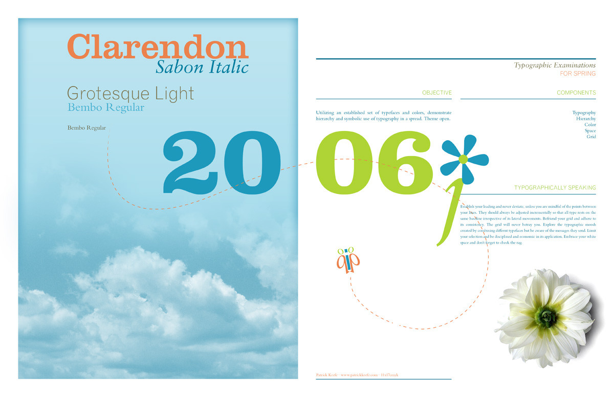
Typographic Experimentations for SpringI'm such a typophile. No matter where I am, I recognize a typeface before I read the words. Is that sad?
Anyway, I've been experimenting with different typeface combinations lately and decided to make a little 11x17 spread dedicated to my flavor of the week: Clarendon Roman, Sabon Italic, Grotesque Light, Bembo Regular.
Can I just say that Bembo is fucking gorgeous? I know it's wrong to couple Bembo with Sabon but if their point size is so drastically different, I think it's acceptable. Sabon just has such an elegant italic font and it looks great next to Clarendon. But yeah, Clarendon for headers, Grotesque Light for Subheaders, Sabon Italic for special applications, and Bembo for body copy. That's a winner right there, boy.
EDIT: I just realized how poorly kearned this whole thing is. Sorry about that. It was made quickly! *damnit*
Related content


Comments: 23

I have a question, if I may.? where did you get the font Bembo..I really need it for a school project,I can't find it anywhere...I you have it, could you maybe note me, to send it or something..?? or could you show me where you can get a download for free..?
👍: 0 ⏩: 1

Do you know how much time and effort went into designing Bembo? You can't get it anywhere for free. Too many people believe that typefaces just pop up out of nowhere. The amount of technical skill and time it takes to produce tremendous typefaces like that is staggering. If you're a design student, I hope you take the time to learn about type design and recognize that typefaces shouldn't be taken for granted.
👍: 0 ⏩: 1
As a matter of fact I am a (graphical) design student..and do you think that with my paycheck as a 18 year old, I can afford something that costs 300 dollars, just so I can use it for a school project,personally I think that's a little bit over the top.If it was a real assigment for a real custumor it would be different, and then a again if I would have real customers I would make more money, and be more then able to buy it. And that is what I will do, when I, hopefully, become a good graphical designer.
And yes I know how much time and effort goes into a typeface as Bembo,I did a whole research on it..
No problems though, I was crazy enough to think that my school would all let us buy the font, turns out they had all fonts on the school pc's, for us to install on our own pc's..
So sorry to bother you, but mainly, I was just trying to get it for free, because it was for school..OMG what a crime.
Other people I asked had no problem with all of this though...
👍: 0 ⏩: 1
It actually IS a crime to steal typefaces. And your school is violating the copyright of the typeface unless they are paying for a license for every student's computer.
Furthermore, it doesn't matter if other people don't have a problem with it. I bet they'd have a problem with it if someone was stealing their work and not paying them.
I bet you would too.
👍: 0 ⏩: 1
As a mather of fact..they did pay for the typefaces..And they have probeply been approved to have a project with all these typefaces, would they, as a graphic design school, do it if it were to say illegal..I think not.
👍: 0 ⏩: 1
You'd be surprised...I know of at least one school in my area that doesn't pay for a license for every student to use the typefaces. And just because the school paid for a set of typefaces doesn't mean that they have the right to put them on as many computers as they want. They'd need to buy a bulk license.
These are things you'll hopefully learn as you go through design school. As a junior designer it will be your responsibility to do ethical and legal work for your employer. Doing less could get you fired.
Good luck in school. Keep an open mind.
👍: 0 ⏩: 1
Things are different in America...
There is only one graphical design school here in the Netherlands, could it be that hard to accept that we, as the only school around here that uses these projects about typefaces, actually are being legal.
Besides they are not on every computer,I'm sure.
Perhaps we have done something that isn't right or something in that direction, even then it is not my fault, who am I,to tell an entire school, that what they are doing is wrong.
If you have issues with this..please..from now on take it on the school...
[link]
Thanks.
👍: 0 ⏩: 1
Hey, I'm just saying that you should keep an open mind. Don't just take everything at face value and assume that you are complicit in something ethical because other people are doing it too. I am not saying your school is necessarily breaking the law; I am just encouraging you as a young designer to respect and consider the rights of type designers. Most people don't. I just hope that you will as you continue to develop as a young designer.
👍: 0 ⏩: 1
Don't worry..I already had a good lesson about the licences, and rights of type designer..
So..I'll see what happens later on.
👍: 0 ⏩: 0

I don’t think it’s sad to be a typophile.  (Smile)")
Very nice design. I like the simplistic feel and overall design of it. You chose a good combination of typefaces that all work well together and also add a bit of contrast and interest to the piece. Too, the flow of the page is set up very well and I like the dotted line and how it guides your eye through the piece and unifies both pages with each other. Also you have some very good balance with your weight distribution in the elements themselves and as a whole for the entire piece. Great job!

👍: 0 ⏩: 0

this it really nice. I like the colors and the form... and great layout too!
👍: 0 ⏩: 0

Ahh there you are!! Long time no see my friend. And you're STILL putting out some good stuff....right on!
👍: 0 ⏩: 1
There YOU are. How's it been going? Still sexy?
👍: 0 ⏩: 0

Wow! Bembo struck me... Wonderful! I love the Capital R. And Grotesque - what a clean typeface! I didn't know that one.
PS: Do you know Gentium ? I love that one... Very nice italics.
👍: 0 ⏩: 2
Ooooh, now that is a lovely little italic. I had never seen that one before. Thanks for the heads up. And yes, Grotesque is quite nice. It's a nice departure from Helvetica Neue, which of course is brilliant but can't be used for everything.
👍: 0 ⏩: 1
Gentium rocks! For free. And the license even permits changing it...
Helvetica Neue brilliant...? Personally, I don't like it. Of course, it's a big family - but when I look at it, makes me shiver. But the Grotesque - I love the ampersand (speaking of which - some & glyph variations in Poetica make me faint
PS: Another shot - Antykwa Półtawskiego , font in Public Domain. At 11pt good for longer publications - I used it for ~100 pages (my masters thesis), and it worked fine. Lovely 'g' glyph.
PS: I'm not a typo expert, I just like nice typefaces. If I say stupid things - correct me: I'd like to know more...
")
👍: 0 ⏩: 1
I really appreciate your typo input, rehael. It's nice to converse with someone else who appreciates type like I do. The reason I call Helvetica Neue brilliant is because of the circumstances in which it was created.
I'm definitely going to check out those two typefaces you mentioned more closely. Thanks again!
👍: 0 ⏩: 2
Well, if You like the history of type, You should like that: How the font Antykwa Półtawskiego was created [PDF, english] , and Renaissance of type design in Central European countries [in english] by Adam Twardoch.
👍: 0 ⏩: 0
Well, if You like the history of type, You should like that: How the font Antykwa Półtawskiego was created [PDF, english] , and Renaissance of type design in Central European countries [in english] by Adam Twardoch.
👍: 0 ⏩: 1
I'll give those a go. Thanks, man. Much appreciated.
👍: 0 ⏩: 0
Grr... Proper link: Gentium . Sorry.
👍: 0 ⏩: 0

bembo is very gorgeous (well, what i see of it anyway  (Wink)")

👍: 0 ⏩: 1
Bembo is a lovely one. Thanks, Shelly.

👍: 0 ⏩: 0