HOME | DD
 SN37 — Windows 10 File Explorer Concept

#ui #technicalpreview #concept #microsoft #win10 #windows10 #uiconcept
Published: 2015-02-22 17:03:05 +0000 UTC; Views: 1337; Favourites: 1; Downloads: 0
Redirect to original
Description
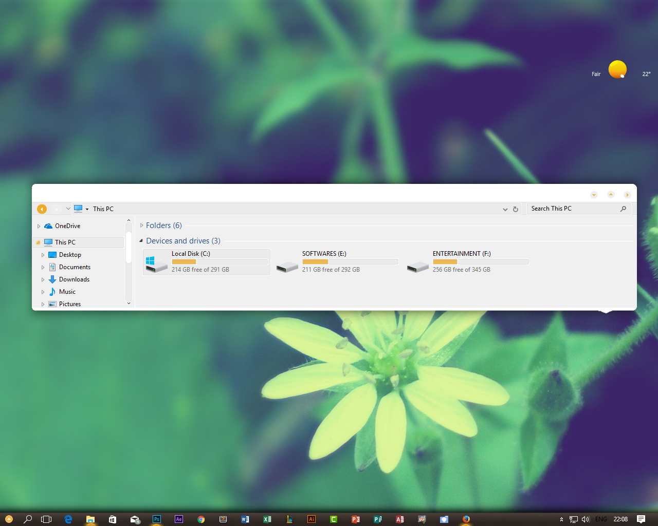
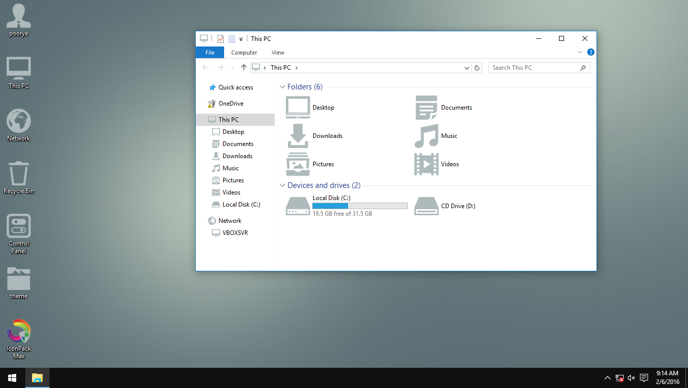
Since I've tried Windows 10 Technical Preview, I found out their Explorer a little bit weirder, like the min-max-exit buttons are quite bigger (like it was used for people with vision problems) and the text among with the ribbon interface a little too confusing than the ones used in Windows 7. I kinda like how Windows 10 is heading a little bit. The reason why I created this, this is what users really want about the concept so far: No big-ass min-max-exit icons, white on black texts, and enhanced icons.I don't really doubt this concept would exist in the final release, so let's see how Windows 10 is heading into.
Related content


Comments: 2

no it is not bad bro why are you mad?
👍: 0 ⏩: 1

invisible taskbar not good! i'm hate this idea
👍: 0 ⏩: 0