HOME | DD
 Snapester — Zero Logo
Published: 2007-09-03 19:45:12 +0000 UTC; Views: 729; Favourites: 3; Downloads: 9
Redirect to original
Description
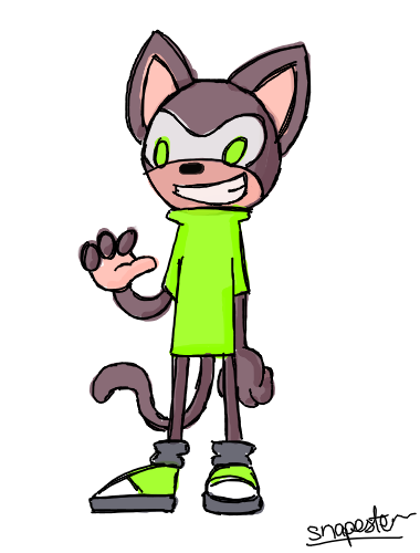
Some Zero designs I did on Illustrator.Related content


Comments: 9

digging the b/w one also like the red. Is there a reason the r's are a different color?
👍: 0 ⏩: 1

I just thought it would look cool with different colour R's
👍: 0 ⏩: 1


 (Smile)")

")