HOME | DD
 SnoByrd — Azure
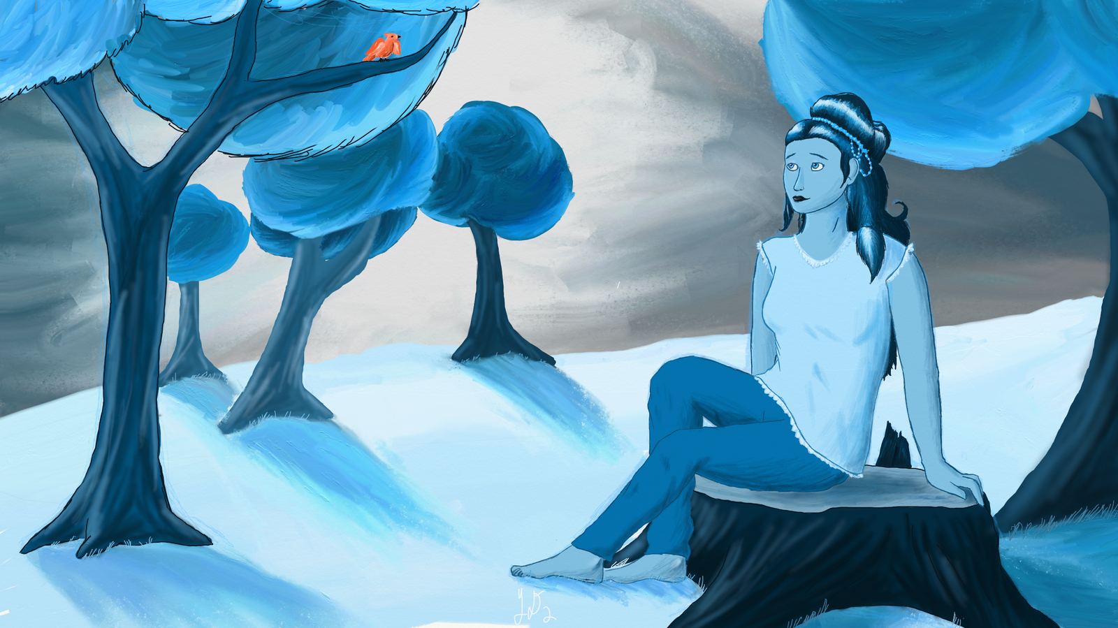
#blue #oc #originalcharacter
Published: 2018-02-12 01:18:11 +0000 UTC; Views: 212; Favourites: 16; Downloads: 0
Redirect to original
Description
I decided to try something new so I drew this using only two colors; blue and orange. I really love how it turned out, especially her hair.Related content


Comments: 17

I really enjoy your use of color here. It's warm and cold at the same time. How did you do that? Haha.
👍: 0 ⏩: 0

I´m from
I feel relaxed when I see that image.
And it's serious: The multiple shades of blue and white to gray, the chosen perspective, in how it feels balanced but not heavy at the same time the image, the character that has a magnificent design and blends naturally with the scene, in addition to that little orange bird that adorns the moment, the shadows that make it seem more like a photo than a drawing ...
What else can I tell you? This drawing is incredible and maybe ... Maybe it's a bit oversaturated, but equally approves. I loved what you did.
The Ice King approves
👍: 0 ⏩: 1

Thank you for the comment. I can see how it looks over saturated in spots but I think I may have left the piece too empty. I'm glad you loved it.
👍: 0 ⏩: 0

Ay, ProjectComment member, at your service!
Let's get down to business. This is a pretty cool painting, and I like the concept. The atmosphere is nice and I really love blue/orange contrast schemes.
But as always, there's room for improvement.
Starting with composition. When composing a scene, there are a couple of guidelines you can use to make things visually more balanced and appealing. for instance, aligning the points of interest along the Rule of Thirds line. You don't always have to do this for a good composition, but it's often a good start and it works well. So I would move your bird down a bit, so it isn't so close to the edge of the image, and I'd position your character so her head fits in the lower right area.
Another useful composition trick is to take any repeating lines and have them point toward the objects of interest. For instance you could change the lighting so that the tree shadows point more towards her head than her feet. Unless her feet are the focal point of the image, but I doubt that.
One last change I would make is to make the bird more visible. It's clearly a key point of the image, so you could either make it larger and more detailed, or have it give off an orange glow onto it's surroundings.
Next up is perspective. It's not terribly bad here, but there are still some little things. Mainly, I think the application of aerial perspective would help - the farther away something is, the brighter and less saturated it gets. If you're just going for a scene that looks exactly like this, for the t part it's fine, but I think the piece would benefit from a bit more interesting perspective. You could add another hill further away with more densely packed trees, or take the trees in the background and move them further back to show the area is mainly empty, depending on what you're going for.
Lastly, the objects in the scenes themselves need a fair amount of work. Your anatomy, while not terrible, isn't top notch either. It makes it really obvious that it's a painting, and that kinda pulls me out of the experience of viewing it. The bark of your trees and the leaves themselves also don't really look like bark and trees. It's fine to try and go for a cartoony approach to trees, but if you do it would be better to apply the same style to the character. Same goes for the bird - in general it would be a good idea to practice some real life drawing. But hey, that's advice nearly every artist needs, ha. I'm not perfect either.
Overall though I really dig the idea behind this piece, and it's executed fairly well. If you want, I can try to do a paintover and try to show you what I mean. Only if you want though, it's totally up to you.
👍: 0 ⏩: 1
Thanks for the critique. I appreciate the time and the offer for a paint over, but I don't want to bother you. I see what you mean with the background and others have told me the same. I was going for a more empty scene but I agree with your suggestions for improving that and the composition could use work too.
👍: 0 ⏩: 0

I liked the monochromatic aspect of it, I just think that you could have added some darker shades
👍: 0 ⏩: 0

Hello, I am from Project Comment!
I really like how you used two colors as ranges for the artwork, pretty hard to pull one something off(I have tried it before).
so for the comment:
The character is perfect! no anatomy problems for me, it is good as it is. The main thing I would concern here is the background, which can be improved
First is the trees, branches should connect with the leaves, which should make thesebranches connect with them. The close tree on the left has that clump of leaves in which there was no branch to uphold it, so I am seeing it as floating. Also note that trees have rings in their trunks that signifies age, that should also be evident in the character's stump.
Second is the distance shadings, its sometimes confusing if the further objects doesnt have lower saturations than the others. Objects tend to lose saturation as they go far.
And third is the lines of the trees, I noticed that the left tree also has linings that the others didnt have. I would suggest making each tree consistent, you can easily remove those lines after working, so the details are not distracted by the lines.
Overall, great character pose and anatomy. The focus of improvement here is only the background, hone that and you can make incredible sceneries!
👍: 0 ⏩: 1
Thanks for the critique. I agree with what you've said, though I did put rings in the tree stump. I guess I could've made them more clear though. The background can definitely use more attention. That's probably one of the biggest places I need to practice in my work.
👍: 0 ⏩: 0

She looks very serene, and that's a hard emotion to capture in my opinion! I love all the blue and the orange stands out nicely! Great work!
👍: 0 ⏩: 0


I really like the orange bird in all the blue ")
👍: 0 ⏩: 1
Thanks! I was wondering if anyone would pick up on the message. Her expression was kind of hard to fix with the tone so I'm happy that it worked out well.
👍: 0 ⏩: 1
Yes I could definitely tell ")
👍: 0 ⏩: 0
