HOME | DD
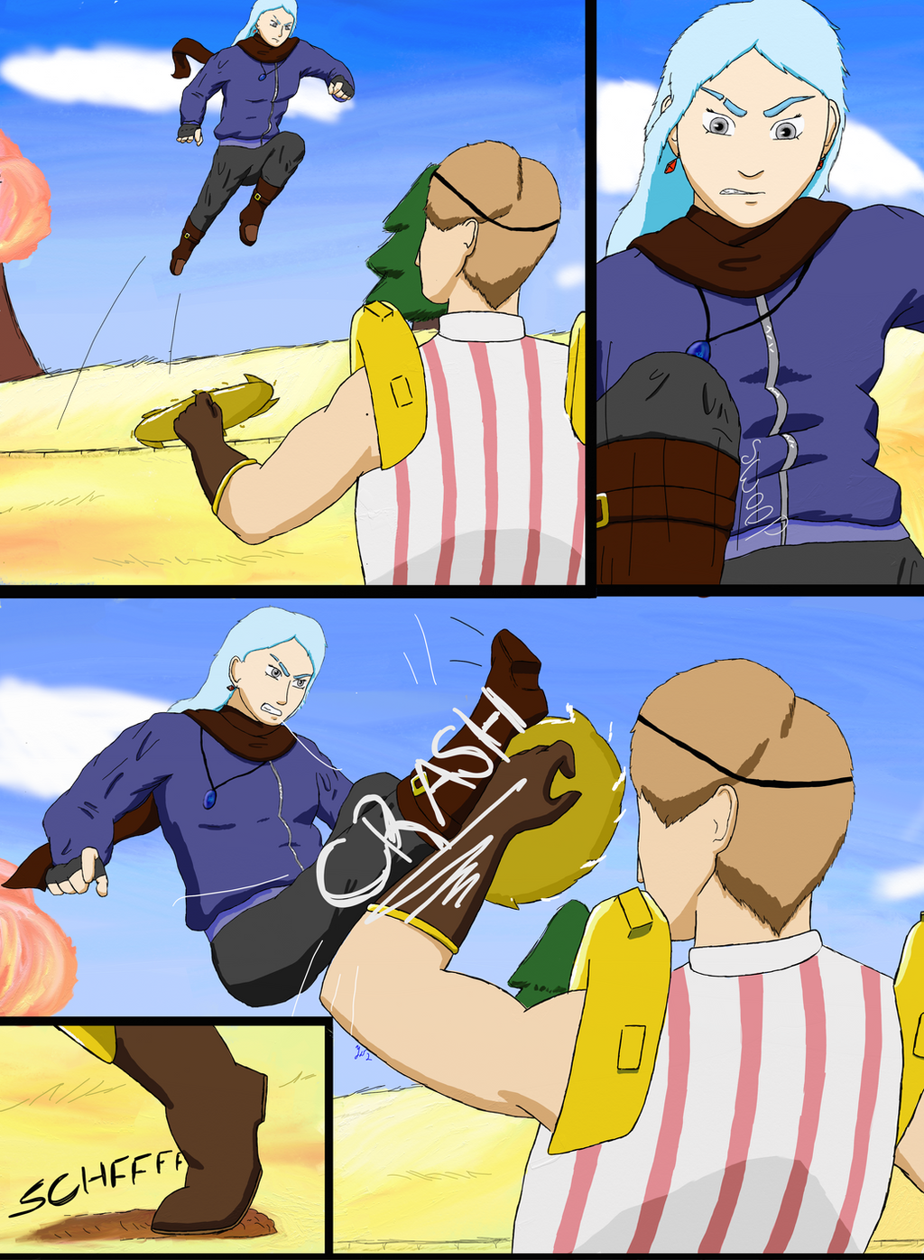
 SnoByrd — Oath to Three pilot 5

#oc #comic #comicstrip #originalcharacter
Published: 2018-04-08 17:51:48 +0000 UTC; Views: 707; Favourites: 4; Downloads: 0
Redirect to original
Description
Yo, it's been forever since I had the time to work on this. School had to come first. I tried a few style changes in this page so let me know how it turned out.Next: www.deviantart.com/yodawgyouta…
Last: yodawgyoutalkin2me.deviantart.…
First: yodawgyoutalkin2me.deviantart.…
Related content


Comments: 2

From
It's a decent image, for what it is, but there are quite a few things that can be improved upon. First and foremost is anatomy. Hands and feet ought to look a little bigger and wider. Feel free to exaggerate a little bit. In your drawings, you seem to have made them a bit smaller than they really ought to be. In addition, their bodies also look a little wider. It doesn't really match the size of the head. Heads themselves can also be a bit bigger. Not balloon head big, but big enough to make it a bit of the central point. Faces are among the first thing that people would be drawn to in characters. The bodies here are a bit too wide that your eyes would be more drawn over to those parts.
Next are the folds on the clothes. There is an unnecessarily excessive amount. It is not uncommon to find them around the elbows and ankles, since that's where they bend. However, when you put them all over the arms, it gives the impression that the clothes are too big or too long, and need to be compressed to make them fit on the body.
Third, is the posture and movement. For this, I'd suggest studying poses, as animation is basically a number of poses one after the other. However, since you are doing a comic, you ought to choose the more exciting poses. They all look as if they're in the middle of a process, rather than an action taking place.
Lastly, I would also suggest not to often show the entire body in a panel. Those ought to be reserved for something big or really showy. There's too much space and background on each panel, that the reader would have to take in more information than they ought to.
You've got the idea down, and you've got what it takes, but there are quite a bit to improve on. Keep on working and you'll get there!
👍: 0 ⏩: 0

From project comment.
Okay, this needs a little work. First the shading, it's okay. It gives shadows in proper places, but I think that it could be used more.
The anatomy is okay in most part, but the torsos are too long. Also in the 2nd frame, the perspective is way off the legs look way too small.
And the characters are really stiff and the punch doesn't have look to have any impact, I don't know how to tell you to fix that but there are tutorials online to help you fix that.
The lines are also decent but if you're going to do that the background also needs lines to keep consistent.
I actually like the charter designs, they are simple and that's important in a comic to keep charter designs simple. And the color schemes are also great for the charters but needs some work in the background. The sky and the trees are too bright and you should desaturate it.
Just a nitpick here but I think that you should place a black border around the frame.
With the framing looking at your other comics I think that you could do something more interesting with the frames. Look at other comics and see what they do right and try to emulate that in your own work. Because right now just having regular black boxes is kinda boring.
Have a nice day.
👍: 0 ⏩: 0