HOME | DD

SofiaERamirez — Double Trouble: Take Two

Published: 2010-05-10 08:11:55 +0000 UTC; Views: 1795; Favourites: 65; Downloads: 0
Redirect to original
Description 
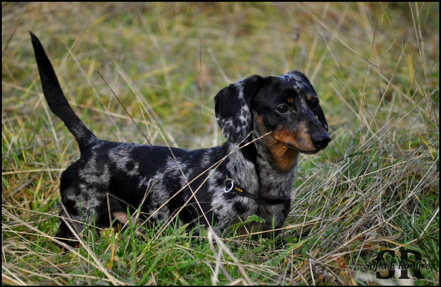
After roughing eachother up, these two pull off the innocent look like they've done nothing at all to disturb the peace lol

Related content
Comments: 32

contemporaryhart [2011-08-13 06:52:40 +0000 UTC]

..they look very young and playful!..

👍: 0 ⏩: 0

IamCo [2010-12-22 08:56:03 +0000 UTC]

What an AWESOME capture!

👍: 0 ⏩: 1

SofiaERamirez In reply to IamCo [2010-12-24 06:24:10 +0000 UTC]

Thank you :]

👍: 0 ⏩: 0

Paulaart18 [2010-06-16 16:22:16 +0000 UTC]

great pic a lot of stripes

👍: 0 ⏩: 0

Dermoo [2010-05-22 12:51:52 +0000 UTC]

Nice picture

👍: 0 ⏩: 1

SofiaERamirez In reply to Dermoo [2010-05-22 22:08:14 +0000 UTC]

Thank you kindly

👍: 0 ⏩: 0

mishkuu [2010-05-14 13:15:34 +0000 UTC]

i love this!

👍: 0 ⏩: 1

SofiaERamirez In reply to mishkuu [2010-05-14 18:37:54 +0000 UTC]

Thank you

👍: 0 ⏩: 0

AlmudenaDoncelArt [2010-05-14 07:19:55 +0000 UTC]

ZEBRAAAAAAAAAAAAAAAAAS!!!
I ABSOLUTELY LOVE ZEBRAS!!!!!

👍: 0 ⏩: 1

SofiaERamirez In reply to AlmudenaDoncelArt [2010-05-14 07:32:26 +0000 UTC]

👍: 0 ⏩: 0

Karim-sama [2010-05-13 13:09:15 +0000 UTC]

Nice shot!
It is almost hypnotic.

👍: 0 ⏩: 1

SofiaERamirez In reply to Karim-sama [2010-05-13 16:39:29 +0000 UTC]

Thanks! I know, the stripes are almost psychadelic xD Imagine if they were multicolored!

👍: 0 ⏩: 1

Karim-sama In reply to SofiaERamirez [2010-05-14 08:57:45 +0000 UTC]

Interesting... I think it would be a bit over.

I think minimalism is classy LOL

👍: 0 ⏩: 1

SofiaERamirez In reply to Karim-sama [2010-05-14 09:00:36 +0000 UTC]

I like minimalism too I have a lovely photo of a duck that was fairly vibrantly colored, but it looked strange to me, so I desaturated it. I looove how it looks now. I did it with a flamingo, too

👍: 0 ⏩: 1

Karim-sama In reply to SofiaERamirez [2010-05-14 15:32:42 +0000 UTC]

Very interesting tendency... to make vibrant fauna more minimalist LOL

I would like to see more of that.

👍: 0 ⏩: 1

SofiaERamirez In reply to Karim-sama [2010-05-14 18:37:39 +0000 UTC]

really now...this pleases me lol. Most people are all about super vibrant colors...I rather like the anatomical beauty of the animals versus their coloring, to be honest.

👍: 0 ⏩: 1

Karim-sama In reply to SofiaERamirez [2010-05-14 21:24:15 +0000 UTC]

interesting.
I like both and how the the two mix together.
But you are right. People are most about the colors. It must be instinct.

👍: 0 ⏩: 1

SofiaERamirez In reply to Karim-sama [2010-05-14 23:42:45 +0000 UTC]

Why thank you. I know a lot of people are turned off by the "lack of color", but I think to truely appreciate the natural beauty of things, black and white or desaturation can achieve a new perspective on animals typically only known for color.....if that makes sense?

👍: 0 ⏩: 1

Karim-sama In reply to SofiaERamirez [2010-05-15 00:53:56 +0000 UTC]

Makes TOTAL sense!

I'm not a guy for desaturation, I like the colors or totally BW.
As you may have noticed on my gallery I have very little pictures desaturated.

👍: 0 ⏩: 1

SofiaERamirez In reply to Karim-sama [2010-05-15 05:49:44 +0000 UTC]

I am not one for desaturation either, but I have noticed that BW doesn't always achieve the effect I am going for and desaturating does...mostly because it shows just a hit of the vibrant coloring you know should be there...you know? Adds just a bit of mystery to the photo and gives it some mood, I think.

I like your use of color..particularly in the Samus photo and the one of Ada Wong at the window. In the Samus photo, the bold colors are deeply contrasted by the black and it really suits the photo...and in the one of Ada Wong, the saturation of the blues really does add to the photo, sort of playing off her make up and adding a little something extra to the air and mood of the photo...sort of flirty in a way. I like it

👍: 0 ⏩: 1

Karim-sama In reply to SofiaERamirez [2010-05-15 09:52:19 +0000 UTC]

Thanks you!

I was between heating up and cooling down the Ada Wong picture.
But I think the blue and red have better contrast and it is visually more interesting.

Have you ever noticed how much movie posters use Blue and Orange/yellow on them?

👍: 0 ⏩: 1

SofiaERamirez In reply to Karim-sama [2010-05-15 18:07:10 +0000 UTC]

Oh yes. Hot and Cold colors contrast nicely together. That's why if you have orange colored fish, you put blue decorations in the tank

👍: 0 ⏩: 1

Karim-sama In reply to SofiaERamirez [2010-05-15 18:44:25 +0000 UTC]

Check this out LOL
[link]

👍: 0 ⏩: 1

SofiaERamirez In reply to Karim-sama [2010-05-15 19:13:07 +0000 UTC]

ROFL nice! Yeah, Blue and yellow/orange is very popular xD It's pleasing to the eye...like "Woah..that's cool"

👍: 0 ⏩: 1

Karim-sama In reply to SofiaERamirez [2010-05-17 16:46:56 +0000 UTC]

He he he
^_^

👍: 0 ⏩: 0

Seraitsukara [2010-05-11 00:27:45 +0000 UTC]

Stunning shot!

👍: 0 ⏩: 1

SofiaERamirez In reply to Seraitsukara [2010-05-11 12:38:10 +0000 UTC]

Thank you kindly ^^

👍: 0 ⏩: 1

Seraitsukara In reply to SofiaERamirez [2010-05-11 13:25:20 +0000 UTC]

You're very welcome!

👍: 0 ⏩: 0

ISolitude [2010-05-10 08:23:16 +0000 UTC]

From the thumbnail I was like "whoa! TWO HEADED ZEBRA."

This is cool to though Scheming zebras.

👍: 0 ⏩: 1

SofiaERamirez In reply to ISolitude [2010-05-10 08:25:18 +0000 UTC]

Lol it does sort of appear that it is a two headed zebra, doesn't it? Damn those sneaky stripes lol

👍: 0 ⏩: 1

ISolitude In reply to SofiaERamirez [2010-05-10 08:26:21 +0000 UTC]

Yes xD Good shot.

👍: 0 ⏩: 1

SofiaERamirez In reply to ISolitude [2010-05-10 08:27:25 +0000 UTC]

Lol thank you

👍: 0 ⏩: 0