HOME | DD
 soladam — LCARS Dawn Interface Project
by-sa
soladam — LCARS Dawn Interface Project
by-sa

Published: 2011-12-12 13:50:55 +0000 UTC; Views: 4569; Favourites: 12; Downloads: 127
Redirect to original
Description
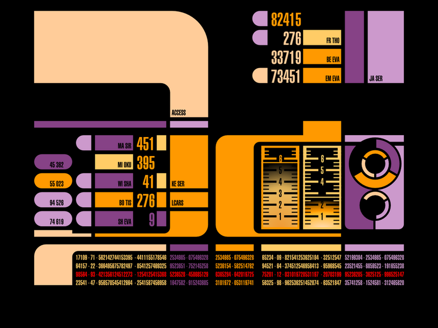
This is an new take on LCARS with a more subdued background and a greater focus on content and controls.This is not a working interface or skin for windows, instead this is a concept design with the purpose of creating a workable LCARS interface that could be used in a real life interface project.
This design is free to use, so please feel free to download the photoshop file and either adapt it to fit your needs or continue this project further. I only ask that you credit me for the original artwork it helps me to find my work online and I would love to see how this develops, also please feel free to post links.
The design features two panels, a library (like Windows Explore or Mac Finder) and a viewer like any built in image or file viewer (like Mac Preview) these can be minimised to the bar at the bottom, or maximised to fullscreen. Obviously other panels in the OS would look similar to these, but could also be full width like this: [link]
As this is a touch interface I would imagine that the panels are fixed an are not drag-able, the panels will be displayed according to the size of their content. Opening a new panel will result in other panels being minimised to the bar at the bottom, a bit like iOS or other touch based operating systems.
If you want to create a skin for windows then I think this will work well too, if you remove the black background you will see that these panels could be used like windows.
A few tips about designing for LCARS......
Alignment: Alignment is key - constantly check your alignment, LCARS is very blocky so you need to focus on alignment and the space between objects.
Black Space: The single most important thing to consider is the black space between objects, make sure you give objects enough space, set guidelines for padding and don't squeeze in content. LCARS is about balance, consistency and simplicity, which sounds straight forward but is difficult to achieve.
My Panels have set areas that I have organised into folders, but there is essentially three parts to consider:
Panel top: this contains titles, subtitles and table headers.
Content area: This is the panel's content, which might be an image or a file list etc.
Panel bottom: this is for extra buttons or status area text.
The panels frame contains the name top left or right, the panels controls (max, min, Close) and the panels sidebar menu.
The sidebar contains whatever controls are necessary and could even be customisable by the user. The height of the sidebar is the same as the content area. The panels top an bottom are sighed to fit adjacent to the brighter coloured frame.
I hope I have given enough information and guidance, but please feel free to use this as you want and develop it in a way that suits you, but remember to credit me for the original design concept. Enjoy!!!
Font is available here: [link]


 (Smile)")