HOME | DD
 Solaris07 — RIOKA TYPEFACE SKETCHES

Published: 2007-05-23 01:49:00 +0000 UTC; Views: 1876; Favourites: 18; Downloads: 104
Redirect to original
Description
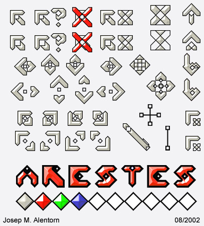
RIOKA TYPEFACE SKETCHESThis is my first typeface. I'm currently in the first stages of designing it. It's inspired by the DANUBE typeface. I love DANUBE but some of the letters are funky and don't seem to fit so I wanted to make my own, thus RIOKA.
Related content


Comments: 20


Cool one!
May be this font interests you [link]
The "e" counterform is small, "k" needs to be less thick in center. the rest are fine to me!
👍: 0 ⏩: 0

nice man, what program are you going to use to make the font into a true type format? I might want to try my own someday
")
👍: 0 ⏩: 0


Sweet font. I really like it. If you do release it, will it be free?
👍: 0 ⏩: 0


Good luck on this. It's really interesting to see things like this come together  (Smile)")
👍: 0 ⏩: 0

must add that i don't like the k. the two line coming out are to fat i think... nice job so far
👍: 0 ⏩: 1

yea, i think the k is weird too. i couldn't find something that really worked. i drew about 3 other versions of it. i'll probably try and rework it. thanks for the feedback!
👍: 0 ⏩: 1

I agree with them, and the T is a little bit to shoort on the sides, and I is way to short if you compare with J & L.
Are you going to have !?"/()&*-,. and special letters like the german Ü and nordic ÅÄÖ ?
👍: 0 ⏩: 1
alright, ill take that in to consideration. i thought about doing punctuation and numbers. i'll see what i can come up with.
👍: 0 ⏩: 0

Your Y, I would make it look more like your H but rotated at 180 degrees, with the ending of G.
And your X, I would use your S, and naturally continue the X with it.
👍: 0 ⏩: 1
alright, ill see what i can do.
👍: 0 ⏩: 0
Wow, I love your font! Unfortunately, I wish I could find a better comment, but I agree with TheMonkBob's comment.
👍: 0 ⏩: 0

the font looks amazing... just finish it... i want it!
👍: 0 ⏩: 0

The J feels a bit too long at the tip. wxyz seemed to be squished a bit. But, otherwise, I love danube and what you're doin' with it
👍: 0 ⏩: 2
yea. i agree. thanks for the comments, that what i was looking for when i posted this. i wanna hear what people think, before i go ahead and trace all the letters.
👍: 0 ⏩: 0