HOME | DD
 Solaris07 — The Ocean Project Poster
Published: 2007-05-04 02:30:27 +0000 UTC; Views: 7932; Favourites: 52; Downloads: 345
Redirect to original
Description
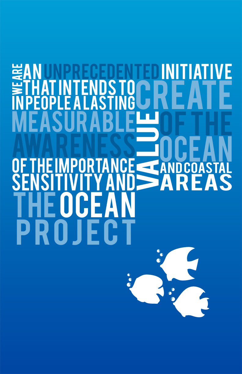
The Ocean Project Poster @ 72 DPIPrint Size: 11x17 inch
Related content


Comments: 12

I can read all of it, too! Excellent typography. Its very clear : )
👍: 0 ⏩: 0

I actually read all of that right the first time! This is great though, clever word play!
👍: 0 ⏩: 0

Wow... ocean power  (Wink)")
👍: 0 ⏩: 1

BEBAS, you can get it from dafont.com
👍: 0 ⏩: 1

Blue is my color. It's amazing. WOW.
You got everything I love... Blue, Water, Ocean, Capital letters, Cute fishes... Yay
 (Smile)")
👍: 0 ⏩: 0


i like it. i like the color scheme and i think you did really good with the text placing. the best feature of this is that you are doing well with branding the company with a certain style. since the text on this poster is really similar to the logo text.
👍: 0 ⏩: 0

The Way you've placed your text is interesting but the overall color Scheme and whatnot Is just kinda blah for me......I dont like it...Sorry.
👍: 0 ⏩: 0