HOME | DD
 Somdude424 — 3-in-1 Redraw this Meme.
by-nc
Somdude424 — 3-in-1 Redraw this Meme.
by-nc
Published: 2014-01-25 23:35:59 +0000 UTC; Views: 10393; Favourites: 99; Downloads: 60
Redirect to original
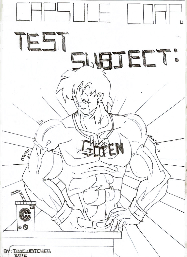
Description
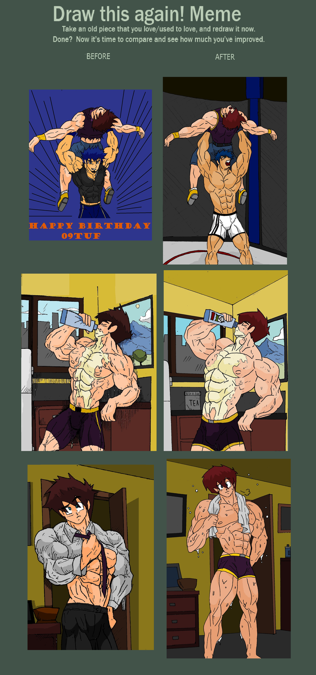
Looking back at these I thought I could do better... were my efforts fruitless Its up to you guys...
Related content


Comments: 48

Woah, Christ man. I'd be scared to have an arm wrestle with him.
👍: 0 ⏩: 2

Arm wrestling would be the least of your worries! he'll break your back!!!!!
👍: 0 ⏩: 0

👍: 0 ⏩: 0


I love your art the new ones look better and a bit sexier woof
👍: 0 ⏩: 1
Thank you for the compliment...
👍: 0 ⏩: 0

Very good. Also, I noticed you've started adding an extra row of abs.
👍: 0 ⏩: 1
.... oh yeah... you're right...
👍: 0 ⏩: 0

Ah, a nice improvement indeed! The lines are definitely cleaner and the background is better too!
👍: 0 ⏩: 1
I've been correcting your anatomy in the comic... forgive my slack work
👍: 0 ⏩: 1
...dunno what's wrong with it haha. I mean I don't have accurate anatomy either! It's all about stylizing it into something pleasing to the eye
👍: 0 ⏩: 1
^_^ its part of your identity... I gotta try my best to capture it ^_^
👍: 0 ⏩: 1
Ah, well thank you Som. I'll try to do the same in my replies from now on
👍: 0 ⏩: 1
Dont be scared *reassuring pat*
👍: 0 ⏩: 0

I see great improvemnts!!!! plus your inking became less shaky and some unneccesary lines/details erased toma it easier to look at. Yeah, you really improved. I'm glad i was here to watch u geting even better and improve even more as an artist!!!
👍: 0 ⏩: 1
")
👍: 0 ⏩: 1


I love these meme's! You have improved very much in my opinion
 (Smile)")
👍: 0 ⏩: 1
")

Overall I'll say the ones on the right are an improvement of your style. But I do have counter statements.
The home from work and finished workout ones on the bottom are good comparison pics, but I still like them both as separate images. The home from work one is slightly more provocative with the tight shirt, the bulging bicep, and the slightly pouty face. 
The other one is the milk scene. I like the changes you made to the right one the best, but there are still two things I'd like to point out.
Firstly, in the new one, he looks like he is pouring the milk down his nose. Usually, it is supposed to go the other way, and not while trying to look sexy. lol
Secondly, you forgot the shading behind Som. :-/ And I liked the blood vessels on his arm in the original.
I do however like how you made his head smaller in comparisson to the rest of the body as far as proportions go. It makes 'other' body parts look 'bigger'.
As usual, it is a thrill to see your art work grow and improve while watching you experiment with new styles.
👍: 0 ⏩: 1
Hahaha... wow... thats alot 
👍: 0 ⏩: 1
Well, I think there is a 'lot' to see in your older stuff...

👍: 0 ⏩: 1
Excuse me now, I'm gonna go play 'Where's Waldo' with you art gallery...
👍: 0 ⏩: 0

Even when you started you were great, hope to see the boys when they start growing and learn their powers
👍: 0 ⏩: 1
AzakiShimo [2014-01-26 04:45:29 +0000 UTC]
Oh you are improving, my love~ turns t nice! but I can't believe I didn't see the difference~
")
👍: 0 ⏩: 1

AzakiShimo In reply to Somdude424 [2014-01-26 17:17:45 +0000 UTC]
You're so very welcome, my love~

👍: 0 ⏩: 0
Thanks man... look at the milk pic and how the abs shift when the torso arches back... as muscle artists we must be aware of how the bodies movement change the shape and size of individual muscles.
👍: 0 ⏩: 1

Ah Indeed, now I get why you said the old ones weren't correct, I'll certainly be keeping this in mind in future sketches, thanks ^-^
👍: 0 ⏩: 0

Bigger and taller, linear cleaner, a new way to make more definition in muscles and better Background´s dimensioning concept. I still loving your old style but there´s no doubt, you are improving in big steps >w<
👍: 0 ⏩: 1
Hahaha.... thanks its always good to know you're moving forwards ^_^
👍: 0 ⏩: 0


depending on your standars theres a diference between horrible awsome and perfect
to me horrrible is the drawings we did in elementery school(for most people)
awsome is like you and jj
ok is were im at and perfect is anime quality
they do look cleaner though
👍: 0 ⏩: 0

The body is the same size the head is slightly raised so is also slightly smaller.
👍: 0 ⏩: 0
Does that imply that its an improvement?
👍: 0 ⏩: 1

the before looks rough, and some lines look unnecessary
👍: 0 ⏩: 0