HOME | DD
 sonofsanta — Progression

Published: 2004-12-20 19:58:06 +0000 UTC; Views: 159; Favourites: 2; Downloads: 57
Redirect to original
Description
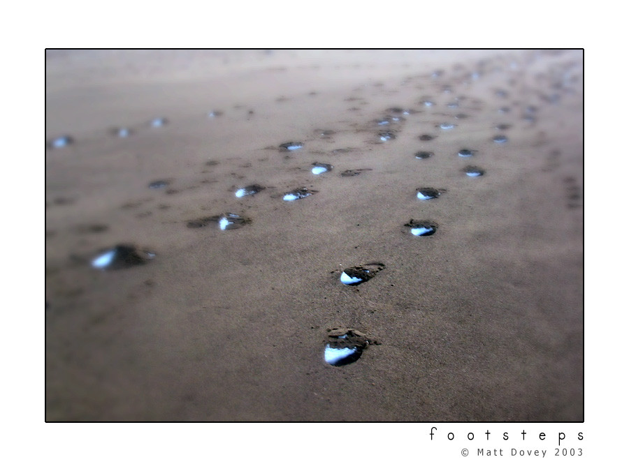
Autumn progressing through Winter toward Springbut some things don't change.
Gross amounts of contrast on this one. That's about it, really, I spent ages doing loads of other stuff that makes almost no difference, especially at this size. Might make a print someday...
")
Related content


Comments: 50

Very nice work, love the rich colors and the semi-abstract quality this takes on. There is a great sense of texture and shape as well as the dominant color scheme. Love the way a bit of the red/orange makes its way over into the green.
👍: 0 ⏩: 1

Thankyou - this is one of my very favourites for the reasons you mention. There's enough detail to stop me ever getting sick of looking at it.
👍: 0 ⏩: 0

Nice capture of progression. Being complementary colors, red and green are a great combination here. Good division of the image into a diagonal. The overwhelming contrast at first is a bit odd to deal with, really creates an unnatural kind of saturation....but readjusting to look at this as pure image instead of leaves and grass, it works well, it almost forces you to think about it in a more abstract way.
👍: 0 ⏩: 1
Thanks Weldy, you always leave the acest comments 
I'd never really considered what effect the harsh contrast had on it in real terms, it was an effect I'd been chasing for a while and happened upon accidentally here, so it pretty much got accepted straight off...
It's always been a favourite image, though, so thanks for all the input
 (Wink)")

👍: 0 ⏩: 0

This is nice. I like the deep redish orange contrast between the two. Almost gives you the feel, that the falling leaves are fighting the summer grass. With a few full leaves even on the other bright green side. I can almost smell the leaves. Very nice job.
C.V.
👍: 0 ⏩: 1

👍: 0 ⏩: 0

i probably can't add much to the comments you've already gotten here but the intensity of the colours is just breathtaking.
but what i like most about this picture is that there's a concept behind it rather than it just be a picture of some pretty colours.. it says something.
👍: 0 ⏩: 1
I like to think all art's better with a meaning than when it's jus a pretty picture

👍: 0 ⏩: 0

wow this is very pretty! I love the bright colours!
")
👍: 0 ⏩: 1

this is my favourite from your gallery...the colours are 2die4...
amazing contrast...good cropping...


👍: 0 ⏩: 1
Thankyou very much

👍: 0 ⏩: 0

Nice little life and death shot. great contrast between the two areas. You should've raked just a bit moreon the green side, but I do like the one full leaf in the bottom right area.
👍: 0 ⏩: 1
That's just dodgy cropping, I could probably redo that with the original photo, if I ever got too bugged by it... and I'd never really consciously noticed that leaf in the corner. Hmm
👍: 0 ⏩: 0

I really like the colors on this
it makes for a nice play on psoitive and negative space in unconventional ways
👍: 0 ⏩: 1
Y'know, I'd never really thought of it in that way... so thankyou
👍: 0 ⏩: 0

brilliance of colors ... did u know that red is the opposite of green or did this come to you naturally?
also love how some parts at the edges are a tad blurry .. gives it extra vibrance
on the nitpicks note... there's something silvery a tad above the middle ...
i would put a red layer over it and change the blend mode to "color".
cheese

👍: 0 ⏩: 1
Colours - it's just the photo. Autumn leaves on winter grass multiplied by extra contrast just turned out like this, no extra colouring  (Smile)")
I hadn't really noticed the blurriness either, so thanks
And the silvery thing? That, my friend, would be the concept
👍: 0 ⏩: 1
silver is the concept? ....
oh well

👍: 0 ⏩: 1
The piece of rubbish is the concept... though the season's change, our treatment of nature doesn't.
You see?
👍: 0 ⏩: 1
i get it ... but you need more garbage in the shot ... something more visible like a can of soda maybe... i just thought it was a speck on the image

👍: 0 ⏩: 1
To be honest, I didn't really notice it until I'd got the photo into Photoshop, this was a quick, one-off shot as I walked way from E.A.S... a lot of my concepts are post-photo, rather than pre-photo
It was also an excuse not to have to modify it out, lol. I quite like it being so subtle, though; it's as if we're not noticing what we're doing to the planet, that we're so used to seeing it we don't really see it anymore.
")
👍: 0 ⏩: 1
excusses
.. use the post photo ideas for the upcoming shots

👍: 0 ⏩: 1
It's pure sophistry through and through, but I don't see anything wrong with that, it's just what I see in my own photos
And I'm obviously far too lazy to go out and retake photos. I'm pretty terrible at planning shots anyway... lol
👍: 0 ⏩: 1
sophistry you say ... hmmm ... opens thesaurus
lol ... keep using interesting words

👍: 0 ⏩: 1
Sophistry is usually used in a religious sense, because it's coming up with excuses to sin and trying to justify it, even thoguh the intent is still there. It's doing something even though you know it's wrong, reasoning your way into being able to do something that you know you shouldn't be. No matter how many excuses you make, God stills know you're sinning, so the arguments are all pointless.
I hope you can work it out from that rather lengthy description
👍: 0 ⏩: 1
oh yeah ... i had a notion about the meanning from looking it up at thesaurous .. but now when u've put it into church/religious context i can feel better the sub-meannings attached to it.
thank you for that lengthy input
👍: 0 ⏩: 1
I can see how 80's B-Movies would fail to teach you words like sophistry, so no worries

👍: 0 ⏩: 0


Ooooooh 


👍: 0 ⏩: 1
I usually turn the contrast up on photos I'm working with but I never figured it'd look this good if I pushed it... that's essentially all I've done and it makes it look so professional to me, in a cheesy advertising kinda way. I just like it, I think.
👍: 0 ⏩: 1
lol its not cheesy, and you should like it, it's beautiful

👍: 0 ⏩: 1
I am rather taken with it, so thank you 

👍: 0 ⏩: 1
i think i have...
The leaves represent autumn, when the leaves turn brown and fall off the trees, and they land on the grass, which is a beautiful bright green, representing spring, when everything that has fallen is reborn and the cycle starts over again.
Am I close?
*looks at you hopefully*
👍: 0 ⏩: 1
Well, that was the obvious one for the title, but there's something in the photo that I thought about editing out but decided to leave in, and is all to do with the second line of the description...
But don't tell anyone when you do get it

👍: 0 ⏩: 0

dude, if I didn't already watch you I'd do it for this pic Oo
👍: 0 ⏩: 2
Nice to know... lol. Thanks for the second fav of this evening
👍: 0 ⏩: 0

ahhhhh the contrast
Geesy peets mate, its really bright! I like it though, especially the seethrough title, that is rad. looks almost acidic!
EDIT:
hmm
You could try doing an overlay - gradient map - purple orange deal.
=/
I do that sometimes just to see what it would look like.
👍: 0 ⏩: 1
Yeah, I had thought it a little bright, but turning the brightness down just didn't look as good. Guess I could do it with levels better, but, eh.... I like it like this. I'm used to that level of colour with it now.
Explain further this idea of different colours... I am intrigued by this new possibility

👍: 0 ⏩: 1
You take the layer and duplicate right?
then go to image>gradient map
then select the two color scheme of purple and orange
NOW
go to your layers and overlay it
=]
I used to use it alot =]
👍: 0 ⏩: 1
...
That, I do declare, is cool as fuck. It's gonna take me even longer to finish mucking about with a picture now, thanks a lot keef
I love learning new things about Photoshop. There's so many ways of doing so many things...

👍: 0 ⏩: 1
hot damn
I can teach you some other cool stuff too, I know alot of cool things in photoshop, im really trying to learn so I mess around religiously.
and every now and then I find something cool.
👍: 0 ⏩: 1
And you tried telling me you were lame in Photoshop...
I've mostly been doing the mess about thing as well, but my PC isn't so hot these days, so there's a patience problem there. Also an attention span problem, there's usually someone in my house distracting me with films or games or smokes...
👍: 0 ⏩: 1
I would kill a mongoose for some smokes =[
I havent smoked in so long
=[
seriously
i die
=[
👍: 0 ⏩: 1
Well that's your first mistake, see. You don't really need to kill any mongeese (mongooses? mongii?) to get hold of it, you just need to find someone willing to see things on your terms, as it were.
Such simple mistakes, young one

👍: 0 ⏩: 0

Very kule... Never thought of taking a picture like that, but it's looks awesome. Nice contrast too
👍: 0 ⏩: 1
It was a bit of a one-off shot taken walking away from another one, but I like it nonetheless. It's a bit blander in it's original form though... lol
👍: 0 ⏩: 0