HOME | DD
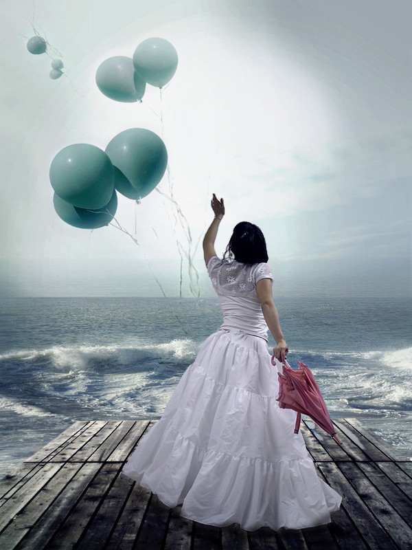
 Sophieluva — Letting Go
Published: 2007-09-09 10:49:58 +0000 UTC; Views: 2441; Favourites: 36; Downloads: 64
Redirect to original
Description
Hey,For this picture I set myself a goal:
To make something half as good as *sheispretty 's work! Very ambitious, especially for me. But I had such great stock to work with.. That always helps! I'm pleased with how I did.
I'd like any sorts of criticism or compliment. I consider this a WIP, but knowing me I probably won't touch it again, so I decided to post it!
[link] - Girl
[link] - Everything else!
Thank you! <3
Edit: Oh, and I would love it if people told me how I could improve it, not just what could be improved. For example, telling me how to avoid making the balloons look washed-out or how to fix that! Thanks!
Edit2: I think I should also say that I used Photoshop CS2 for it
 (Smile)")
Related content


Comments: 27

i love it. it makes me think of a mom letting go of the worries in her life..
👍: 0 ⏩: 0

I like the mood in this, the picture can be interpreted in many way and leaves much room for the viewer to feel and think for themselves. As for improvment I think you need to keep the lightsources in the different resources in mind. In this picture I'm thinking about the girl. The light on her is coming from the right, while the background and baloons are lit from the left. How to fix it? Just flip either the girl or everything else horisntally in photoshop.
Also, I'm not sure but it looks like you've meddled with the horisontal line of the ocean. The new lines definitely looks better, but there are still leftovers of the water in the sky. I suggest you select the sky area (so you don't mess up the lines) and go over the bottom part with the clonetool or something along those lines.
Other than that, some color variation might do the sky good. (Select the sky again and go in and adjust the hue and saturation)
Keep up the good work!
PS. Sorry it took me so long to reply to your comments (Commentexchange memeber), I'm not usually this slow. So I made this a super long comment to make it up. Cheers! DS.
👍: 0 ⏩: 1

Yes.. All good points, wow, that was really thorough! Thanks a bunch
👍: 0 ⏩: 0

wow....I have nothing else to say...I really love this one XD it's just so beautiful FAV
👍: 0 ⏩: 1


tsk, I didn't reply. Thank you!
👍: 0 ⏩: 0

sweet manip, love the coninuity of the tones as they all have a blue hue
👍: 0 ⏩: 1
Yeah, that's something I struggle with: making sure the pieces fit together well. As in lighting and colour. I guess I got lucky ")
👍: 0 ⏩: 1
good job anyways its fairly seemless on first appearance and on second
👍: 0 ⏩: 0

wow! this is a really good picture! love the concept and everything! 
👍: 0 ⏩: 1


thanks so much
👍: 0 ⏩: 0

this is super! my favourite part is the pink umbrella...
she looks like she's throwing away her worries
👍: 0 ⏩: 1
eee, thank you! Yeah.
👍: 0 ⏩: 0
