HOME | DD
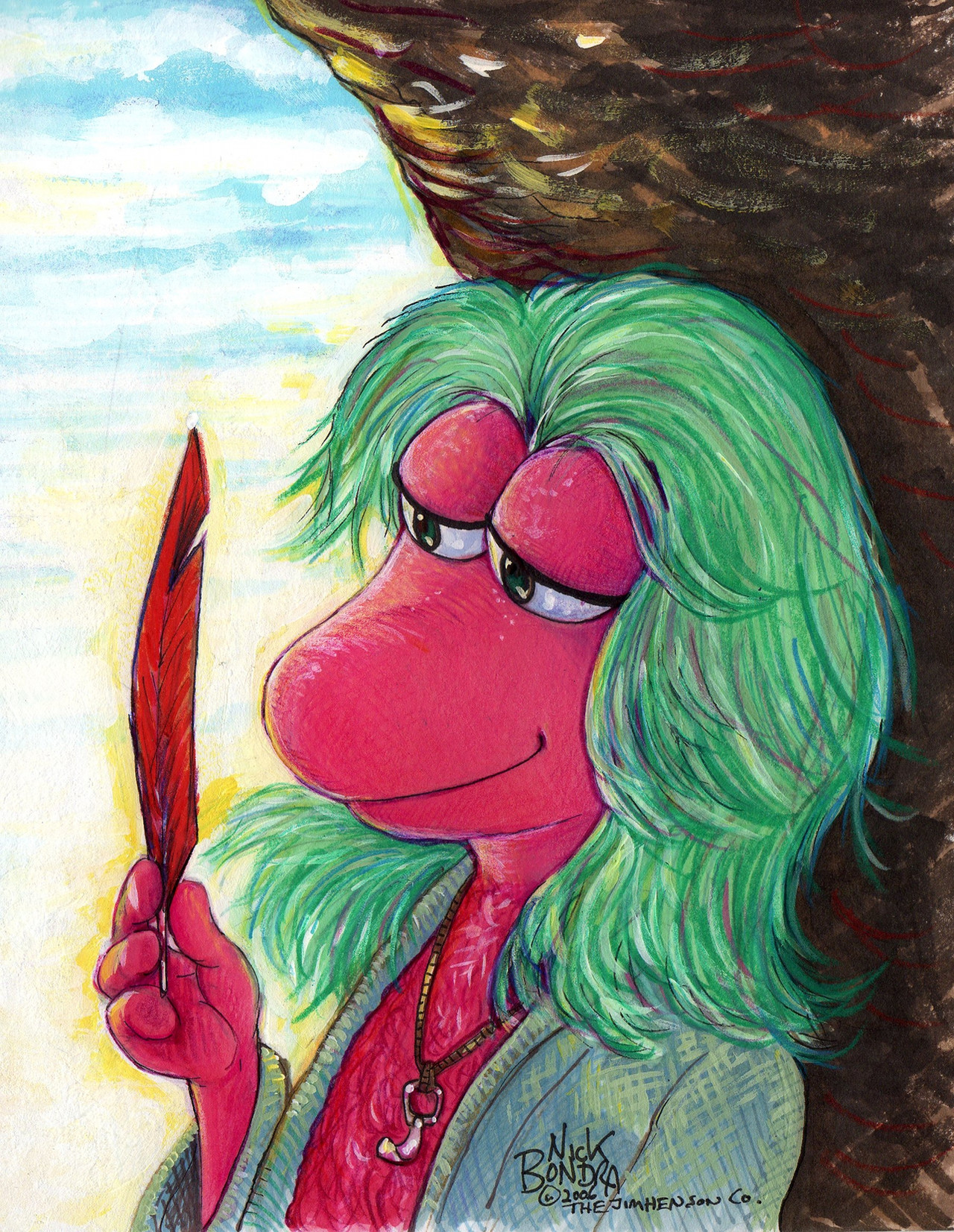
 SorcererLance — summer beach '09

Published: 2009-05-30 21:25:07 +0000 UTC; Views: 1712; Favourites: 25; Downloads: 53
Redirect to original
Description
though I should really work on my class assignments and commissions, I finished this piece I worked on and off at the lounge as I hardly do anything summer-related. I know the perspective's a little off though...I used OC for the lineart and coloring while using Photoshop CS2 for the lighting effects
Related content


Comments: 20

Overall


Vision
Originality
Technique
Impact
Cool piece! Particularly striking is the birds-eye-view perspective, which makes the image all the more eyecatching. The use of shadow is good and the directionality is perfect. I love the look on the face of just contentedness, which is what anybody would feel on a bright sunny day at the beach. e.deviantart.net/emoticons/s/s… " width="15" height="15" alt="
 (Smile)")
Probably my biggest critiques are in terms of the finer details and techniques. For instance, the background seems a bit too light on the detail when it's needed to establish the image's context. I can clearly tell where the image is taking place, but the sand looks a bit too yellow to be sand and the water could use a bit more variation in the colour. Also, some aspects of the anatomy could use some work. The hands for instance look a bit too limp and the stomach looks too short. The legs and feet however look fantastic and I couldn't think of much to improve them.
Overall a solid work. I'd be proud of it. e.deviantart.net/emoticons/s/s… " width="15" height="15" alt="
👍: 0 ⏩: 0

nope, started drawing since I was a kid in the early 90's
👍: 0 ⏩: 1

That's cool to hear.
Developing your own drawing style for a long time!
But I couldn't find them, the old pics went lost?
")
👍: 0 ⏩: 1
sorcererlance.deviantart.com/g…
sorcererlance.deviantart.com/g…
I still need to find and scan more of my old art
👍: 0 ⏩: 1
Oh, you have a category for them?
Oh right dA offers you the option to make some categories.
👍: 0 ⏩: 0

First, so cute! But since you wanted critique, I'll just give it in the comments here.
I think the legs seem to look as if they're at a slightly different angle than the body. The feet make him look like he's either standing on his toes or falling back. Last, I think the lines could be a bit smoother.
But, those are just my ideas.
")
👍: 0 ⏩: 1
yeah, the foot on the left I also felt he was on his toes, but since I redrew the foot so many times, I decided to leave it as-is and try to pass it off as maybe there was some sand on his heel having it elevated or something, I dunno XP
The lines...that's something I need to mess around with, since I've also got a bad habit keeping lines bland and unchanging, it's something I gotta experiment soon.
thanks for the critique ^^
👍: 0 ⏩: 1
Ah yes, you're welcome 
And sometimes, it is hard to get something to look right.
👍: 0 ⏩: 0


Can't see what's wrong with the perspective. The whole pic is neat, in my opinion. Good work!
👍: 0 ⏩: 0

Wow, you're starting to improve with Photoshop. The lineart here is so much cleaner than in your previous pieces, though I still would like you to vary you line width a little, kinda like these ones: [link] [link] [link]
But the coloring is really sharp here, and you seem to be getting the hang of the cell shaded look.
And awww, Foxxy's expression makes me all smiley inside. =3
Ah, perspective sucks to do hardcore. I can never get it right. XC The only advice I can give to that is use reference photos. There's a ton here on dA. Even then it's a pain. *Wriiiiiithe*
👍: 0 ⏩: 0

Cute! Does look like your right foot is levitating, though :3
👍: 0 ⏩: 0

*whistles* awesome job this is definantly my fave non-fetish pieces you have done. great work and faved
👍: 0 ⏩: 0

I notice you didn't outline the change in colour in the arms, ankles, tail, and chest to cheeks. Overall I think it looks much better now. Much more natural.
Excellent work, dude.
👍: 0 ⏩: 0

Ooh nice. Lovely use of effects in this one and great for bringing about the theme of summer. Great perspective in this one too. The direction the light's coming in and where the shadow would be has also been properly shown. Gosh, from looking it at now it'd be so nice to go to the beach now.
Really nice work on this, really gives the spirit of summer from looking at it.

👍: 0 ⏩: 0

Very nice pic! X3 I can never get tired of your art. ;3
👍: 0 ⏩: 0

XDDD NOOOO i was trying almost the SAME POSE XDDDD
👍: 0 ⏩: 0

ahh he's wearing shorts for once! 
👍: 0 ⏩: 0
