HOME | DD
 SOSFactory — Web design: Savious Cash
Published: 2009-04-13 01:22:36 +0000 UTC; Views: 9797; Favourites: 34; Downloads: 469
Redirect to original
Description
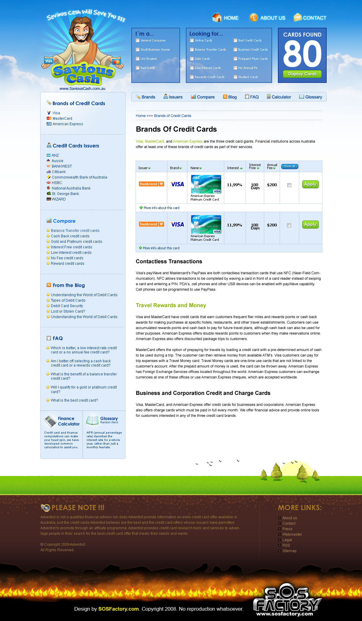
Web design I did some weeks ago for a blog about credit cards.Done from SOSFactory as usual..
I hope you like it.
Sergio
---------------
") PORTFOLIO
PORTFOLIO  (Smile)") BLOG (english)
BLOG (english)  (Wink)") BLOG (español)
BLOG (español) ") YouTube Channel
YouTube Channel
Related content


Comments: 16


I agree with BBT, also the outerglow at the top menu looks a bit off to the rest.
But those are just two minor things, the overall layout is very nice
👍: 0 ⏩: 0

not really liking the footer, I know what you were trying to do, but it could have done with more of an evil element imo, the fire hardly resembles fire, I realize the space needed to be left fairly empty, so as to allow for text and links on it etc, but yea, a little more variety in the shape and size of the flames would have greatly improved this imo
as for the top section, nothing but greatness all the way, clean, easy to navigate, friendly colors and fonts, very nice.
👍: 0 ⏩: 2
so you did not draw the footer 
👍: 0 ⏩: 1

I needed something simple so if its repeated looks good... just like a pattern.
👍: 0 ⏩: 1
I agree, the hell is a repeated pattern, but it have a mission: save loading time. The design is already quite heavy for SEO purposes so we had to sacrify visual impact in exchange of performance.
👍: 0 ⏩: 1
ahhh ok, i thought it might be as much, just a shame, as the header is such a tour de force
")
👍: 0 ⏩: 0

amazing layout. very artistic..
"he loves you and he needs money" lol..
👍: 0 ⏩: 0

wow, Jesús al estilo sosfactory, llamativo diseño y muy buena composición.
👍: 0 ⏩: 0

Nice concept and organization!
I think its easy to move around the page finding
the info really fast.
👍: 0 ⏩: 0

Lol! Saviour cash, just in time for easter! Nice character work as always!
👍: 0 ⏩: 0

hehe i like the heaven to earth to hell layout... very nice
👍: 0 ⏩: 2

Haha agreed, that's a darned nice idea XD
But, Savious?
👍: 0 ⏩: 0