HOME | DD
 SourceRabbit — [CH#3] A breath of fresh apples

Published: 2016-06-08 05:00:07 +0000 UTC; Views: 1228; Favourites: 64; Downloads: 14
Redirect to original
Description
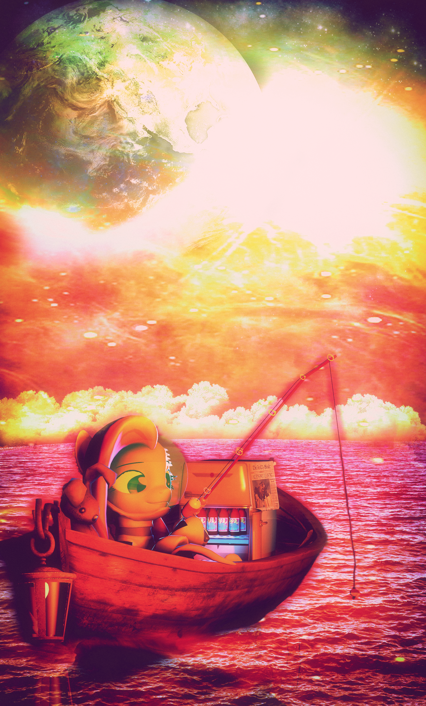
Submission for wednesday's SFM challenge, check it out here!Challenge #3: CompositionComposing a picture is far more important than what you may think, a good composition can harmonize and save a photography of most of it's flaws, and it's really essencial if you want to create an impact upon a watcher.
However, we must ask ourselves, what is composition?
In photography, composition is, well, ''composed'' on how the elements of the picture you are making are positioned, characters, scenery, lights, etc, are also a part of a composition, the rule of thirds is based on this:
The basic terminology of this is the next, what catches the eye of the picture you are making must NEVER be only in the center of the picture you are creating, in this case for example, we have characters in both the left and the right, which make the picture atractive to the human eye.
There's however, some other ways to make a picture atractive through composition, and that is by utilizing the art
Check yesterday's challenge here!
Challenge #2: Emotion(Notice, this is TUESDAY's challenge!)
I have to upload this challenge earlier, don't worry! I'll upload the next one in the same time as the previous one)
A facial expression can express a lot, happiness, fear, sadness, guilt, etc, in ponies this is actually easier because the eyes are much larger, and expressions are much more exploitable, however, one must always think that these expressions have always been based on human faces, the capabilities we have to express emotions are vast and almost limitless.
This is why checking photography with human emotions can be a fantastic reference for faces, such as this one:
http://www.clutchmagonline.com/wp-content/uploads/2014/04/a_3x-horizontal.jpg
Today's excercise will consist on that precisely:
Today's challenge is: Make a poster focused in the character's emotion (And base it on a human face)
If you don't know where to find pictures like the one I showed above, here's a google search that will do that for you:
https:/
Related content


Comments: 16


dazzion.deviantart.com/art/The…
👍: 0 ⏩: 0

It doesnt have good composition doe.
Its disproportional.
The guide lines lead out of the frame, the fense doesnt bend and the left hill screams with emptyness while grass on the right is overwelming in detail in comparison.
The fov and camera angle dont help to cover it up either. If anything, they strech out the scene making composition mistakes more visable.
Top right corner is completly empty too.
You get a D-
👍: 0 ⏩: 2

The rest i can understand, but could you explain the emptiness part a little more? What's wrong with it?
👍: 0 ⏩: 1
I think its pretty self-expleinatory.
I dont know how to explain something obvious.
Grass on the right is irregular, full of detail, shades of color ect.
Hill on the left is just a rounded plain with a single, flat, cartoony texture. Theres not even any bumpmap that could simulate difference between road and the field.
Its very, very basic. Out of place.
It could be fixed by adding small rocks and pieces of grass under the fense. Or any other small, detailed props.
TLDR
Levels of detail dont match.
👍: 0 ⏩: 2
Sometimes it's hard for me to notice errors in SFM posters. Though what about the top right? the sky behind all that grass, what's wrong with that?
👍: 0 ⏩: 1
What part of "its empty" do you not understand?
👍: 0 ⏩: 2
no wait, i remember now.
I can see that it's empty, but why must there be something there? What's significant about that particular space that it needs something taking it up? Forgive me if i'm being a little unknowing or blind here, but what is a composition?
👍: 0 ⏩: 1
I reached the limit of my patiance.
Do your research, im not google.
👍: 0 ⏩: 1
Been too occupied and distracted with things that google has often slipped my mind. But i shall go do it now before something else comes along. Sorry for being a pain if at all.
👍: 0 ⏩: 0
Isn't the AO a little bit exaggerated? Also the colour blur trend.. ugh. Last was the smudge trend, now its colour blur increase...
👍: 0 ⏩: 1
I only included scene fuckups.
AO doesnt throw me off too much so it gets a pass.
color blur was used to make edges look less aggressive. He chose the mood over composition.
Lighting makes no sense. There is zero shadows. And the fense is very bright, which ruins composition in many ways I probably already mentioned.
but fuck me, right?
👍: 0 ⏩: 1

For once I agree with you on something.
👍: 0 ⏩: 0

It looks so simple yet it's so beaufitul and charming. Just stunning. =3
👍: 0 ⏩: 0