HOME | DD
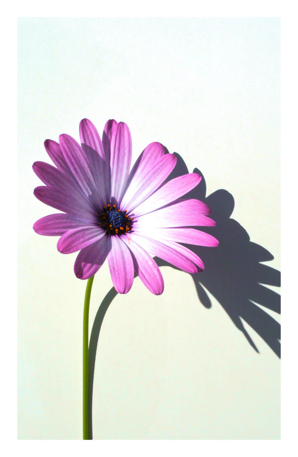
 sourcow — Splash of Colour

Published: 2008-10-27 00:39:01 +0000 UTC; Views: 3720; Favourites: 279; Downloads: 0
Redirect to original
Description


Related content


Comments: 78

That's a cool idea and it's executed wonderfully
 (Smile)")
👍: 0 ⏩: 0


hmmmm... seems i forgot to comment this when i faved it... so heres the comment;
This is a truly stunning shot, i love the colours chosen and the thoughts that you placed into this shot :]
👍: 0 ⏩: 0

")


very very interesting.
the light and the pure colors make the set
👍: 0 ⏩: 1


wow
how many pots of paint did you throw over this flower ( hee hee)
👍: 0 ⏩: 0


It's so pretty yet it made me a little bit sad. It's amazing.
👍: 0 ⏩: 1


sourcow, ....you rock. i LOVE! this one and the rainbow.....super duper.
👍: 0 ⏩: 0


I love it, Brett. There's a sort of old feel to it. I like it.
You're so creative.
👍: 0 ⏩: 1

It tis the flower i bought you so i had to forever immortalize it

👍: 0 ⏩: 1
Care to join me in a romp session?
👍: 0 ⏩: 1
Haha, I can hear you saying that. Funny.
👍: 0 ⏩: 1

Grovilicious! 

👍: 0 ⏩: 0


how beautiful. love the muted colors and the whole concept is rightway stunning!
👍: 0 ⏩: 0


very creative. love the color and how unique it looks. ^_^
👍: 0 ⏩: 0


Nice idea, and the low sat comes up great
👍: 0 ⏩: 0
| Next =>