HOME | DD
 spacehamster — Scourge of the Creed - Color

Published: 2005-12-28 23:57:51 +0000 UTC; Views: 518; Favourites: 7; Downloads: 32
Redirect to original
Description
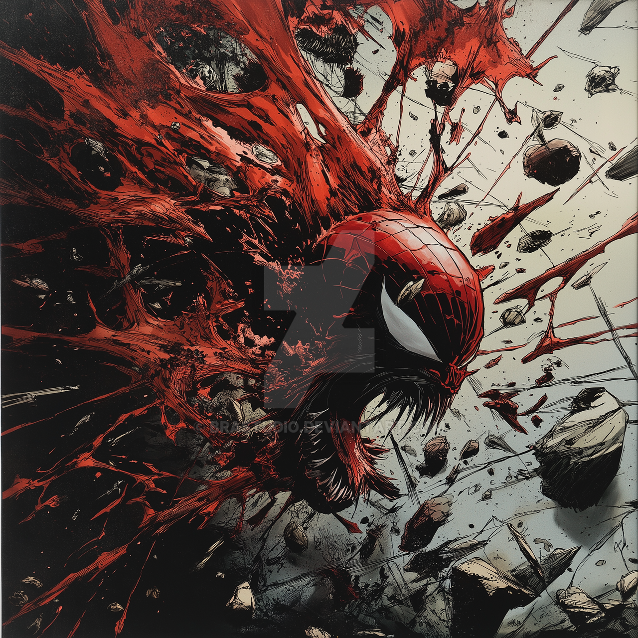
The more I look at this, the more amusing I find the abundant hatching. It's not something I do a lot anymore, but we're talking Image Comics in their heyday here, and... well, I just couldn't help myself. It's a bit like when I drew Goldie from Sin City and ended up using tons more black than I'd intended. Some pieces just seem to have a will of their own.Anyway, the coloring's pretty straightforward here, nothing fancy. Sorry this is another background-less piece, I'm working on something with a background right now, I swear.
Pencil, brush, Wacom. Please full view.
Check out the lineart version here .
Related content


Comments: 23


nice.. the foreshortening is handeled well, and I don;t think its really over hatched at all-
👍: 0 ⏩: 1

Thanks! Glad to hear the hatching works for you, I guess it's just a bit out of character for me.
👍: 0 ⏩: 0

")
Thanks! The character's not mine, though, he's one of Dale Keown 's creations. Just so you know.
 (Smile)")
👍: 0 ⏩: 0


Well done! I like it better than the b/w version, which is saying something. Keep up the great work!
👍: 0 ⏩: 1
Thanks! I'm kinda trying to keep my coloring a bit more understated and less poppy now... the tablet helps with that, too.
👍: 0 ⏩: 0

Thanks. I'm just glad I can still hold a brush, really.

👍: 0 ⏩: 0

really nice, this has to be my most favourite colour you've done,although i think the chain should be lighter
👍: 0 ⏩: 1
Thanks!
I dunno, I was going for contrast, I guess. Bright skin, dark chains.
👍: 0 ⏩: 0


Especially love the work you did on the chains, they look excellent
👍: 0 ⏩: 1
Heh, it's all in knowing how to cheat.
👍: 0 ⏩: 0


