HOME | DD
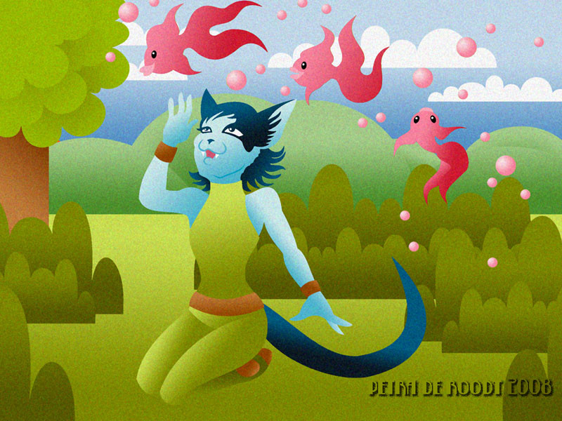
 spaceship505 — Kit's Dream
Published: 2008-04-16 00:17:47 +0000 UTC; Views: 160; Favourites: 0; Downloads: 0
Redirect to original
Description
This is a combination of computer techniques. I first drew the landscape directly in CorelDraw and then coloured it in Photoshop. I then had a thought about what character to use and basically I really felt like using pink flying fish (I have something with fish you see). Adding to that one of my Tirn Aill cat characters (Kit, from my realtime pet Miss Kitty) was a logical conclusion so that's what I sketched.Traced the picture in CorelDraw and coloured it in Photoshop again. For a final touch I added a filter (Texture, Grain, Clumped). The whole result is a bit silly (though a lot more work than you might expect) but I quite like that. Pictures don't always have to make sense right?
[edit] I put up a better quality image. It's little cropped at the sides as this was a desktop version.
Related content


Comments: 11

A lot different from what you usually do, isn't it?  (Smile)")
And about the drawing itself: I love the colours and the whole is nice and whimsical. I like it! ")
👍: 0 ⏩: 1

Whimsical, that's the right word
I really haven't done a lot of experimenting these last few year, partially because of the monster project that is Tirn Aill. But though it is good that after all this time the comic is really going somewhere, I do feel it's time to start doing different stuff again. I sometimes forget that I have much more in my head than just the comicpages
 (Wink)")
👍: 0 ⏩: 0

Because of the JPG quality I'm not sure I can actually see the filter, but I do like the colors very much! And I don't think it matters to Kit if what distracts her makes sense or not.
👍: 0 ⏩: 1
The question is, does it make sense I wanted pink flying fishies
I'm gonna upload a better version in a minute, the filter should be more visible.
👍: 0 ⏩: 0

Nice picture! Though it's so small that I can hardly see all the lovely details ^^
I love the goldfish and the simple way of colouring. But I'm not too sure about the grain. It makes it look like it's pixelated and unsharp.
👍: 0 ⏩: 1
It's the jpg really that makes it pixelated, the original file looks a lot sharper. I might just upload a larger and higher quality version of it, looking at it again in the cold light of day
👍: 0 ⏩: 1
It would be such a shame of all the hard work you put in it if people won't be able to see it properly. And if the jpg makes it pixelated, why not use gif? Sometimes it gives a sharper image, (though sometimes it totally doesn't... I don't know exactly when to use gif and when jpg, I just use what looks best ^^)
👍: 0 ⏩: 2
When a picture is rather small and/or doesn't have many different colors, then I try to see what looks better; I save one as GIF and one as JPG. Depending on the KB size and what it looks like I decide on which one to use.
So I can't really say when to use it either, it depends per picture. But my avvie's are always GIFs.
PS: I can see the grain filter clearly now. I like the effect it has!
Perhaps try an irregullar texture next time..? Gives a nice touch as well if you don't like the colors to be too tight.
👍: 0 ⏩: 0
It's always a dilemma on how good you want the quality to be and to what extend you want to protect your work.
But in this case I've chosen for the better quality (I've already uploaded it if you haven't seen it yet), still a jpg, but larger and saved at quality high instead of medium.
👍: 0 ⏩: 1
It's lovely! Much better viewable this way too ^^
👍: 0 ⏩: 1
And see, not pixely but grainy
👍: 0 ⏩: 0