HOME | DD
 Sparkleswords — BGDC May 10-Off Balance
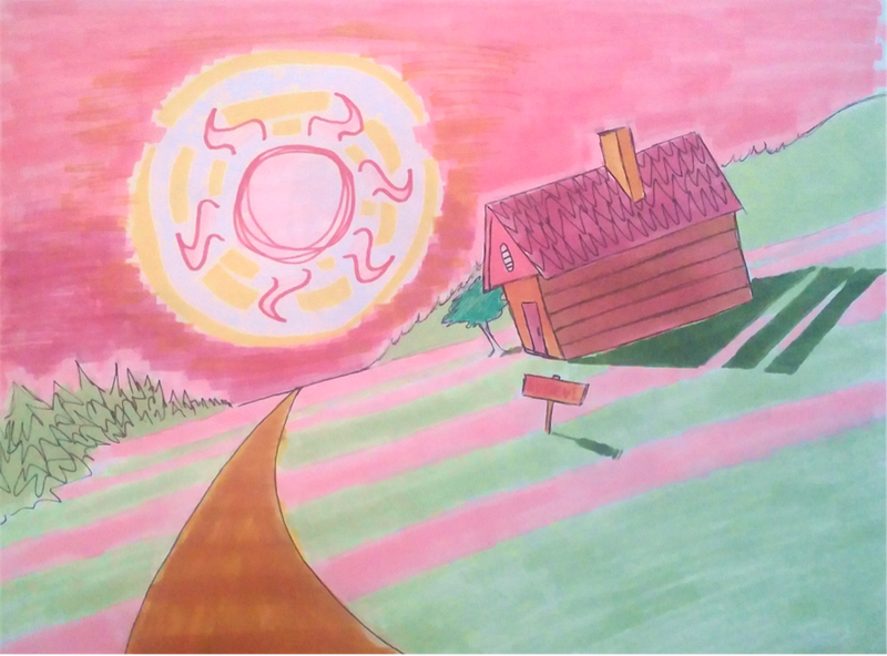
#angled #pink #slanted #sun #sunset #bgdc #bgdc2016
Published: 2016-05-10 15:54:18 +0000 UTC; Views: 316; Favourites: 20; Downloads: 0
Redirect to original
Description
I told myself I was gonna do some realistic type backgrounds this month...you can see how well that's working out...
Notes for myself: When drawing slanty pictures like such, just draw the thing straight and take an angled picture...less disorienting. Also, maybe don't listen to "It's the End of the World" on repeat when trying to make a not-weird picture.
")
Related content


Comments: 10

Hello ! I am from !
This is a very interesting drawing, and I feel as if it was a sort of vision taken from an hallucination, or from a psychedelic dream. Maybe because of the colours and structure, I don't know (or maybe I am just weird, haha !).
Okay, let's start with the good points !
- Colours are absolutely stunning ! They may not be realistic, but wow... This is powerful ! I could almost feel as if I was in a dream, seeing things in a different way. It is very artistic, and gives a very defined atmosphere full of warmness and softness. I can almost here the sound of a movie soundtrack while watching it, as if it was taken from an animated movie or something. The camera would go down to the floor while the sun is shining down, and the screen would progressively become dark. Then, we would switch into the little house, witnessing a scene inside involving many characters. Very good job, you awakened my brain, haha !
- The persective is just... GREAT ! I love oblique views, and I love the way the path is curving because it gives me the impression it is something close to fisheye perspective. I think this vision is very interesting to give a weird atmosphere to the piece. Combined with the colours, it is a treasure !
- I noticed some interesting elements. First, the sun, which is quite unusual. I like the fact it is obvious in the scene, yet doesn't disturb me from looking at the house. It isn't realistic at all, but it brings some variety in the piece, and contributes to create a lovely style (see below). Then, the shadows. I love the way you did them : with separated lines. It is interesting, and also reinforces the style. Finally, that little tree is lovely, and I enjoy the fact it is smaller than the house, because it creates a sort of absurd feeling.
- Style ! It is lovely, yet absurd. The absurdity comes from the perspective and elements above, while the loveliness mainly comes from the colours (pink mixed with orange + green) and the lineart, which is very simple yet impactful.
Now, the points to improve !
- The colouring could be improved because it looks a bit sketchy. I think if you use felt-tip pens, try to make sure to cover every white area, without making "big lines of colours". Here, it looks a bit unregular and it doesn't cover everything (see up right corner).
- The road's colour doesn't match the rest of the piece : while everything is pink/orange, the road is very brown. I think mixing the brown with some pink could be a good idea to suit the piece.
- The shading of the house could be a little more defined, so it doesn't look "without shading". The down part of the root, near the front wall, could be darken at it doesn't face the sun. The back of the flue (is that the right word ???) could be darken as well to make the contrast a bit more intense and the piece more powerful.
Overall, it is a very interesting drawing. I truly think you made the good choice to give up on that realistic look to get something a bit more "weird" because the result is very interesting. Once you'll have mastered felt-tip pen, it will be perfect !
KEEP IT UP !
(And damn, that song "The end of the world" by Skeeter Davis is a pure treasure... I understand why you listen to it over and over again !)


👍: 0 ⏩: 0

Hello I am commenting on behalf of .
I would like to start my comment with the positive aspects of your drawing. One, the simplicity of the drawing. I think you could take this background drawing and make a card from it or you could add a cartoon character too it. It seems to be able to fit multiple options very well. Secondly, I love the colors. Very bright and they really grab your attention. The perspective is interesting and draws your attention instantly.
The main aspect of this drawing that I personally would change would be the inked line work. I think for texture purposes only, like the tile on the roof, or the branches of the pine trees the lines work. However, the lines down the path and in the hillside background seem to harsh for the drawing. They really jump out. I may have colored the hillside a darker shade of green where it meets the pink ground and darkened the pink sky where it also meets the pink ground. Let the tones separate the scene.
Also I see where someone suggested being careful with your markers because they could see white streaks. Have you ever tried applying colored pencil over marker or vice versa. It will help fill in those empty spots.
Overall you have a terrific drawing here. Keep up the great work.
 (Smile)")
👍: 0 ⏩: 1

Thank you for your comment!
I think I see what you mean about those lines being a bit harsh...do you think it would look ok if the lines were just a darker shade of what they were outlining? I feel like having all the colors straight-up touching would lead to a bit of definition loss.
Funny thing that you should mention colored pencils! I'd noticed a few people using both at the same time, and was kind of tossing around the idea myself...but I hadn't thought of the possible use for filling out gaps like here. I think at this point I HAVE to try using pencils.
Again, thank you!
👍: 0 ⏩: 1
You are welcome. I think if you want to keep the inked line work in the drawing. Try varying line widths. Draw thicker lines towards the background with thinner lines in the foreground. This way there is some depth created. Fortune favors the brave, use the colored pencils.
👍: 0 ⏩: 0

(On behalf of )
I like this picture a lot. I like the simple farm picture as well as the marker coloring, the shading and your art style. I think it's pretty cute and shows a little kid's style to it. If I had to criticize something, I think you can color consistently with your markers. I don't really use markers a lot, but I do see that there's a couple of blank white lines around the grass, for example. Once again, be consistent with your markers and try to fill in the spaces.
Still, I like this a lot. Keep up the good work.
👍: 0 ⏩: 1
Thanks for your thoughts! I think that one of the most painful things to do with markers is to try and get two similar-value colors right up against each other without leaving blank spots or bleeding into one another. It's pretty terrible.
👍: 0 ⏩: 1
I agree. It IS pretty hard.
👍: 0 ⏩: 0

I am pretty sure Courage the Cowardly Dog lives there
👍: 0 ⏩: 1
Ha! ")
👍: 0 ⏩: 1