HOME | DD
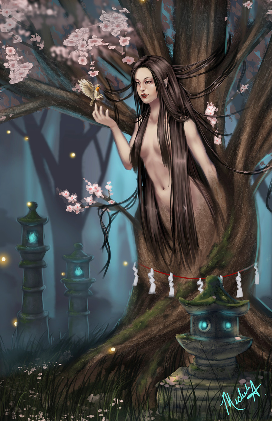
 SparkOut1911 — Sakura Nymph

Published: 2013-02-17 21:44:27 +0000 UTC; Views: 2897; Favourites: 148; Downloads: 0
Redirect to original
Description
and FINALLY I think I'm going to call this one finished! Thanks to everyone that showed up to the livestreams for this thing even though I didn't have many and to all the others who also offered their morale support :3This will be featured as a print at Animazement :3 I'm excited to be going!
Facebook: [link]
Related content


Comments: 32


This drawing is wonderful !
The colors and soft and fit well together in this forest atmosphere.
The character of the nymph is very well done too : i like her having Geisha style lipstick ^^
landscape aroung is fantastic fairy-styled
👍: 0 ⏩: 0

Stunning picture! The way you colored it is amazing!
👍: 0 ⏩: 0

So I had a look at the face, needed to zoom in 300% on the close up and you're right. I know exactly why you aren't happy with it as I suffered with painting/sketching the same kinds of faces. Here's a sum of what's wrong and needs fixing.
1. Her eyes are flat, especially the left one, there is no 3 dimensionality to them.
2. Contrast. there is not enough of it. There's nothing is that bringing the lips forward.
3. Lighting. there is no definite light source here, thus you have random highlights (like under her chin) and no proper shadows to further form the face (needed on her neck ).
4. Her left cheek is too flat comparing to how 'full' her right one is.
5. her ear is way too low, the more your head tilts down, the more your ears move up.
6. Her smile is not clearing shown through tone, when you smile it pushes up on your cheeks.
I suggest looking at references of faces more, study them and try and understand how colour works to tone and form the face. Also look at different faces and different features, all the ones you use are all the same.
👍: 0 ⏩: 1

Thanks for taking the time to give me a well thought out critique, I really appreciate it. I'll have to give this all a hard look when I get home and see if I can't save the picture x_x (thanks also for being technical about it unlike a certain someone.)
👍: 0 ⏩: 1
No problem, just hope you take in my advice as my previous critiques didn't seem to help, I've mentioned your lack of lighting and contrast once before. (she had red hair...there was marble floor or something)
You should really look at other colourists, or at least people who do line art then colour like Artgerm, he's a fantastic example of how much you can do with colour and has live streams)
👍: 0 ⏩: 1
Well I think I'm overthinking some of the highlights, like the one you mentioned, the one under her chin. Doesn't light bounce off things? I think part of my contrast problem is also my computer screen, I thought I was mindful to put more in but when I look at it on my phone it looks different than on my computer :\ I mean its not the whole problem but it certainly doesn't help.
👍: 0 ⏩: 1
Yes, light does bounce, but not all the time and everywhere. It depends on the light source and where the light is coming from and how strong/soft it is. In this picture I have no clue where its from or how strong the light is. Also depends on the substance it's shining on, some things absorb more light while some bounce more.
You shouldn't blame your PC, Why don't you just calibrate your screen then? doesn't take more than five minutes and its built in your PC's system.
👍: 0 ⏩: 1
wait really? 
I meant to make the light source come from overhead and just kinda failed miserably >< I kinda thought that light should reflect from her chest back up a little but I guess I miffed that up.
👍: 0 ⏩: 1
Just Google it if your not sure.
Studies of lighting would fix that.
👍: 0 ⏩: 0

I said it before and I'll say it again, those extra small details really paid off!

👍: 0 ⏩: 1
^^ thanks! I'm still going to have nightmares about cherry blossoms, so many x_x maybe it's my job that gives me this sort of patience since I sometimes end up altering thousands of the same part all day.
👍: 0 ⏩: 0

This is pretty good, the detail is quite exquisite in this particular piece~
👍: 0 ⏩: 1
^^ thanks. I thought I was going to die half way through all of those cherry blossoms ;__; lol
👍: 0 ⏩: 0
^^ thanks! I did it for my table at Animazement this year so I went really heavy on the japanese theme :3
👍: 0 ⏩: 1

For an anime convention, I can imagine! lol
👍: 0 ⏩: 0

I DON'T THINK THISA IS A FLOP AT ALL IT'S AMAZING AN INSTANT FAVE
👍: 0 ⏩: 1
:3 thanks. I suppose maybe I just have bad luck :/
👍: 0 ⏩: 0

This is very nice, I love the composition and your style
 (Smile)")
👍: 0 ⏩: 1

I really like the depth in the picture, how the foreground stands out from the trees behind. The flowers and the petals frame the picture really nicely. The colour scheme looks fantastic. It gives a sense of warmth in the sunlight and coolness in the shadows.
👍: 0 ⏩: 1
:3 thank you very much! ^^
👍: 0 ⏩: 0

ohh, very pretty! i like the flowers falling down gracefully onto the ground! the colours work well together c:
👍: 0 ⏩: 1

love the color and the depth of the pic, good job!!!
👍: 0 ⏩: 1
Nice to see your treating the hair as a whole rather than individual pieces, a nice improvement : )
The cherry blossoms look really nice too. Shame I didn't catch the live stream though, I would have suggested you look at trees and how they are textured cause they are actually pretty easy to paint. At the moment the tree kinda looks furry...ah how nice it would be to have furry trees, we could make thneads!
👍: 0 ⏩: 1
Hmm I may go back and fix it at a later date x_x I think I burned myself out a little on this one lol
👍: 0 ⏩: 0

The finished product is just beautiful!! So much detail, so many amazing colors that blend together so well!!
👍: 0 ⏩: 1