HOME | DD
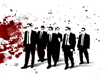
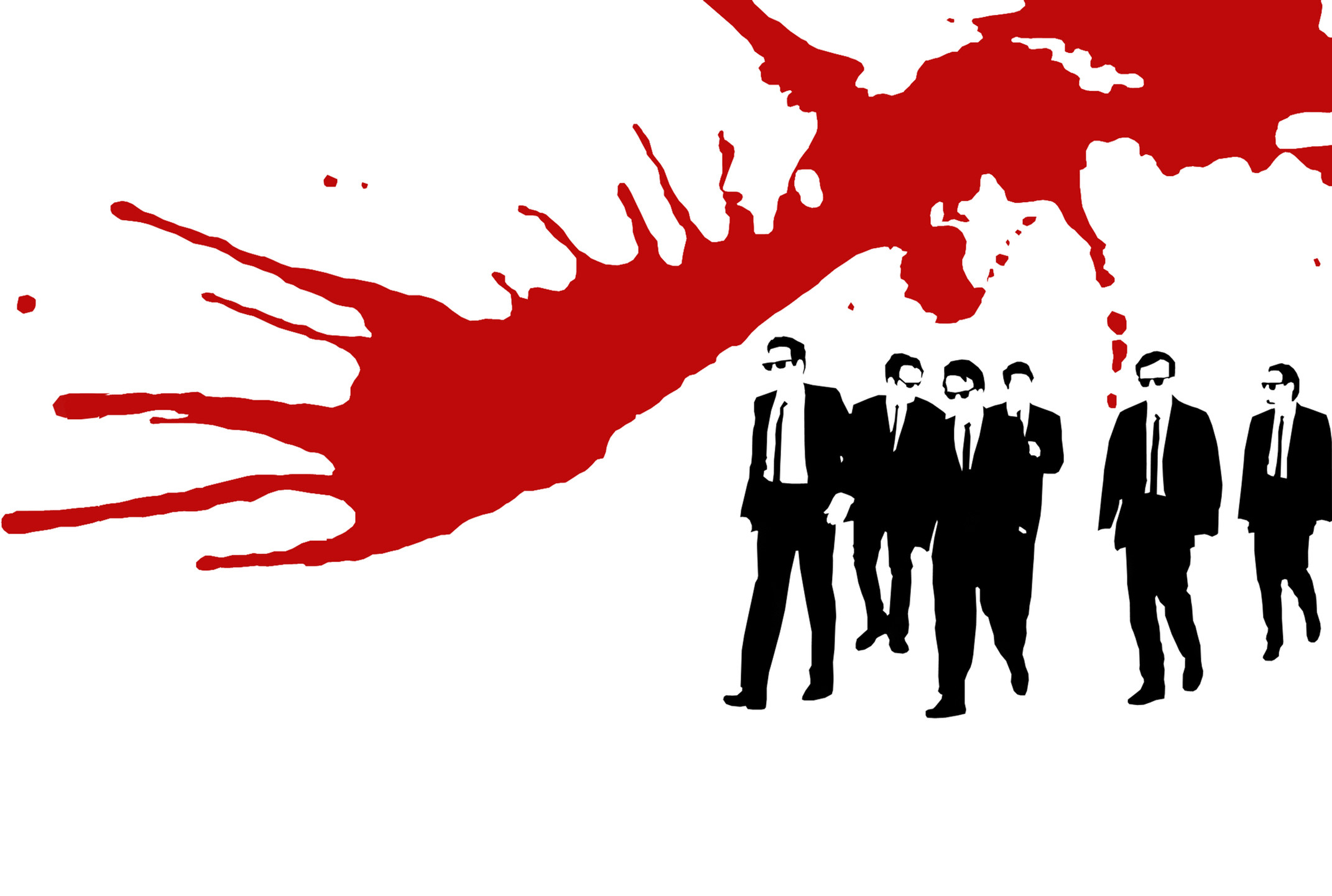
 Spartan-112 — Reservoir Dogs Canvas

Published: 2007-04-20 00:40:44 +0000 UTC; Views: 2379; Favourites: 20; Downloads: 101
Redirect to original
Description
This is 1 half of a stencil that is going on my skateboard deck.I know theres some underspray but i still think it looks good.
The stencil took about 2 hours and the blood spatter took 5 minuites.
Related content


Comments: 49


Great job. It's a bit of a shame that we can't see Harvey Keitel's face though.
👍: 0 ⏩: 1

i like this piece alot. i'm not a huge fan of splatter, but you pulled it off. good job
👍: 0 ⏩: 1

woooou la la! Thats reeeeeealu nice! I like the mix of the black canva and the red blood.. realy expressive!
👍: 0 ⏩: 1

cool! that looks awesome! wicked stencil. you do it yourself? i remember doing a dragon one in art at school. was so damn hard!
nice work on the blood too. very good colour
👍: 0 ⏩: 1

Thanks! and yea i did do it myself and yea it was a serious pain to cut, it wasnt even because it was complex i just didnt want to mess it up.
👍: 0 ⏩: 0

Daaamn... The Resevoir Dogs have just moved up a notch on my cool-o-meter!
👍: 0 ⏩: 1

take out the splatter in the background to the stencil is easier to see
👍: 0 ⏩: 0
tetsuoshima [2007-05-07 12:49:27 +0000 UTC]
I like this a lot, but I think that you could have kept the blood to the background and not have it touch the figures because that's kind of distracting.
")
👍: 0 ⏩: 1
thanks, yea the blood was easy to do but was also a pain. to get the effect that i wanted, i ended up using to much paint.
👍: 0 ⏩: 0

It's a great design, and a very unique art form too. You did a great job with the stencils and splatters. You really get a mixed feeling of light gore and action with this picture...almost like dirty FBI agents. 
The one thing I may suggest is for the people to stand out a bit more, perhaps increasing the amount of black and negative space usage (which was very well done), the blood splatters' randomness takes attention away from the main foreground.
Well done, I enjoyed looking at this piece of art, originality is key here.

👍: 0 ⏩: 1

very cool- the blood splatterslook really good
i bet they were fun to do
👍: 0 ⏩: 1
oh yea. its probably one of the best stencils ive done to date.
👍: 0 ⏩: 0

I kind of like this. Its all really well done, and it looks cool. The men are well done, and its kind of a shame that some of their faces (not that they reallt have faces, but you get what i mean) are covered by bloodspattern.
Don't get me wrong - the bloodspatter is what i like most of this, but it would have looked good if the bloodspatter around their heads were a bit more discret, and keep the big spattern around them.
(And by the way, how did you managde to get the blood to look like that? i myself never manage to make bloodspattern look natural ._.)
👍: 0 ⏩: 1
thanks, when i do the deck ill try to keep the facial spatter to a minimum.
to get the blood spatter was accually the easiest part, i srayed alot of satin red paint onto a peice of cardboard, then i let the paint drip down from a decent height onto the canvas. i think part of the problem with the faces was because i did the spatter in such a random manner.
👍: 0 ⏩: 1
Ah okay. Well, i guess thats kind of hard to do with watercolour, so ill have to try to find another way to do nice bloodspattern >.<
👍: 0 ⏩: 1
accually itll probably work better with watercolour, just so long as the red you use is dark.
👍: 0 ⏩: 0


really good work, nice movie and nice canvas!
👍: 0 ⏩: 1

looks good that you made something yourself and place it in your skateboard. nice job.
👍: 0 ⏩: 1

Nice one  (Smile)")
👍: 0 ⏩: 1

The crew stencil turned out real nice. The underspray is not a problem at all. Got the jpg?
The spatter is pretty solid too; on the board, I recommend hving the general direction of the "action" flow perpendicular to the crew to bring increased image clarity.
Awesome man. Real good job
👍: 0 ⏩: 1
thanks, i ried to get the blood to go one way, but it didnt all dry and some seeped downwards.
👍: 0 ⏩: 0


Not bad. I can really see a true Tarantino's pattern here
👍: 0 ⏩: 1