HOME | DD
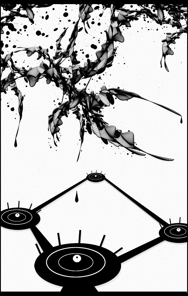
 Spartan135 — Reflective Disposition

Published: 2005-01-22 04:07:45 +0000 UTC; Views: 2602; Favourites: 24; Downloads: 756
Redirect to original
Description
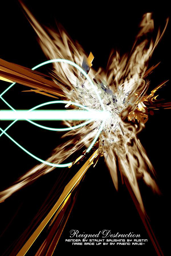
I am proud of this piece, i really like it, and i hope you like it too!! please fave and comment, and watch me! PLEASEI was starting to do a collab with my friend Essentialz, and i asked him to send me a Spikey render, because i am making this kick ass vector thing to go allong with it, and he sends me a blobby one...so i brush it, then get back to my own work, and get out c4D and make a really simple render thats spikey, it fits right in! i didnt even have to add a material! some of the tech brushes are made by ~MetroStation
Related content


Comments: 33

")


Hmmm... That render is too spiky, and it could need some color.
I just love the teching
 (Wink)")
👍: 0 ⏩: 0


... so awesome.
I want to use some of those effects on my stuff wicked badly but I am a total noob
Not the main object but like the lines and shapes and text around it... I think thats vektor...haha I'm totally clueless. do you have to use a program other then PS7 for that...
help me out?

👍: 0 ⏩: 0


Reminds me of something that paras1c did a while ago, but it has enough originality that makes it stand out. Very nice. I like the contrasts.
👍: 0 ⏩: 0


hey thats reallt kool I really like the style and the color with the 2D
")
👍: 0 ⏩: 0


Damn, i cant believe how many comments i hvae gotten!!
👍: 0 ⏩: 0
clearconfusions [2005-01-22 14:42:54 +0000 UTC]
luff! very nice, babe! i really like this one. i'm not much into vector, but this is fuckin awesome. keep up the good work!
👍: 0 ⏩: 0


Xeno, its called Vector, its supposed to be kind of random...i mean look at some of the greatest vector artist, its a little random in that category... * he1z he is vector, check his stuff out, its kind of random too.
👍: 0 ⏩: 0

Frankly...I don't like it...because it seems too random. You might not agree but it's only me. I think it has too many thing placed at random spots, something I don't like.
👍: 0 ⏩: 0

Really nice work. It looks like you put a lot of time in to it. Great vector image The whole thing seems like its sitting on a etched mirror.
👍: 0 ⏩: 0

Nice pic. I like the colors.
Or lack there of. It still rox!
👍: 0 ⏩: 0
Its supposed to be like that....color drains the piece of its uniquity!
👍: 0 ⏩: 0

I really don't much care for this man... the render is nice but the lack of color kind of makes me longing for more. The vector is mad nice.
👍: 0 ⏩: 0
