HOME | DD
 SpecNa — Cyber - Site design.
Published: 2008-10-26 06:19:46 +0000 UTC; Views: 6111; Favourites: 17; Downloads: 258
Redirect to original
Description
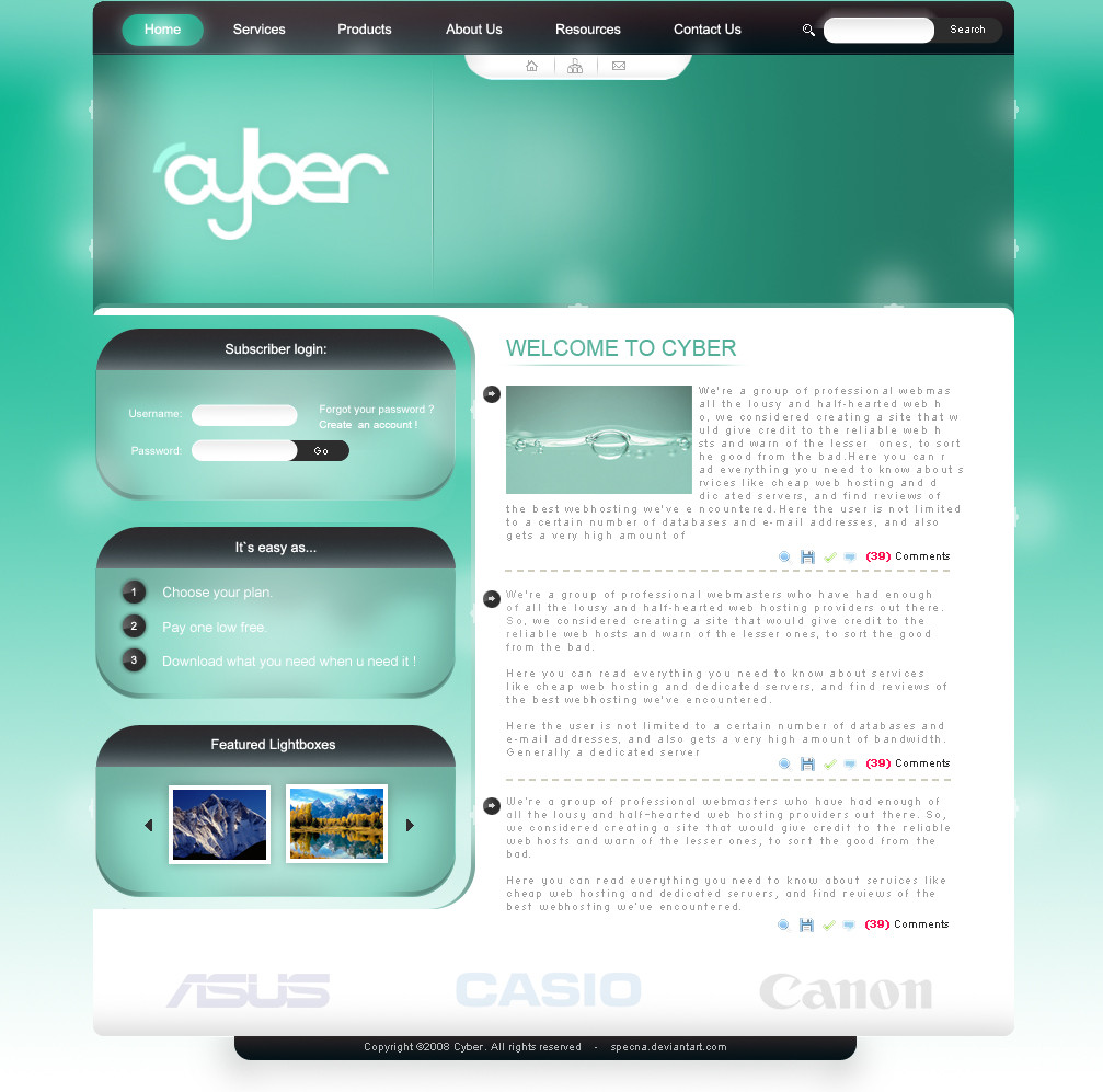
Cyber - Site design.I'm back with a new design. Been quite busy lately but still had to had time for a new design.
I have always liked aqua -colour theme, and I use blue and turquoise a lot.
Programs used: Adobe Photoshop™ CS2
Copyright ©2008 Vlad Merenkov | [link]
Inspired by
If you like it, eny
 ´s are appreciated.
Related content


Comments: 31


Great designer .
can you give me plz the "mail" and "home" pixel icons ?
👍: 0 ⏩: 0


i think this is great! but the text is not very easy to read at a glance because of the blur effect on the background maybe you could make it less promante to improve that.
👍: 0 ⏩: 0

 (Smile)")

Toda toda toda
ken ani bemet mishtaper !
pam halati al lasot mashu kaze !
ma at omeret esh atid hh ?
👍: 0 ⏩: 1


Yup thanx you so much
what u wannt i wrote in Artist's Comments ?
👍: 0 ⏩: 0

В большинстве своем - приятно глазу. Смущают осветительные "девайсы" .. и то, как это будет верстаться.. без проблем?
👍: 0 ⏩: 1

В общем хорошо
Чел тут уже сказал, над чем поработать, а еще слишком закругленные углы как-то не по мне ( можт радиусом поменьше сделать.. имхо )
А так всё гут
👍: 0 ⏩: 1
Радиус и так не большой ты про углы 3 блоков или самого макета ?
👍: 0 ⏩: 1
Ок уменя шас роботы так что не будит время на этот дизайн как закочю с дизайном который заказали пороботаю над этим
👍: 0 ⏩: 0

The colors are nice and the concept as well, but i didn't like the rounded blocks...
👍: 0 ⏩: 1

I like the navigation but I am not feeling the colors.
I also don't like the way the sidebar is like cut off. Over all its quite good.
👍: 0 ⏩: 0

Класс! Очень красивый, спокойный цвет. Единственное что 'кинулось в глаза' это непонятное наполовину обрезаное белое пятно возле кнопки Search...
👍: 0 ⏩: 2
Если ты про то что с лево от кнопки Search так это само поле где ты пишеш то что хочеш искать
а если про то что выше этого поля так это так задумано
👍: 0 ⏩: 0

")