HOME | DD
 SpHaeR — In Control

Published: 2005-03-09 16:31:06 +0000 UTC; Views: 1067; Favourites: 15; Downloads: 95
Redirect to original
Description
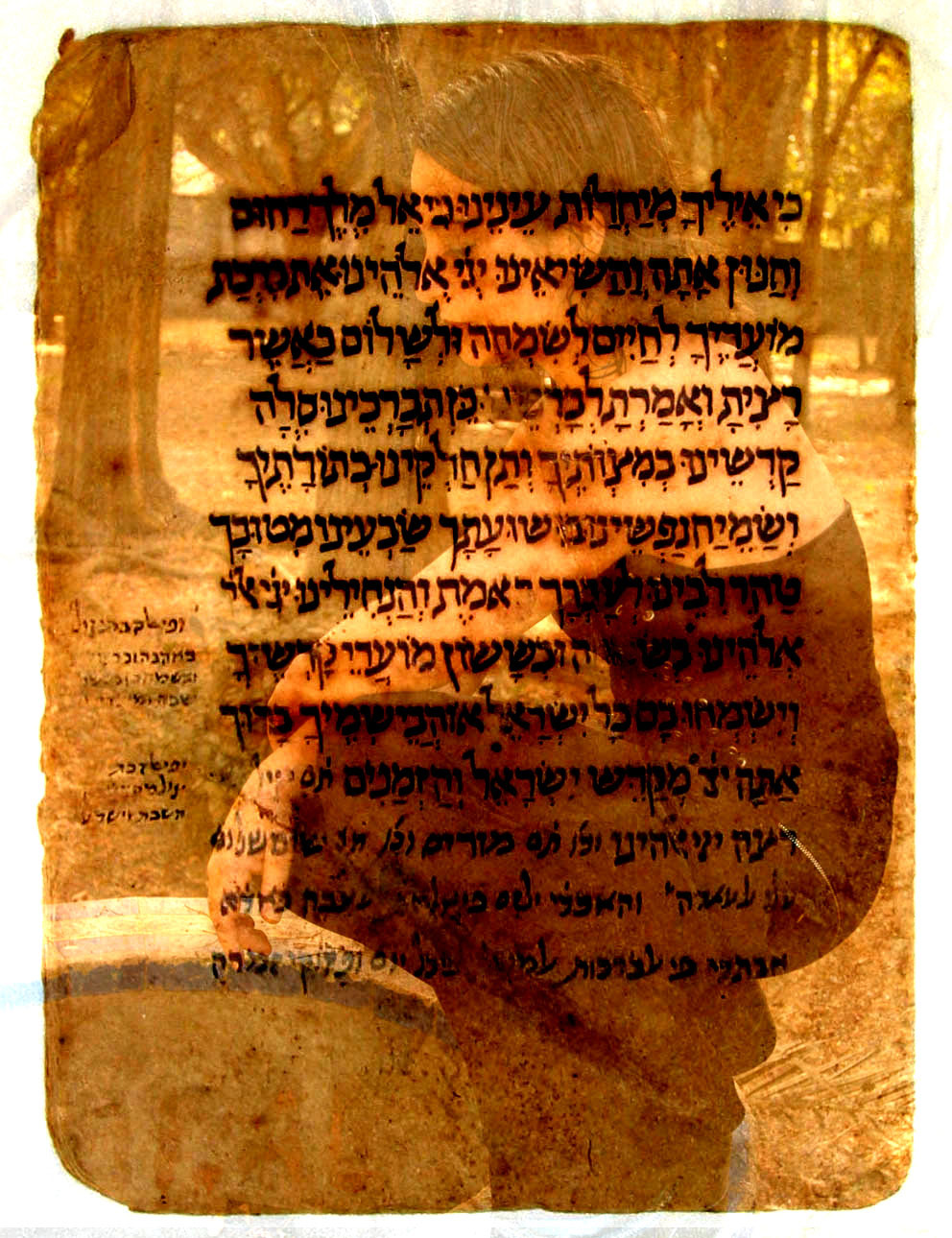
Since I was left without inspiration for the last few days I decided to use inspiration-leftovers and a nice amount of discipline. I hope you like itModel:
Original Picture: [link]
Second head: [link]
A ~Morf-stock stock.
Textures:
Textures were from `thespook 's Got Rust pack ([link] )
Related content


Comments: 35


Wow, i can see so many possible symbols in this, great work and awesome use of texures! keep it up, fav!
👍: 0 ⏩: 0


god!!
what a concept...thats definetly amazing and very well executed...
👍: 0 ⏩: 1


yo wouter, vet mooi gemaakt man")
heel appart, maar mooi!
👍: 0 ⏩: 1

Dag Evelien ")
👍: 0 ⏩: 1
haha dank je
👍: 0 ⏩: 0

well dude i'd have to say you coulda done better.. the eyes are cheesey.. the white just isn't your style, the cropping is really sloppy i can understand how you would have wanted him looking like he was half way in the dark but his whole body wouldn't have been. I'm sure if you took another swing at this piece when you were like UBER inspired you woulda done a better job..
sorry for the harsh critiqueing just trying to help! you can bash my spelling if you like LOL.
👍: 0 ⏩: 1
That's quite alright mailorderchild, we're all here to grow  (Smile)")

👍: 0 ⏩: 1
I can understand working on something when your really not inspired to do it at all it just turns out scary.
My spelling is horrid 90% of the time.. o.O
👍: 0 ⏩: 0

you done it again you have made stand in awe and made me feel like a mere beginner compared to you mate, oh i know i already commented on it but it was soo good i had to do it twice.
👍: 0 ⏩: 1
👍: 0 ⏩: 0

Great image, very freaky... Thanx for using my stock!!!!
👍: 0 ⏩: 1
Thanks and you're welcome, Mr. Morf!

👍: 0 ⏩: 0

nice  (Wink)")
but like I say its a nice piece
👍: 0 ⏩: 1

Hey interesting concept! Nice skin patterning as always
--- don't forget --- [link]
👍: 0 ⏩: 1
But better than average, don't you think?
👍: 0 ⏩: 1

Somewhere between average and plain genius
👍: 0 ⏩: 0
Thanks Mr. SorrowInTheDark

👍: 0 ⏩: 0

👍: 0 ⏩: 0

how did you know it was a complement

👍: 0 ⏩: 0