HOME | DD
 spicone — fool it

Published: 2008-04-02 16:37:14 +0000 UTC; Views: 3254; Favourites: 48; Downloads: 104
Redirect to original
Description
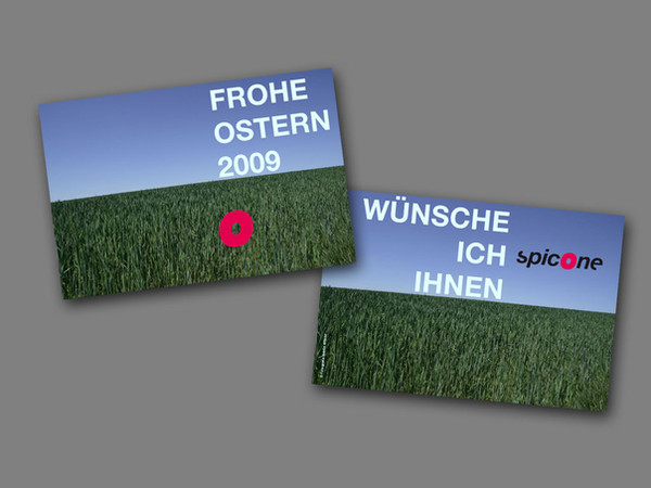
fool itsubmission for Text Art Wordplay Contest [link]
organized by
type: adobe garamond, dax
photo: myself
texture: [link]
by
Related content


Comments: 18


featured here [link]
*if you don't want to be featured, please let me know
👍: 0 ⏩: 0

 (Smile)")

")


gorgeous! i love the fusion of bauhaus and dada styles...interesting to see a serif typeface in there, i would expect such diagonal orientation to have a sans serif...great work!

👍: 0 ⏩: 1

fusion of bauhaus and dada sounds very good!
thank you
👍: 0 ⏩: 0


Love the layered look and this bg creates a good contrast with the black typface...maybe too much though? perhaps a dark brown or 90-95% opacity would draw the text into the overall composition more? I dunno... I especially like the 'jumbled' look you acheive with the text - it gives a 'thrown together' look but all the elements work together in the overall composition. Good overall look^_^
👍: 0 ⏩: 1
just playing around with new techniques
👍: 0 ⏩: 0