HOME | DD
 Spidersaiyan — A Message from the Future

Published: 2009-02-23 05:03:00 +0000 UTC; Views: 1226; Favourites: 44; Downloads: 21
Redirect to original
Description
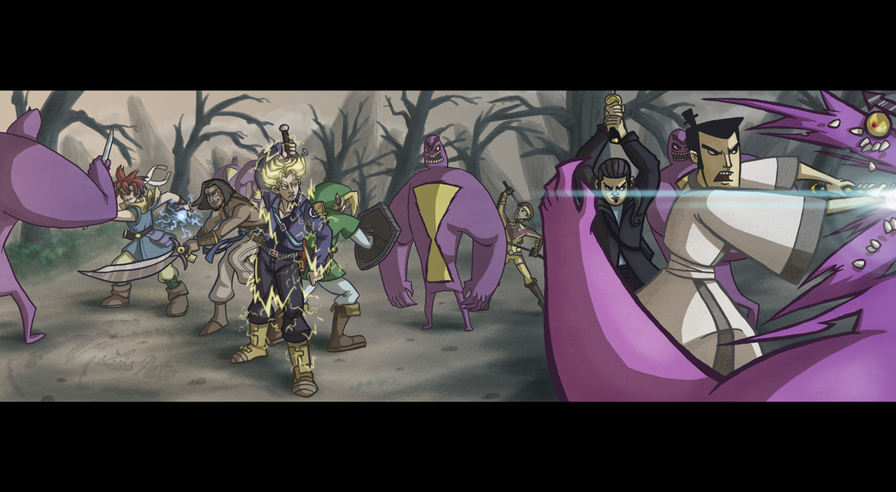
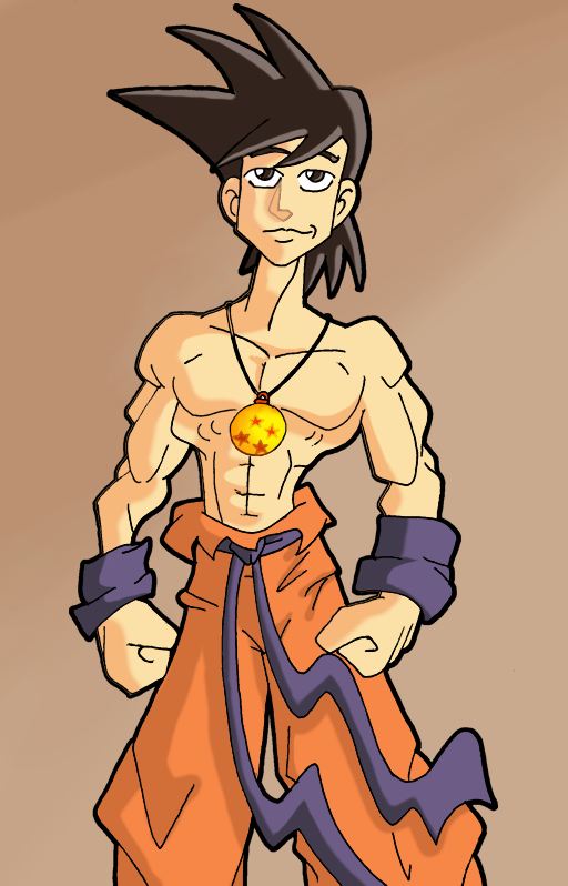
Ya know, I'm surprised that with the word "Saiyan" in my nickname, it's taken me this long to do some Dragonball-themed artwork! Anyways, here's my all time fave DBZ character, Trunks!Hope ya like it!
Trunks © Akira Toriyama
Art © Luis Neto
Related content


Comments: 9

This would be a pretty sweet concept for an American-style Dragon Ball cartoon, ya jerk.
👍: 0 ⏩: 0

well done! this could definitely be a re imagining/americanized TV show
👍: 0 ⏩: 0

I can never choose colours that blend together to make a good background. Got any tips?
👍: 0 ⏩: 1

Uhm, to be honest, most of my colour choices that I use for background are either done through trial-and-error, or by copying the colour-scheme of another pic I like! My advice would probably be to do the same...As long as you're not stealing someone's content, it's more than fine to steal their colour schemes!
I mean, Optimus Prime, Super Mario, Spider-man, Superman, and Sonic the Hedgehog all have the same general colour scheme, and no one goes out accusing anyone of really ripping either of them off...And there's a reason for it! Colours convey certain feelings and connotations. For example, the characters I listed are all mainly coloured using the primary colours. Primary colours tend to be associated with good guys, and tend to stand out more! Villains and Anti-heroes tend to be coloured using secondary colours like purple, green, and orange...For example, Joker, Riddler, the Hulk, Green Goblin, Bowser, etc.
Finally, I'd say to keep contrast in mind...Do you want the character to pop out of the page, or do you want it to blend into the background? The more you want it to separate itself from the background, the more you should create contrast between the character and the background (with colours and/or saturation). The same goes for the opposite...You want the character to blend in with the background more, just decrese the ammount of contrast between the character and the bg!
Wow, that was a long answer to a short question! lol
Anyways, hope that helps...That stuff's mainly what I think of when doing bg's!
👍: 0 ⏩: 1
Thanks. I usually have a problem with contrast my pictures are usually "too" full of colour or not enough.
👍: 0 ⏩: 0


Thanks...Glad you think so!
👍: 0 ⏩: 0

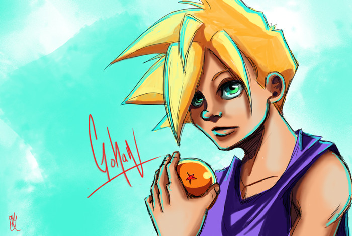
Oh wow! I love how you mixed your own style with Dragon Ball
👍: 0 ⏩: 1
Thanks, glad ya like that!
👍: 0 ⏩: 0