HOME | DD
Published: 2005-11-22 19:25:35 +0000 UTC; Views: 15996; Favourites: 137; Downloads: 951
Redirect to original
Description
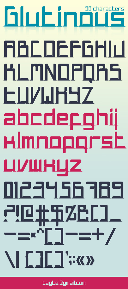
School work [typo]; printed on A2.Done with illustrator.
edit:
// code process in progress... //
edit 2:
You can download the .ttf here: [link] It seems that it doesn't work yet for mac but it's ok for pc!
> Thanks to
 it if you download the font
  (Wink)") <
< 
Related content


Comments: 88

 (Smile)")
")

superb font !!! Im just loving it.
I used it,for my first digital art submission
[link]
Simpel is more!
👍: 0 ⏩: 1
spritek In reply to mowka [2006-05-08 06:59:23 +0000 UTC]
Thanks, nice job. It's "Less is more"
👍: 0 ⏩: 0

Wow, it works as a stencil font for most of the characters too, I've gotta fav this.
👍: 0 ⏩: 1


simply put. amazing !!
using this on my next minimal project.
thank you for sharing.

👍: 0 ⏩: 1
spritek In reply to kon [2006-03-25 10:31:27 +0000 UTC]
Thanks, please
👍: 0 ⏩: 1
iight, ill do it kus i like the font so much.
cya around man..late.
👍: 0 ⏩: 1


late comment.
koo fonts
how u make fonts?
what program u use?
👍: 0 ⏩: 1
spritek In reply to NguyenB [2006-02-25 09:38:17 +0000 UTC]
Thanks, I've draw the font in illustrator and when I decided to code it I did it in fontlab
👍: 0 ⏩: 1


spritek In reply to sektor7 [2006-01-25 07:26:25 +0000 UTC]
Mmmh I don't know but it's really hard to do... wait
👍: 0 ⏩: 0


Cool looking font, sad we can't use it ")
👍: 0 ⏩: 1

Nice fresh style of typeset... Gw.
If you need it converted, i could do it for you.
👍: 0 ⏩: 1
spritek In reply to bindyeye [2005-11-24 15:50:15 +0000 UTC]
Wow thanks a lot, but I'll try to do it myself... when I've got the time.

👍: 0 ⏩: 0


nice font. but i think there's a problem with the A, C and E letters. its hard to tell the C from the E appart unless they would be side to side. as for the A, i wouldve most likely assumed that it was an O instead. it'd be perfect if you'd rotate it 90 degrees counter clockwise
👍: 0 ⏩: 1
spritek In reply to visualeyes [2005-11-23 07:20:41 +0000 UTC]
Maybe, but I love the way I draw them... and look a "a" and mine
👍: 0 ⏩: 0


Ooo..any chance of us being able to download the font? That would rock.
👍: 0 ⏩: 1
spritek In reply to Sarabi-Adruenna [2005-11-22 22:03:12 +0000 UTC]
I don't have the time to release it as a downloadable font
👍: 0 ⏩: 0


<= Prev |