HOME | DD
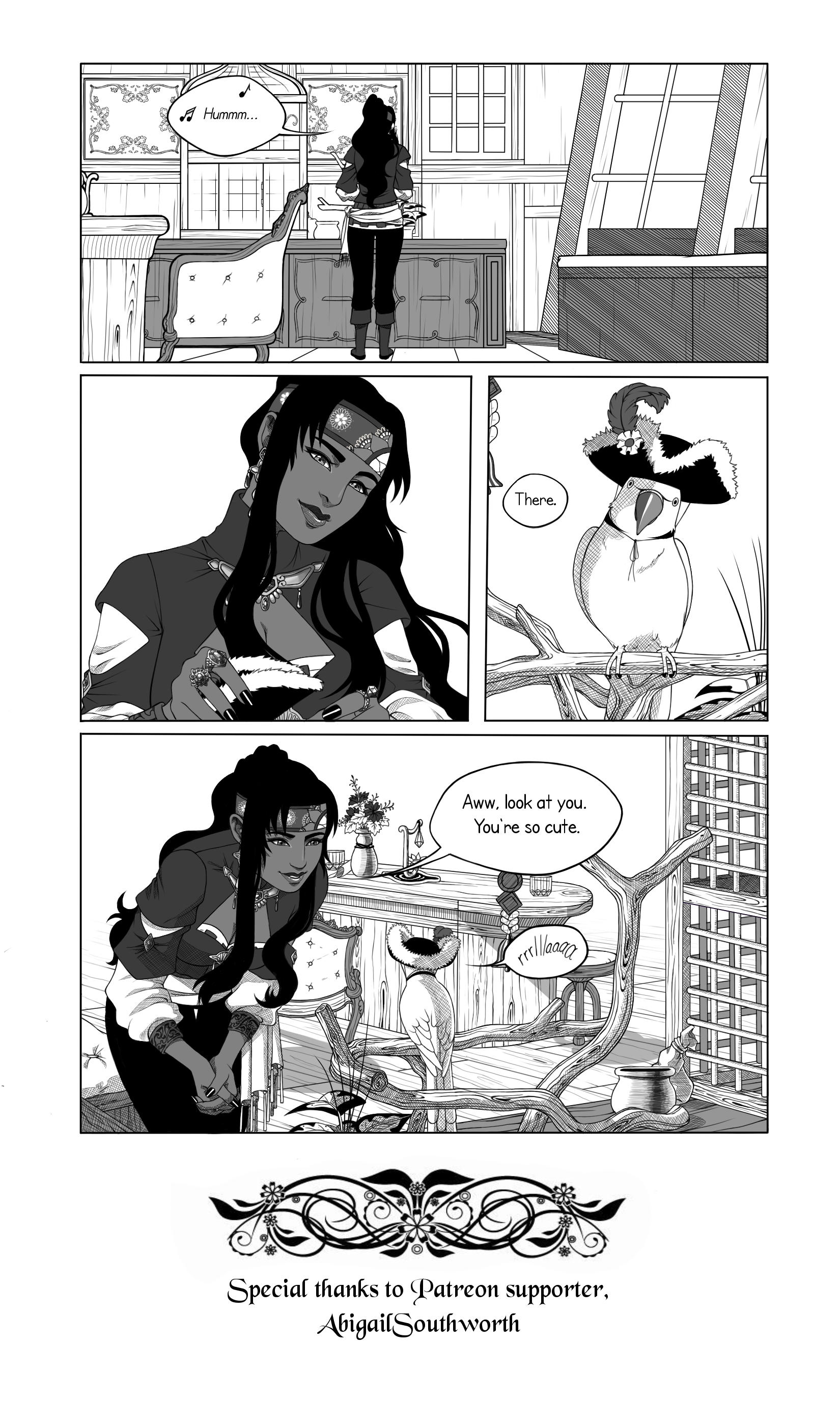
 Spudfuzz — [Peeko's Day Out] Page 1
#indianringneck #strawberryriot #peekosdayout #webcomic #webcomics
Published: 2017-03-09 21:22:36 +0000 UTC; Views: 983; Favourites: 51; Downloads: 0
Redirect to original
Description
Reads left to right.Overall I am not very happy with this page. I need to figure out a way to include detail without it looking like a cluttered mess. Terraset wants me to use handwritten text as well, but I'm iffy on it. Let me know if it's hard to read.
You can pledge to our Patreon and have your name attached to pages you support here:
www.patreon.com/strawberryriot
Related content


Comments: 22

Honestly, I think your details are perfectly fine, but if you wanted to try and make some visual separation, you could push the variation in the line weight a bit more. And, if you're not already familiar with it, you could look up the use of line weight to create depth. I think that's probably what's triggering your cluttered feeling. Just to give an example, look at the last panel. The edge of table in the foreground, which is right next to the viewer, has the exact same line thickness as the objects off in the background. If you thickened the lines up front and maybe thinned out the ones in the back a bit, I think it might help assuage your worries  (Smile)")
👍: 0 ⏩: 0


Actually, the detail looks perfect to me. Not too cluttered, not too empty. Enough to engage the eye without overloading it. You did really well here.
👍: 0 ⏩: 1

Oh great, thanks! I get paranoid about that a lot lol.

👍: 0 ⏩: 0

This came out so good, such lovely details and that crosshatching is on point.
👍: 0 ⏩: 1
Thanks Lana! I actually rush the cross hatching lmfao
👍: 0 ⏩: 0

I think the detail looks really good and not cluttered, I'm actually impressed with your awesome little details. And I love the handwritten text, definitely readable and fits the theme/mood!
👍: 0 ⏩: 1
Oh thanks! I get really paranoid over the text, because people keep telling me to use that darn bolded anime font. But the problem is, it doesn't suit for non-action stories.
👍: 0 ⏩: 1

IKR! I think people are just like "Oh, it's an anime based style, so you should use the standard anime font." I see some non action anime/ manga comics use it and it just doesn't look quite right.

👍: 0 ⏩: 0


Aww, quite cute! It was hard for me to read when not zoomed, but my monitor's pretty far away.
Zoomed in was fine.
👍: 0 ⏩: 1
Ah, I've shrunk down the file size since so it may or may not be better to read. Deviantart blurs large file sizes hardcore.
👍: 0 ⏩: 0


Captain reporting for duty. Ready to instill cuteness into the hearts of my enemies.
👍: 0 ⏩: 1
